branding, wayfinding
Yuen Shinjuku
|
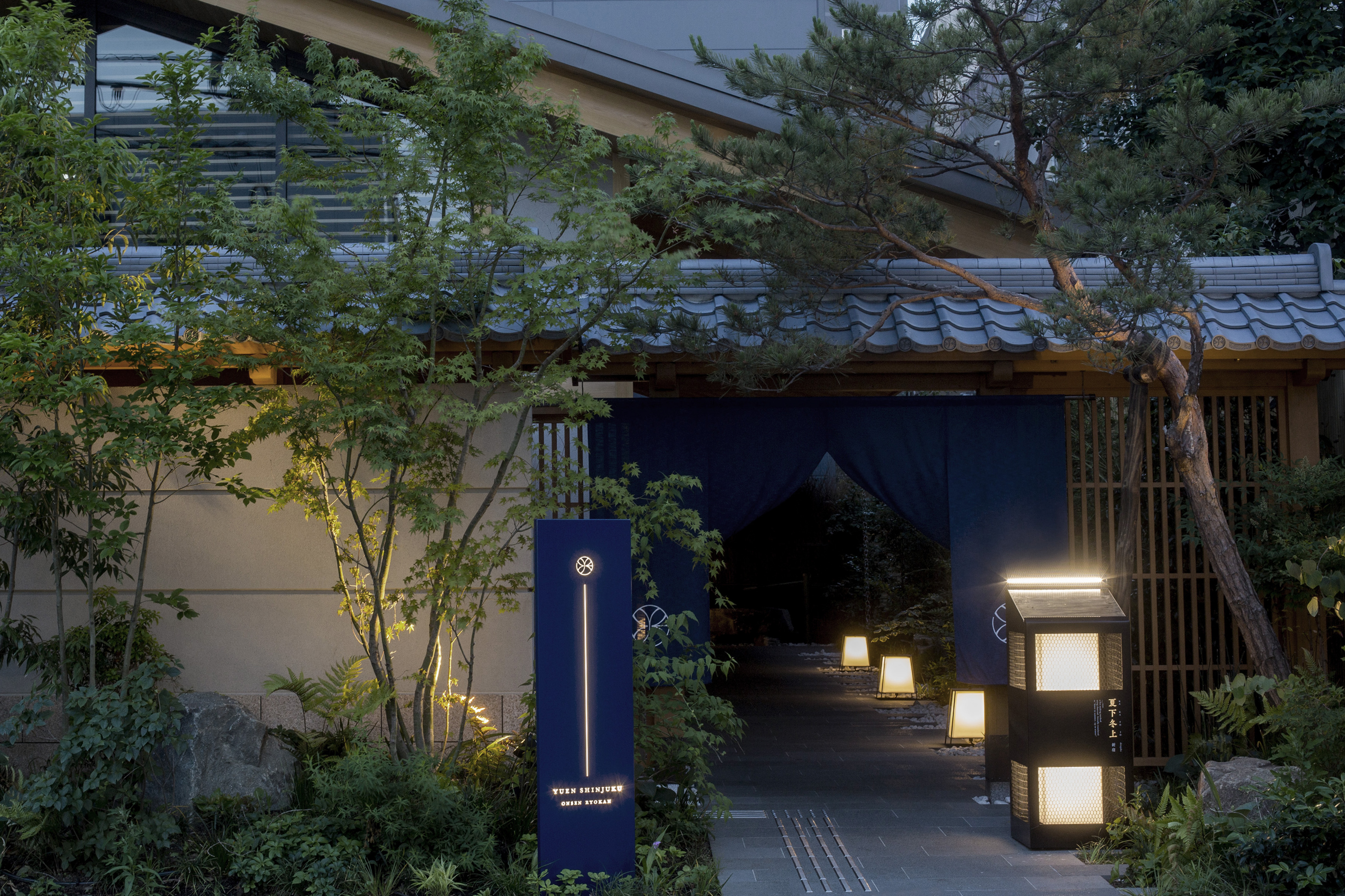
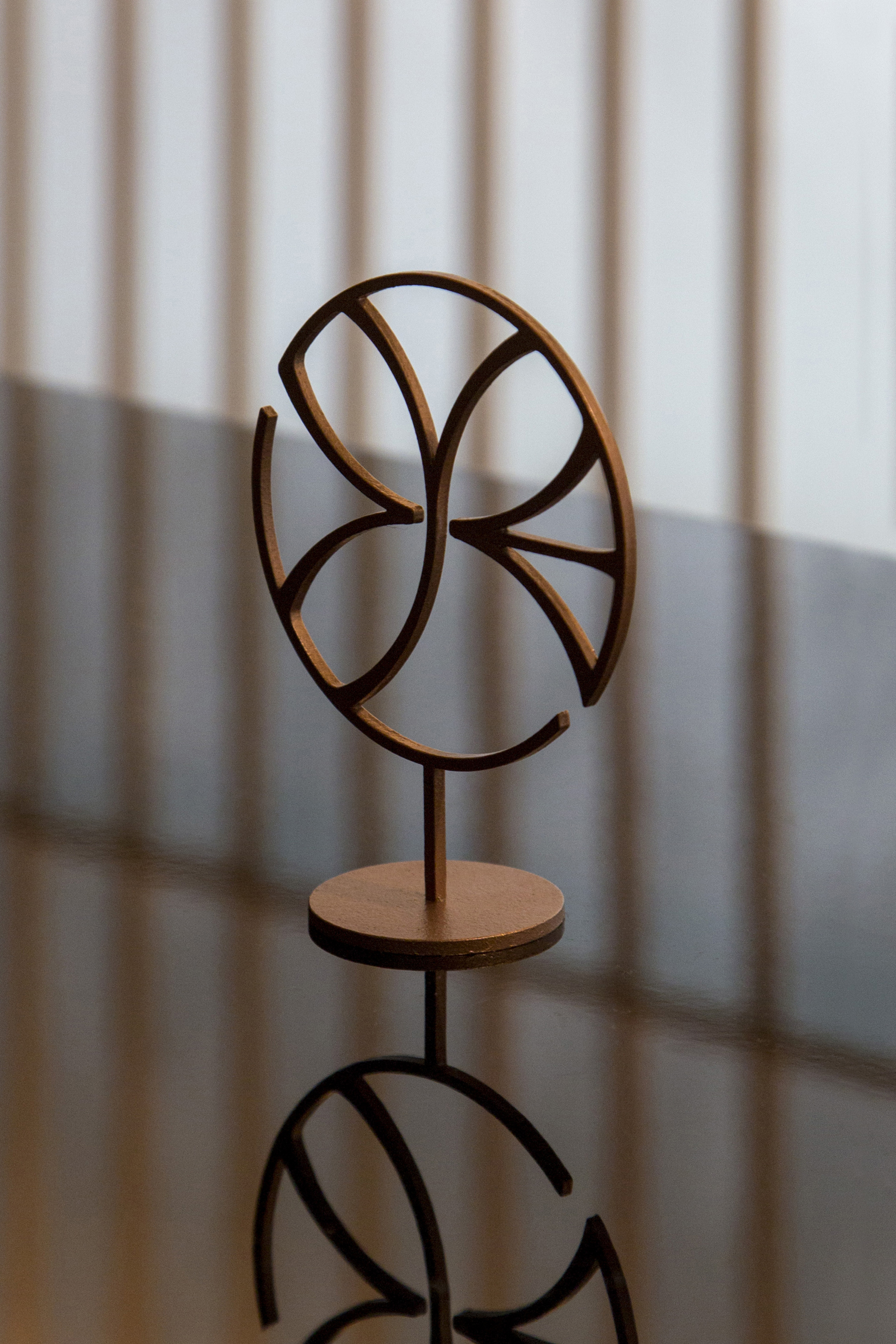
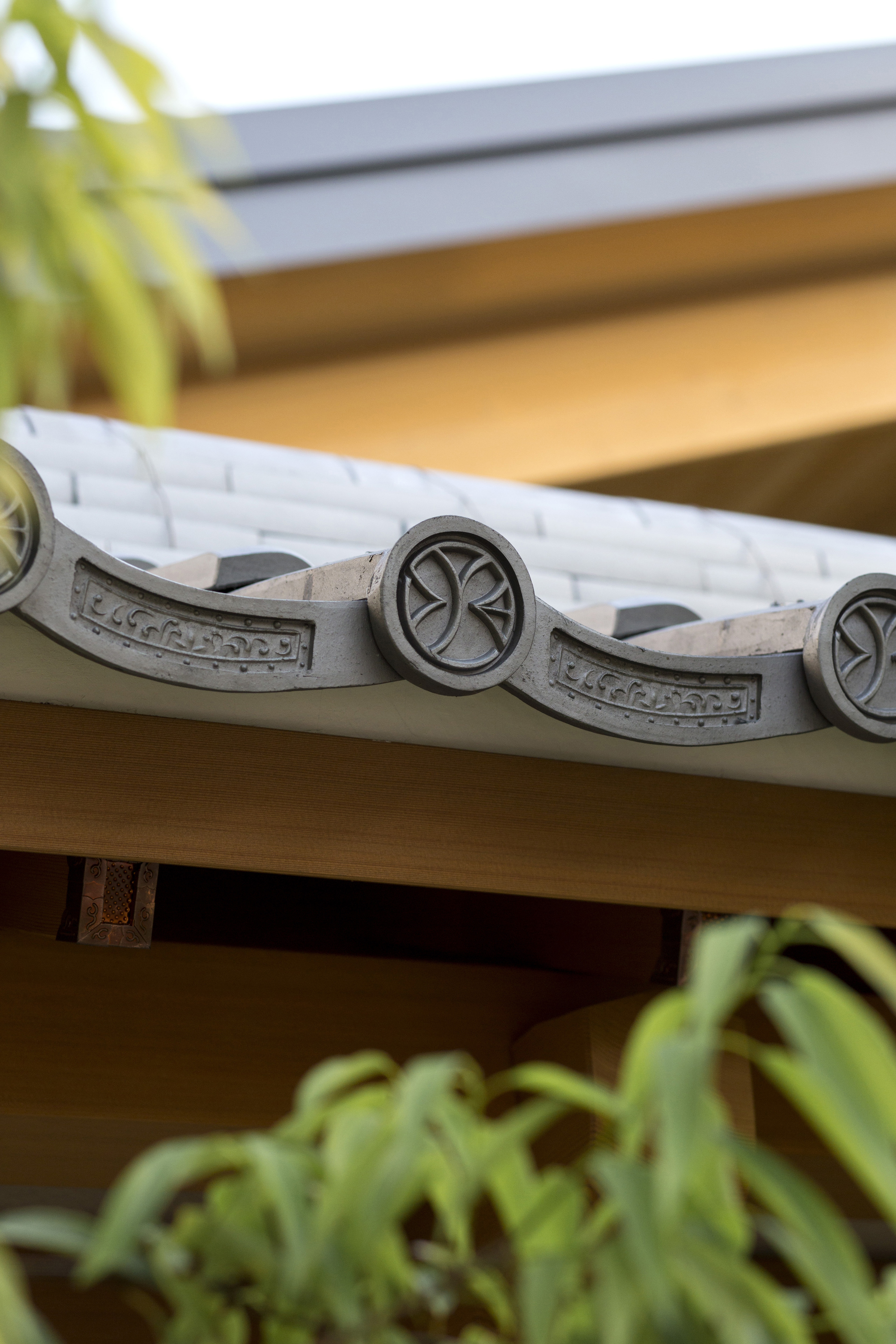
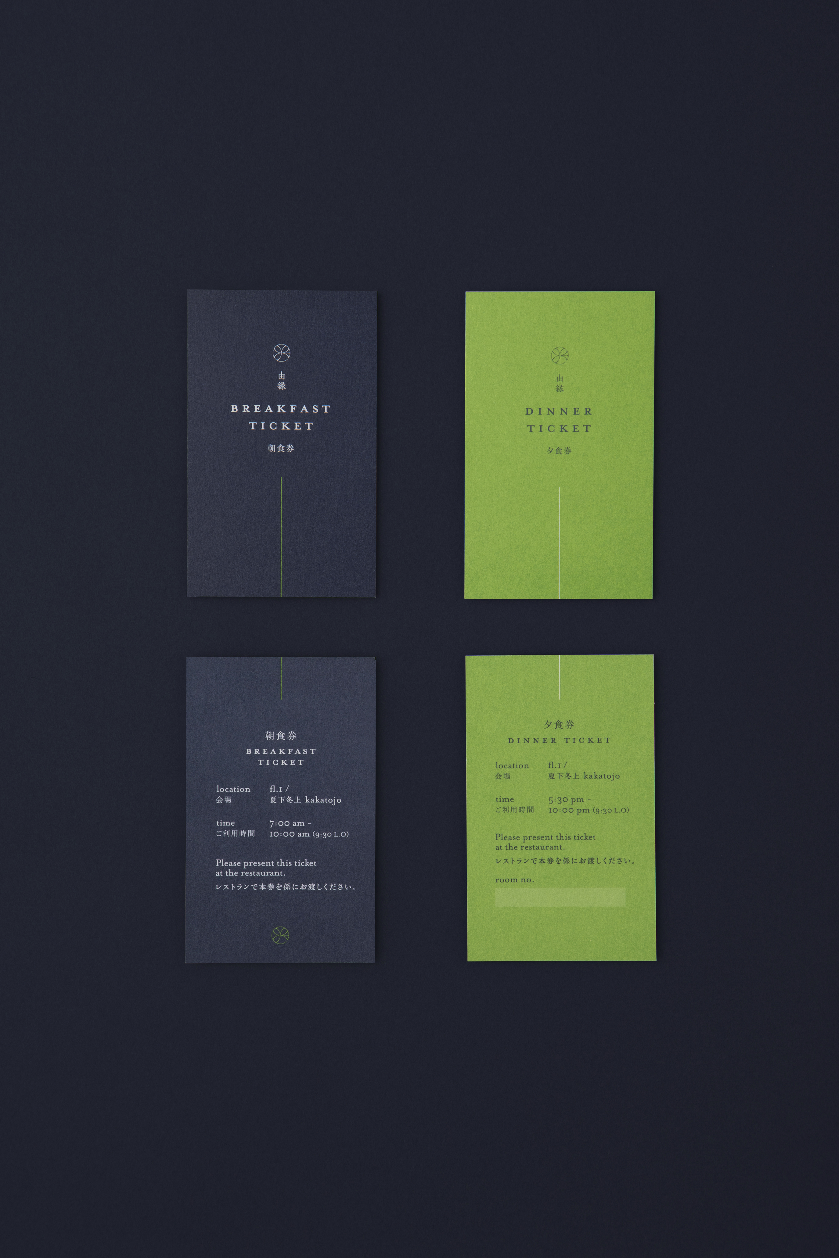
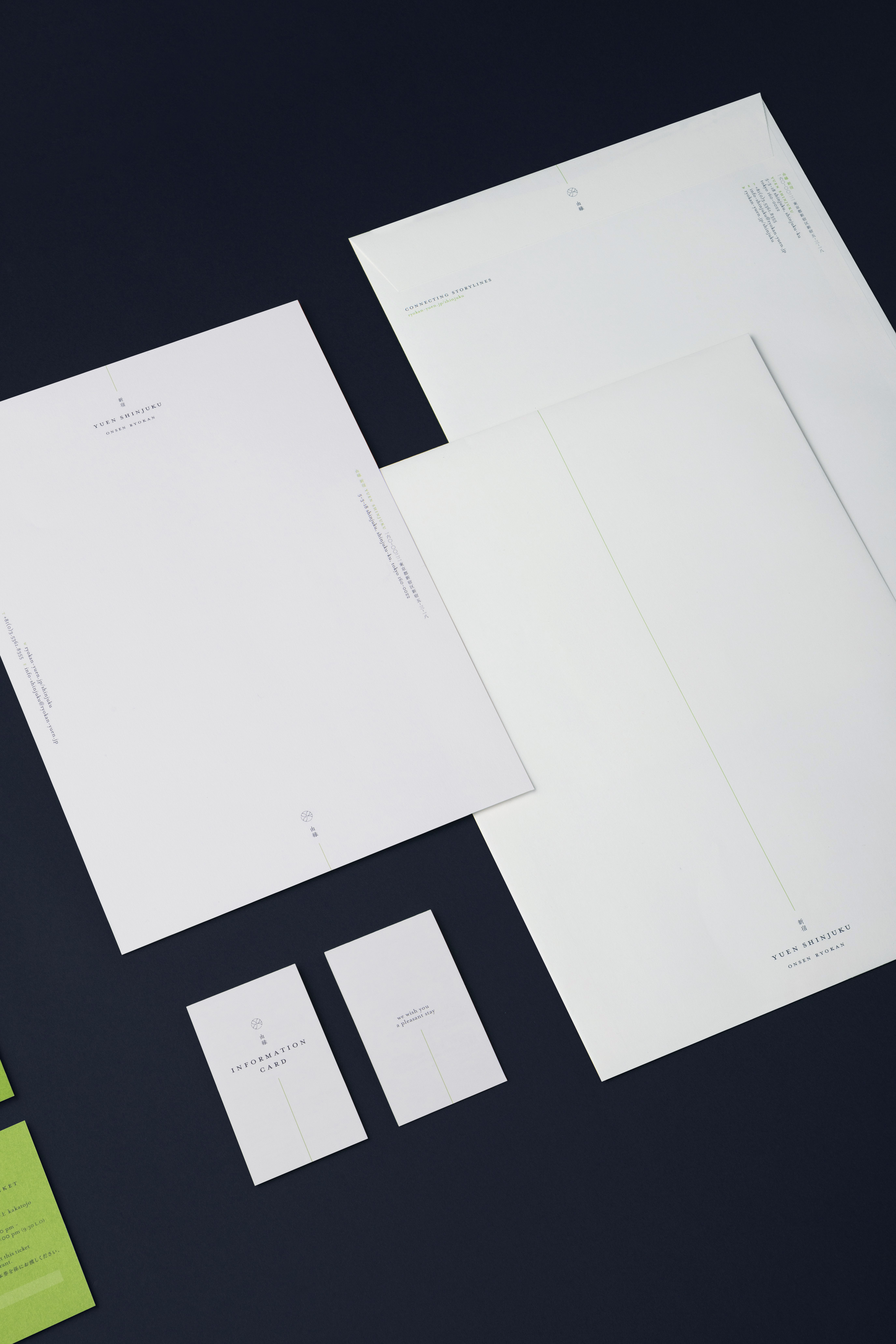
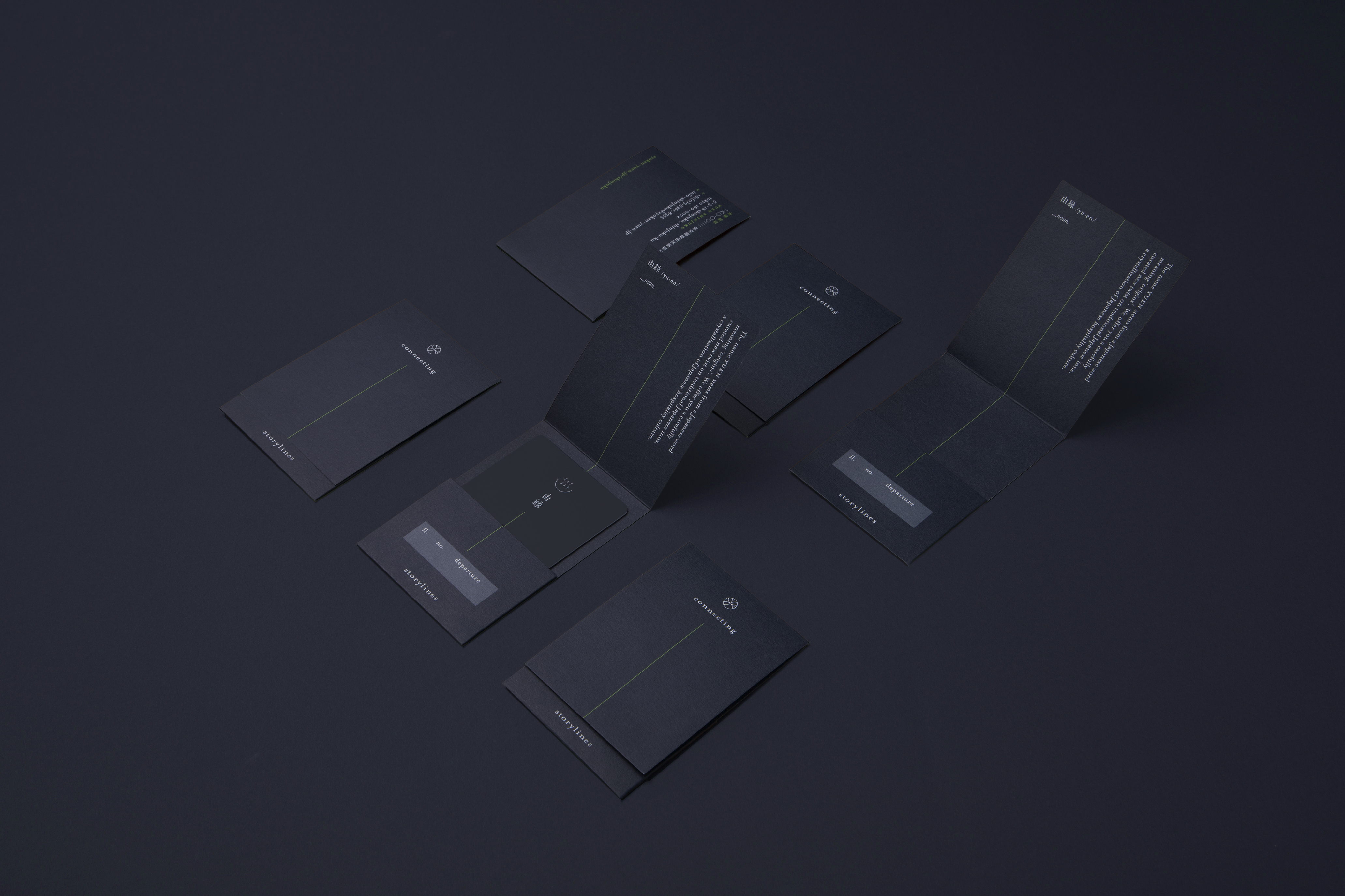
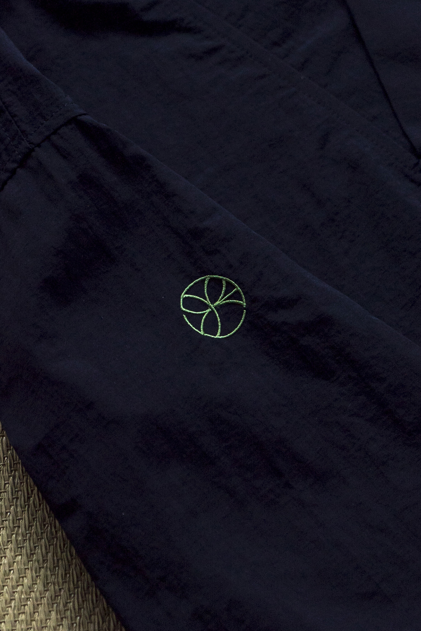
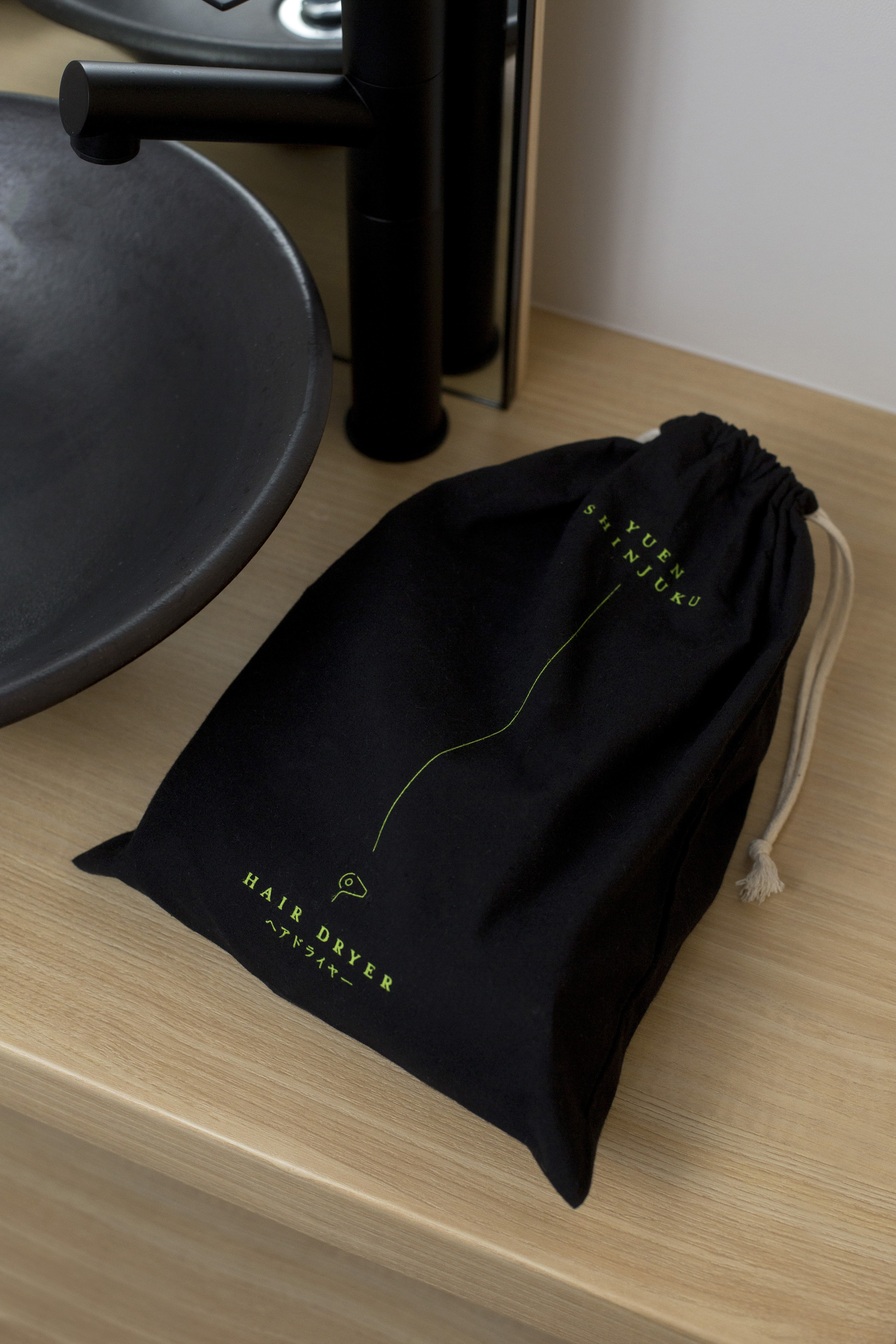
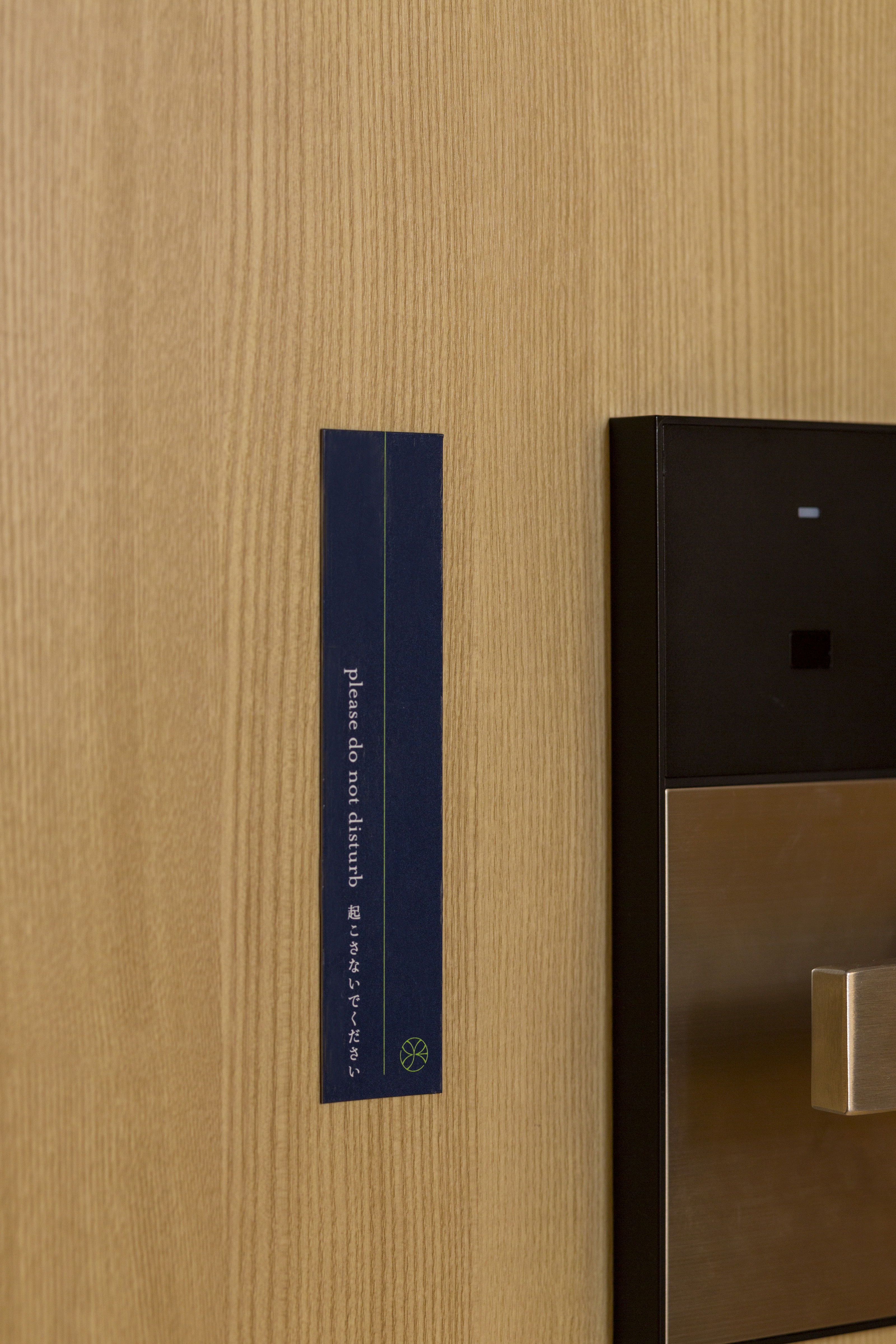
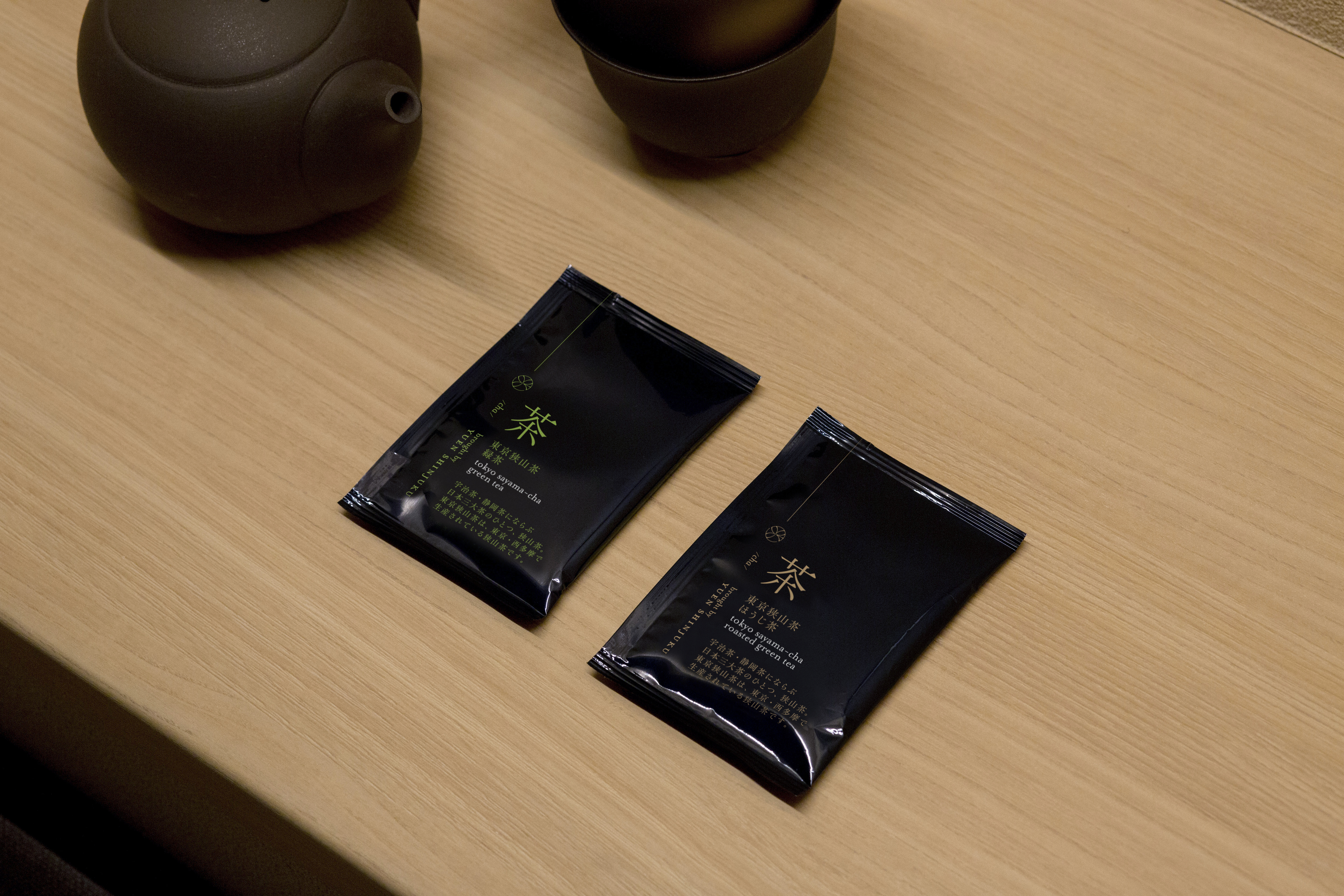
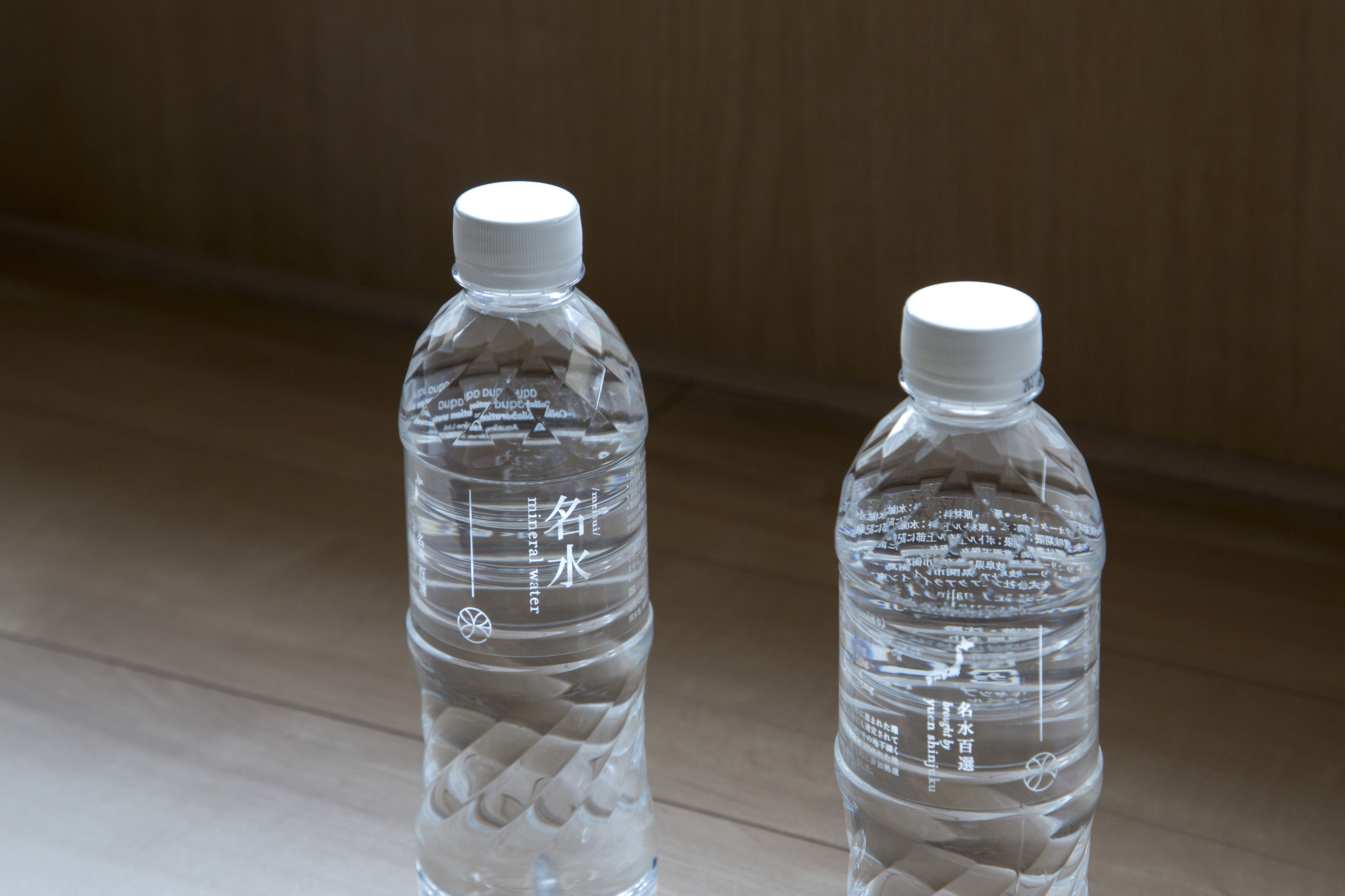
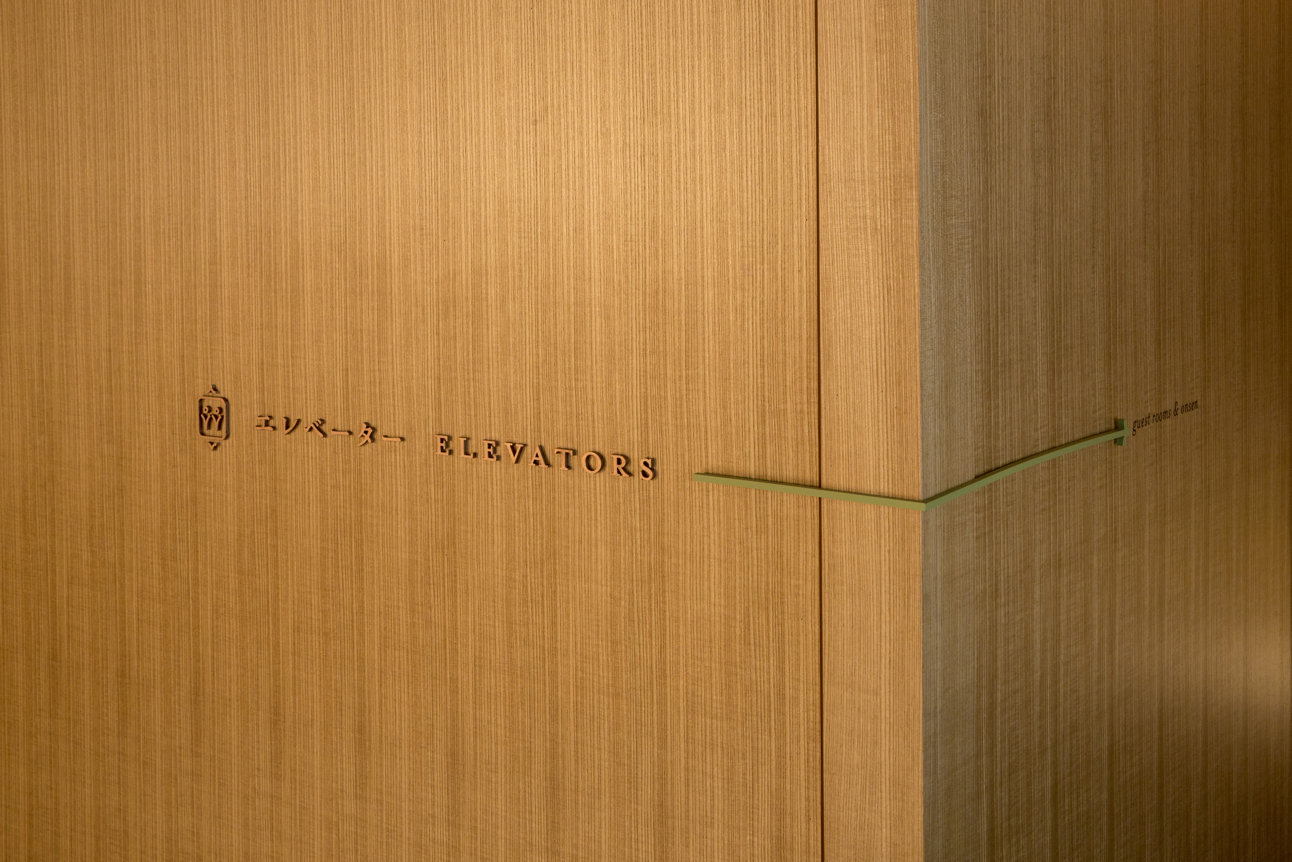
Branding and wayfinding design for Yuen Shinjuku which is a ryokan, a Japanese style boutique hotel, in the heart of Shinjuku, Japan. The logomark is a result of combined inspirations from kamon, Japanese family emblems, as well as Latin alphabet monograms spelling Y-U-E-N.
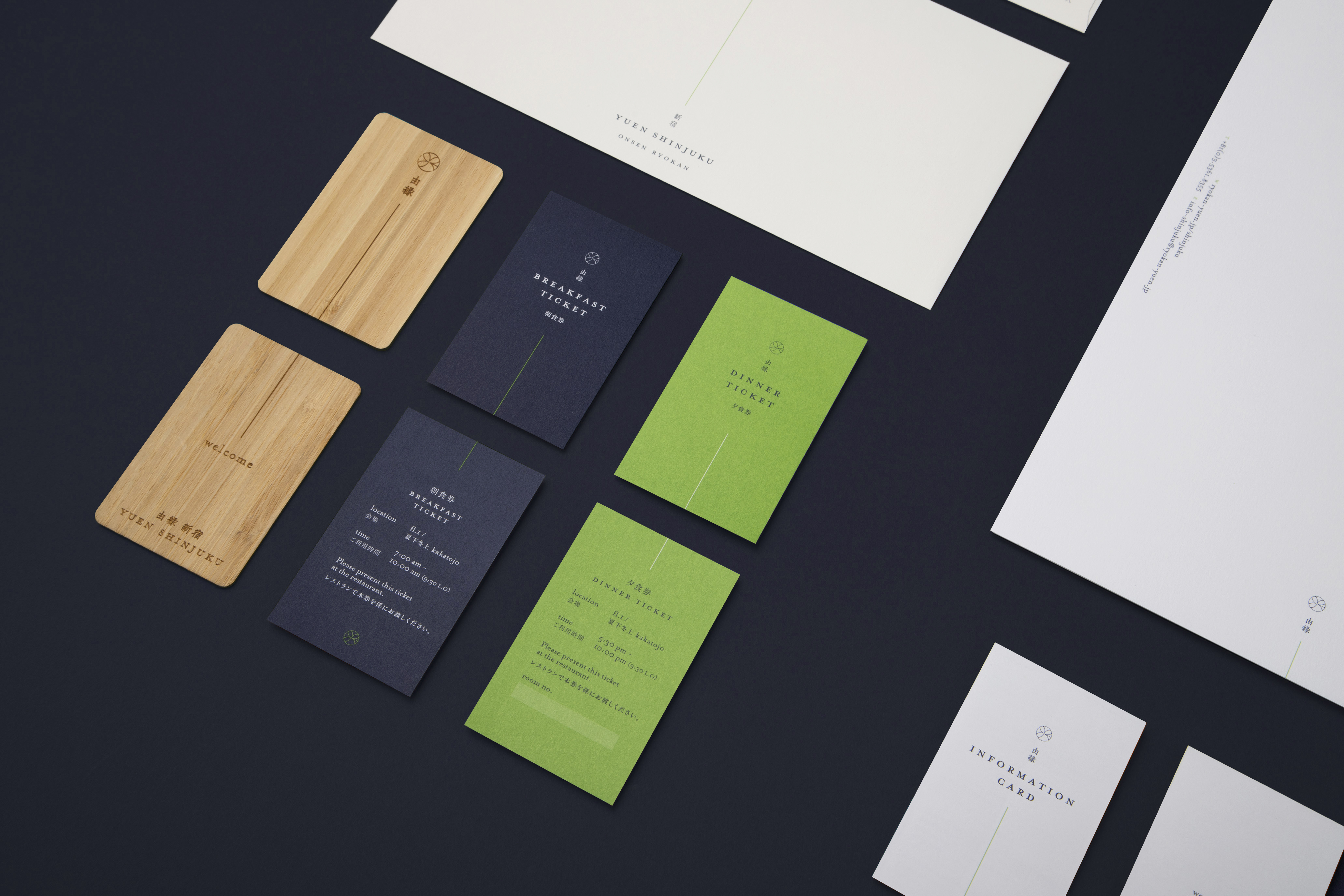
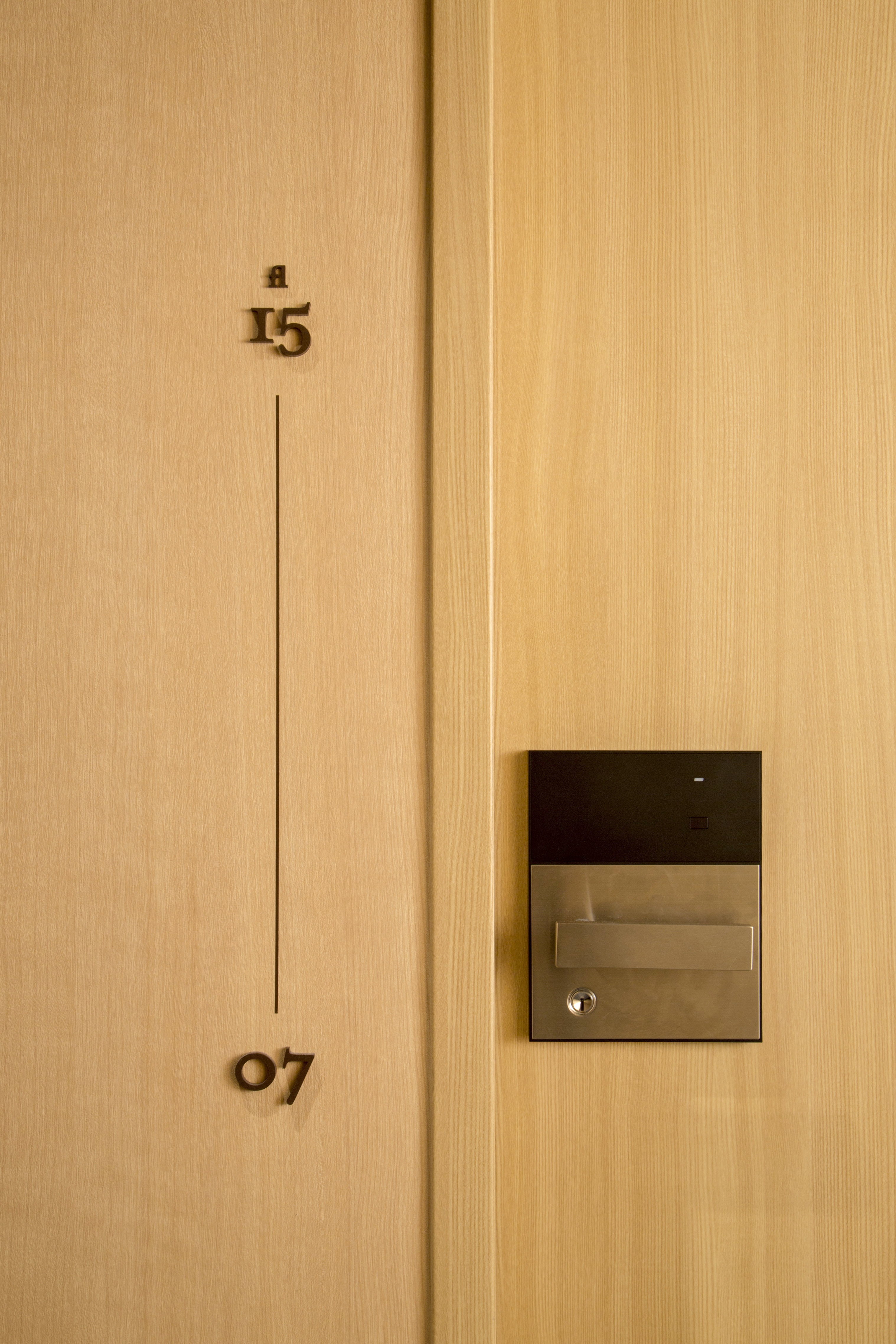
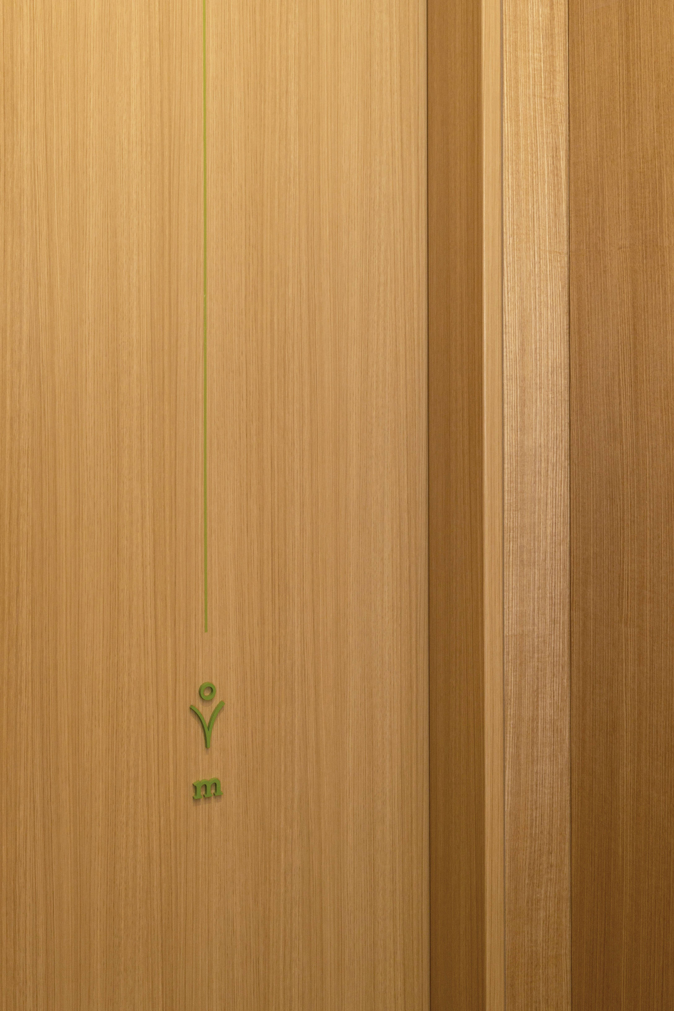
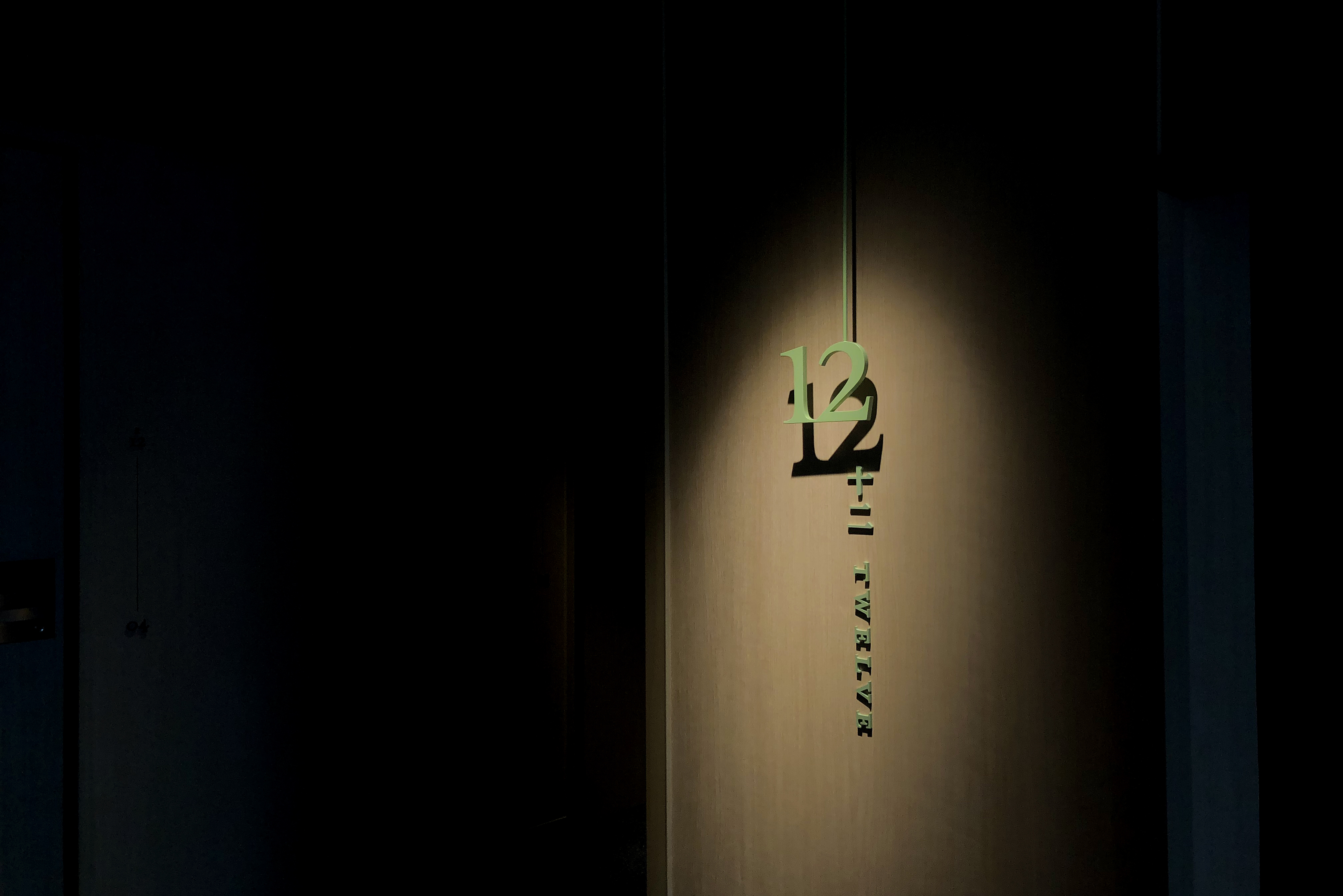
The stationeries, amenities and sign designs are integrated with the vertical line that is also present in the logo. The line represents yuen, meaning ‘link’ in Japanese. The hint of green colour in the hotel is inspired from Tatami greens, Japanese traditional floor covering, higher in vibrancy to suit the modern translation of Japanese inn.


wayfinding
www.ryokan-yuen.jp
credits
creative direction: shun kawakami, artless Inc.
interior design: UDS Ltd.
graphic design: koyuki inagaki
assistant design: kanako ueno, qiwen cao
project management: satoko tanaka
photography: yuu kawakami
interior design: UDS Ltd.
graphic design: koyuki inagaki
assistant design: kanako ueno, qiwen cao
project management: satoko tanaka
photography: yuu kawakami