branding, wayfinding
Mist Hotels
~
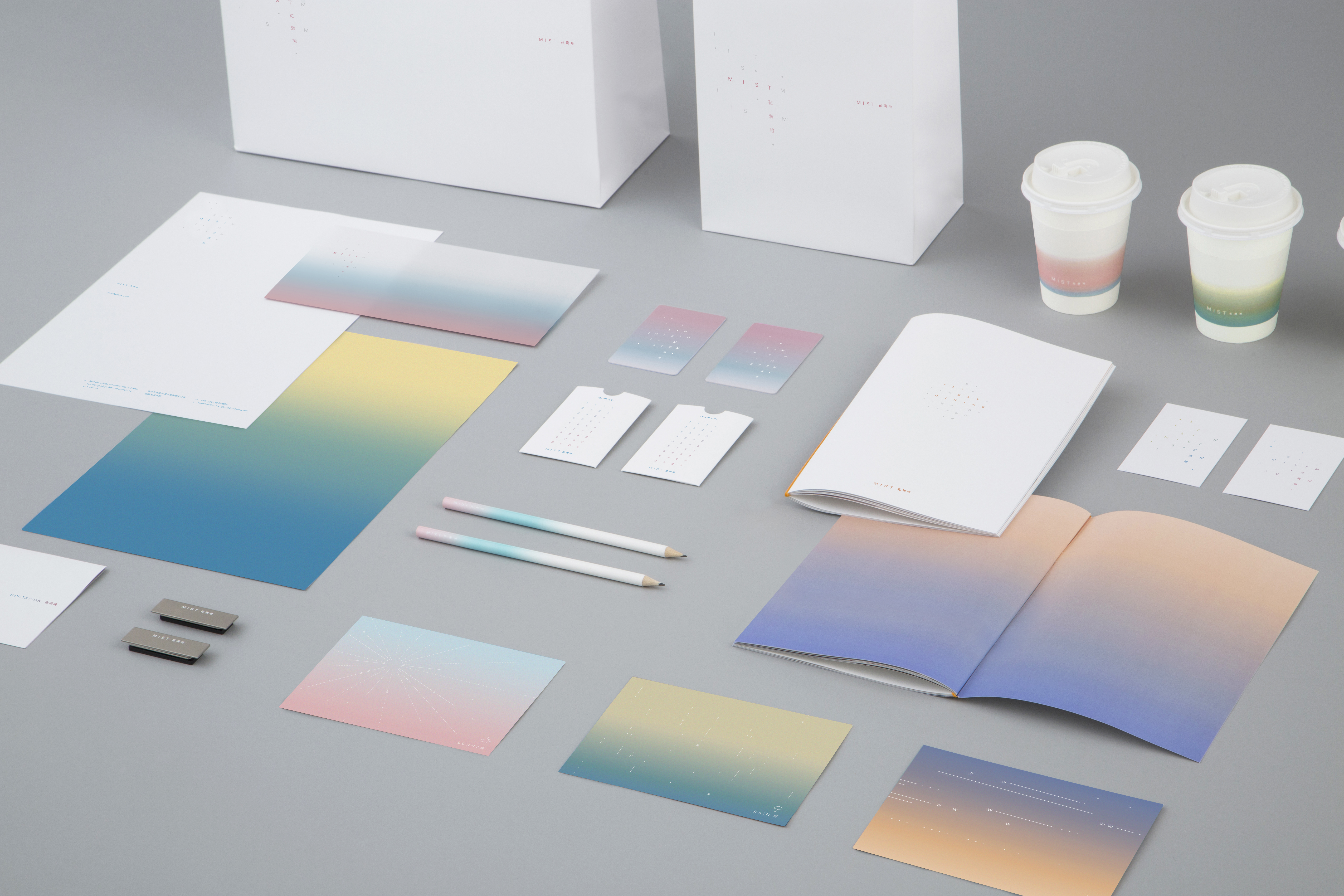
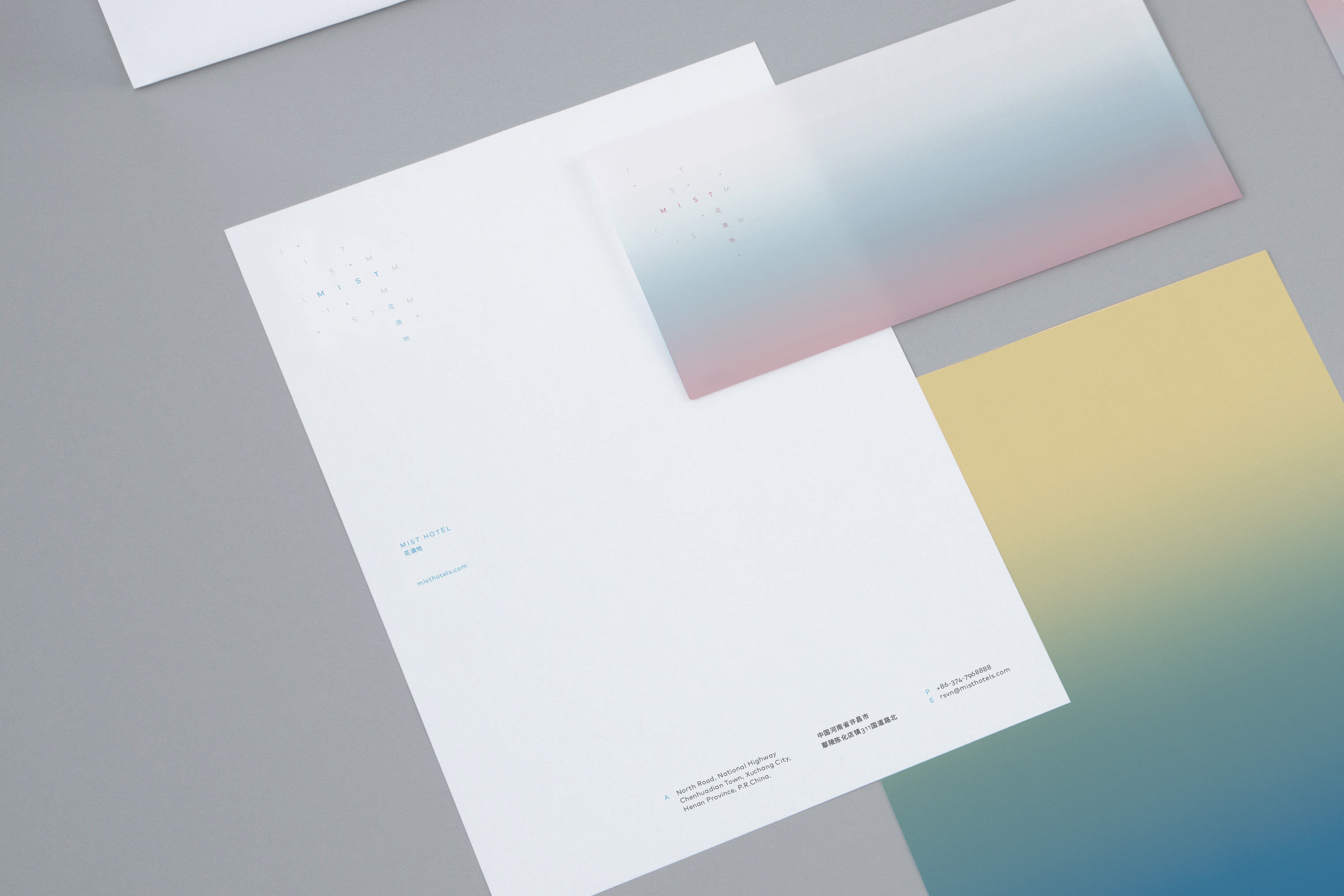
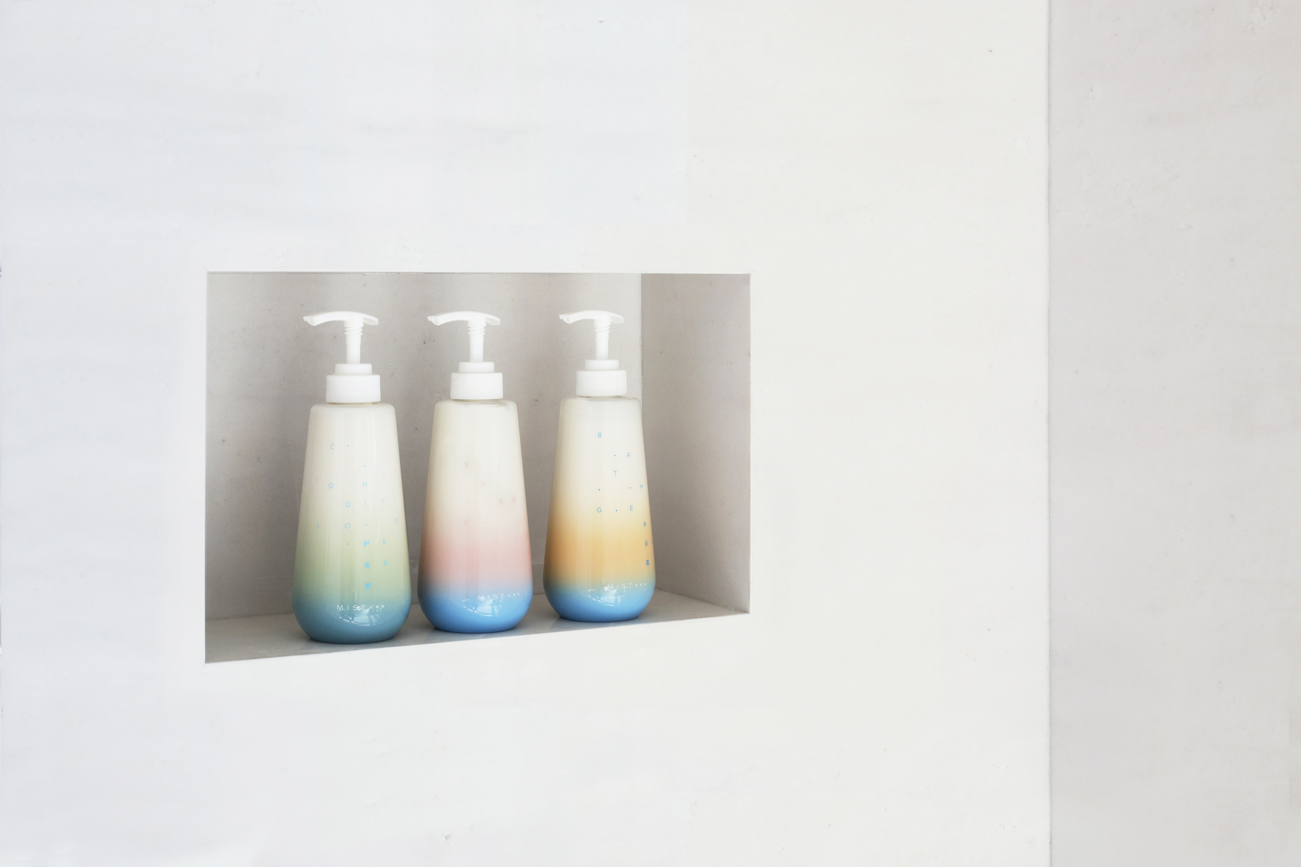
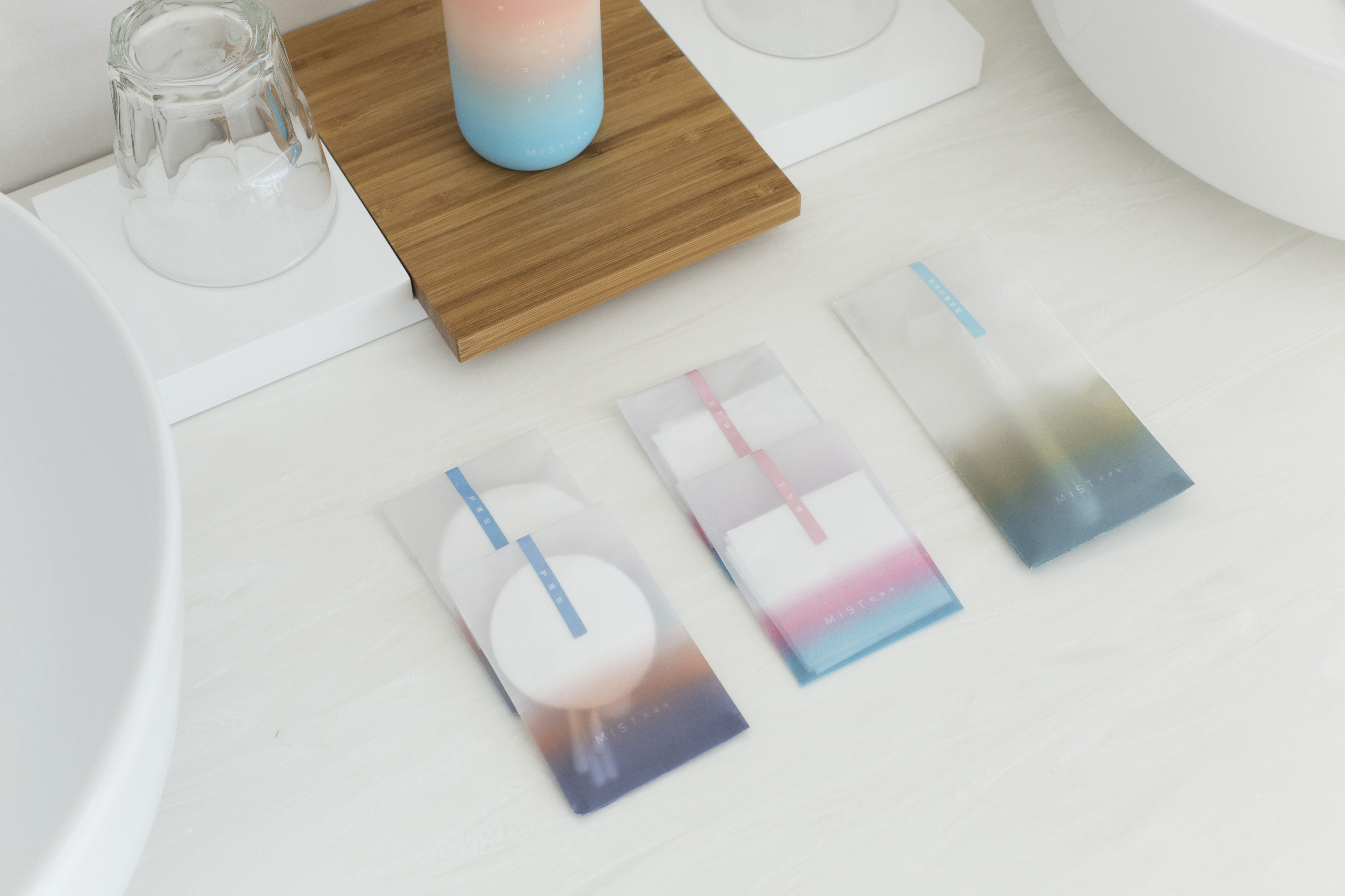
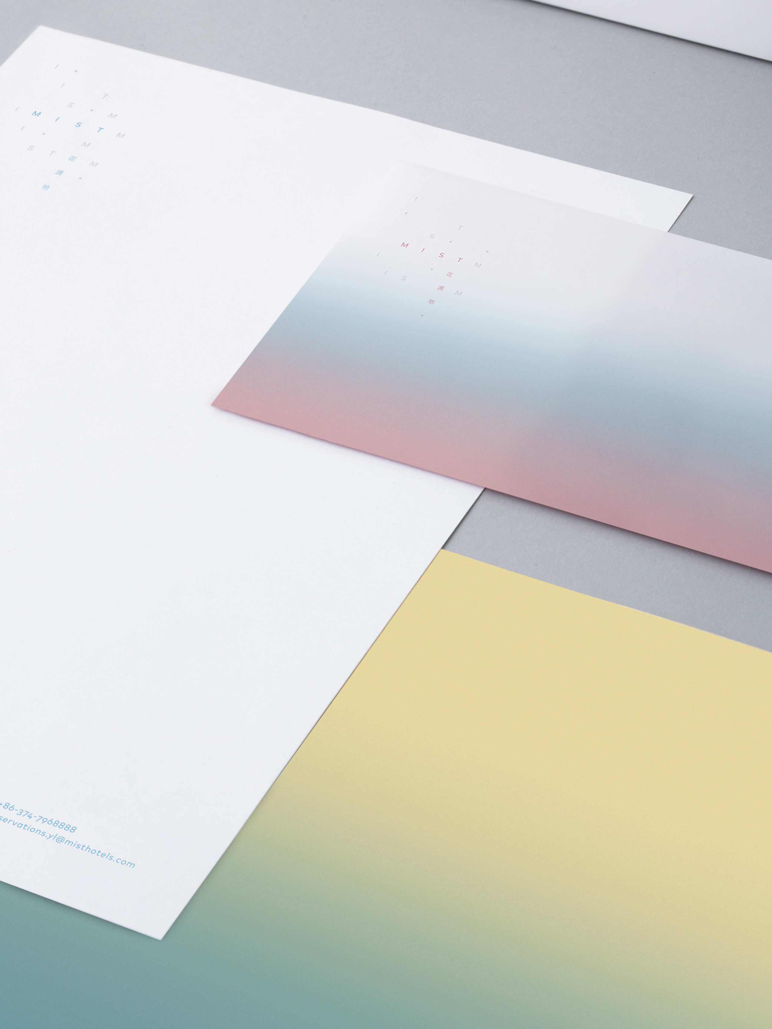
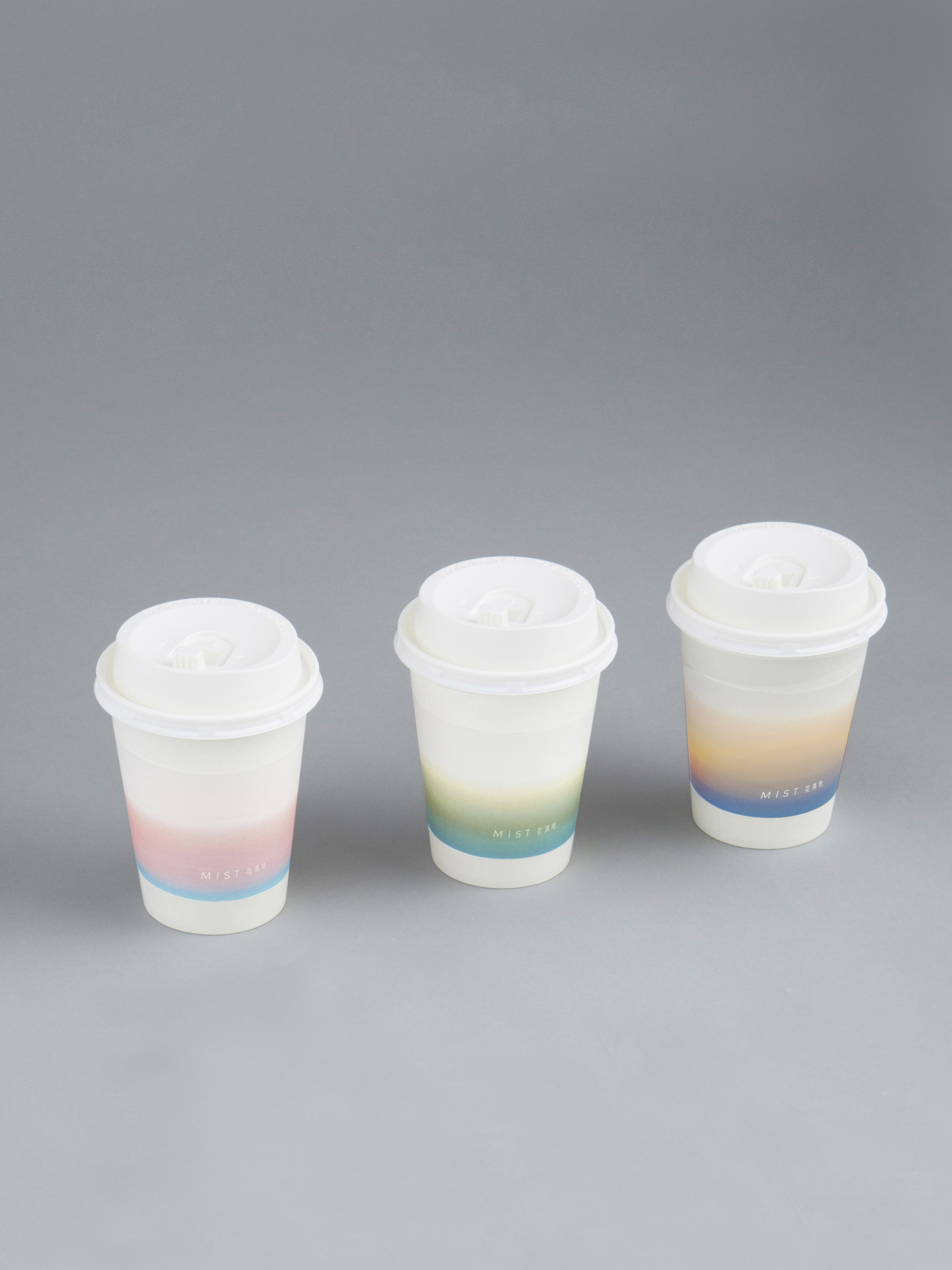
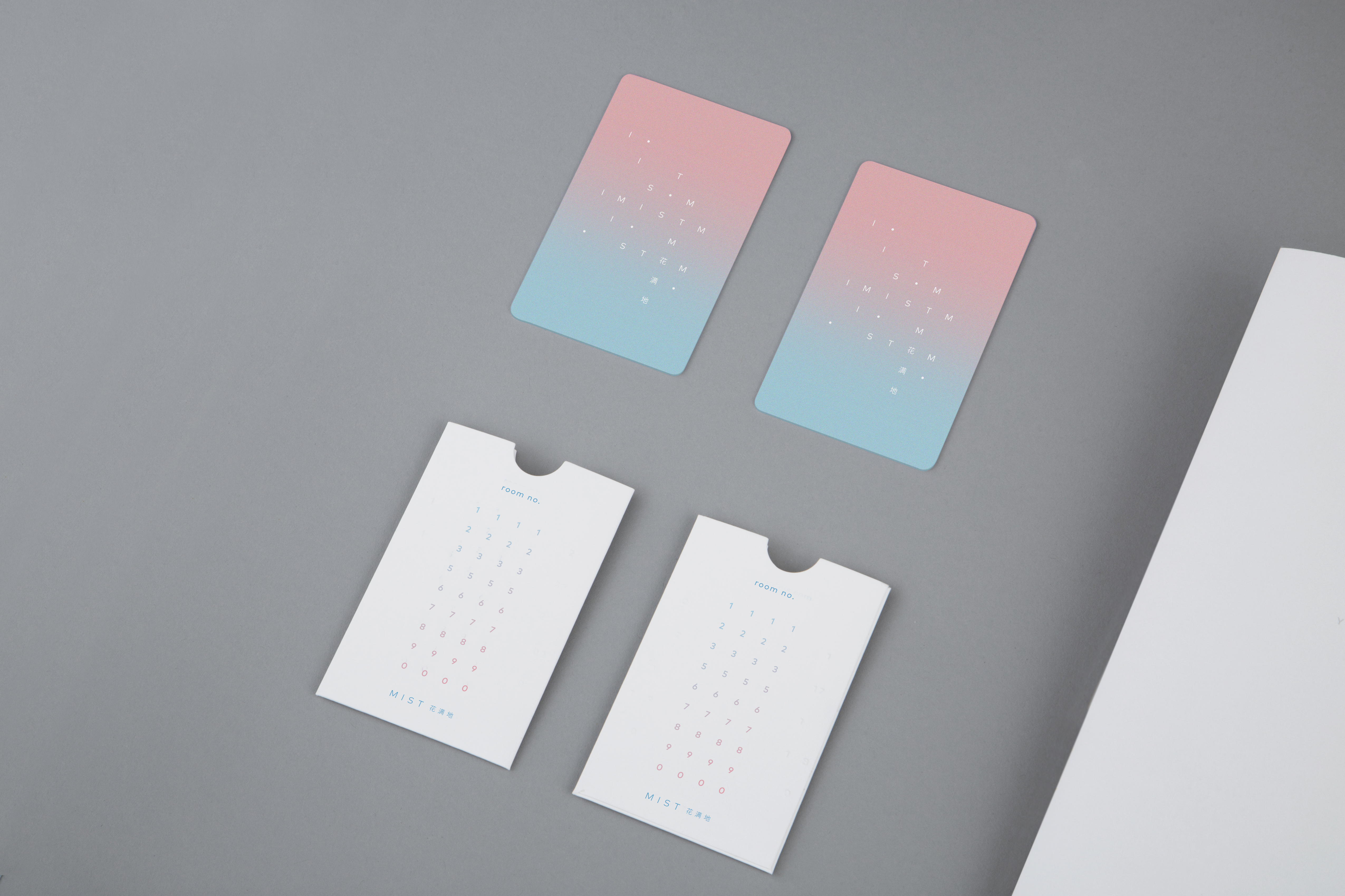
Branding & identity design for MIST Hotels, a luxury design hotel in Henan Province, China. The shape of the logotype depicts the outline of the hotel seen from the above, and the floating letters are designed to represent ‘mist’; water droplets suspended in the atmosphere. The floating algorithm of the logotype appears throughout the guests’ experience in the hotel—from the wayfinding signs, restaurant logo to hotel amenities.
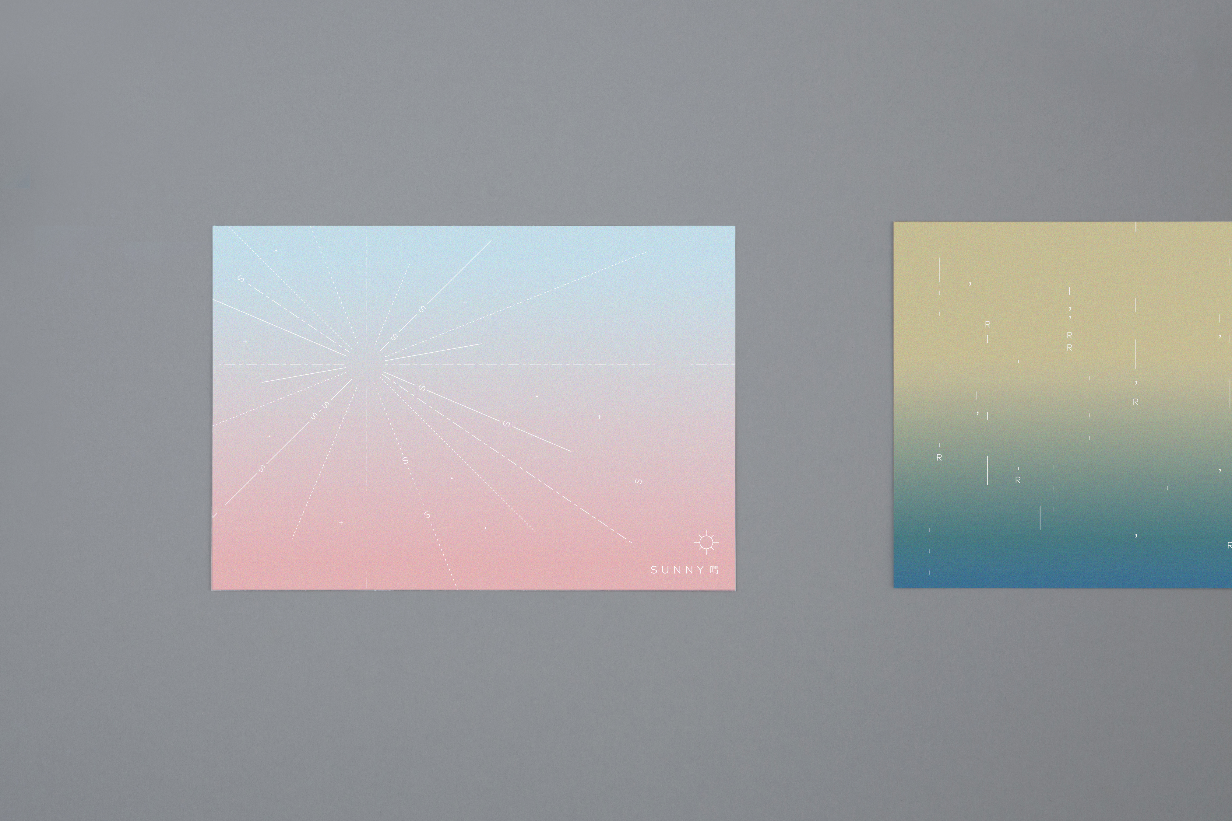
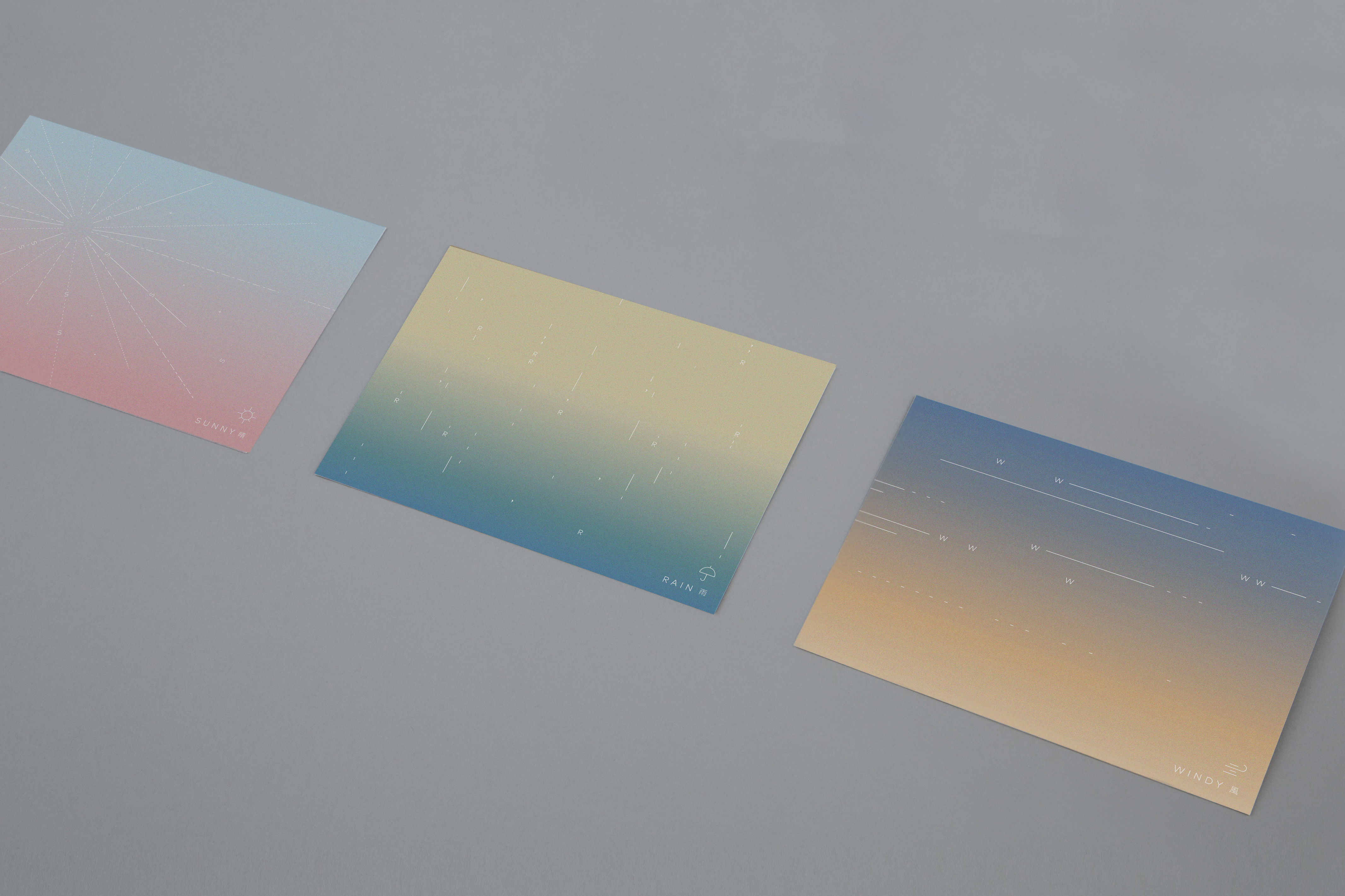
The branding aims to achieve integrity with the architecture, designed by Department of Architecture from Bangkok. The colour palette is set from the colours of the sky, from which the architecture draws its inspiration as well.

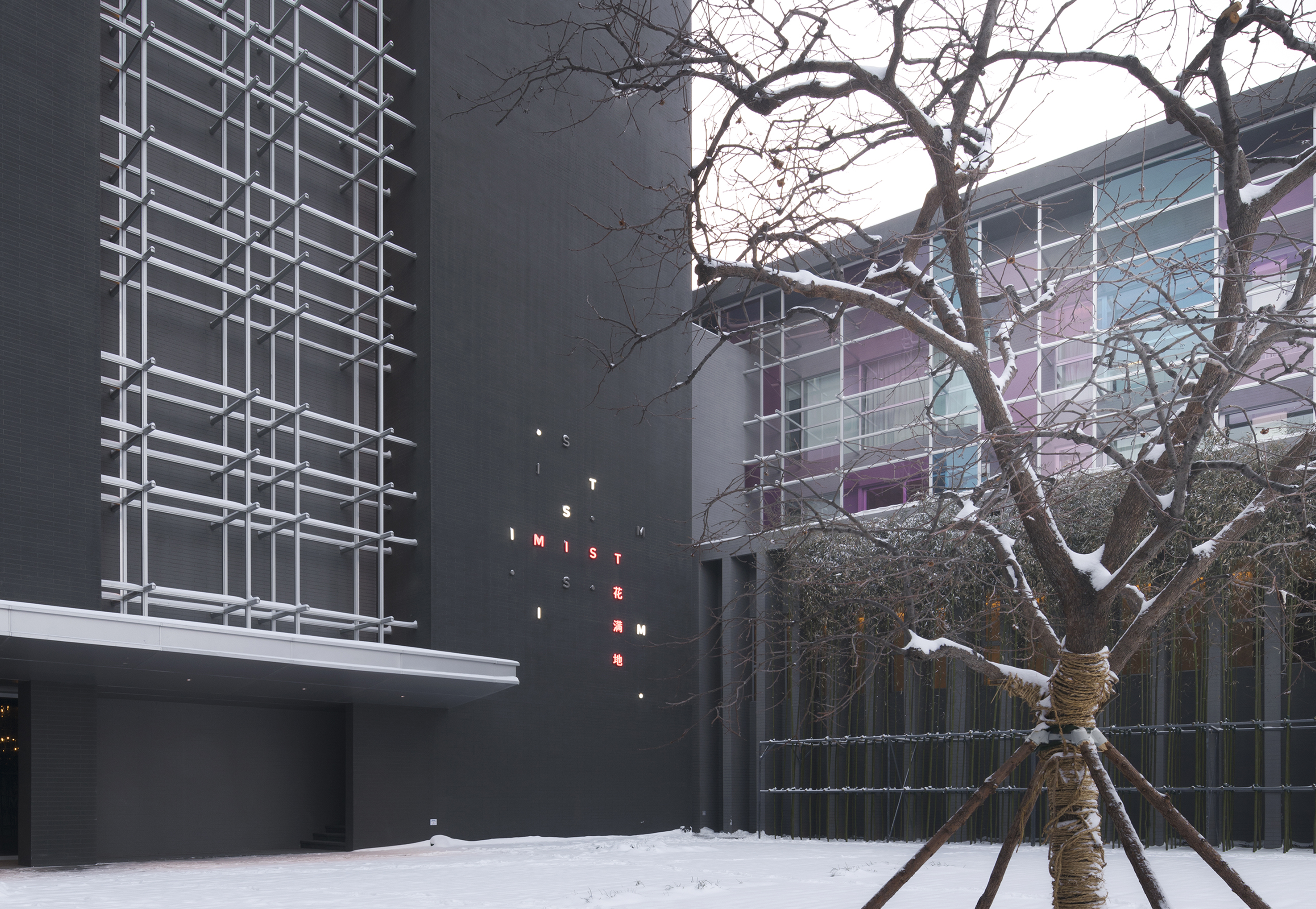

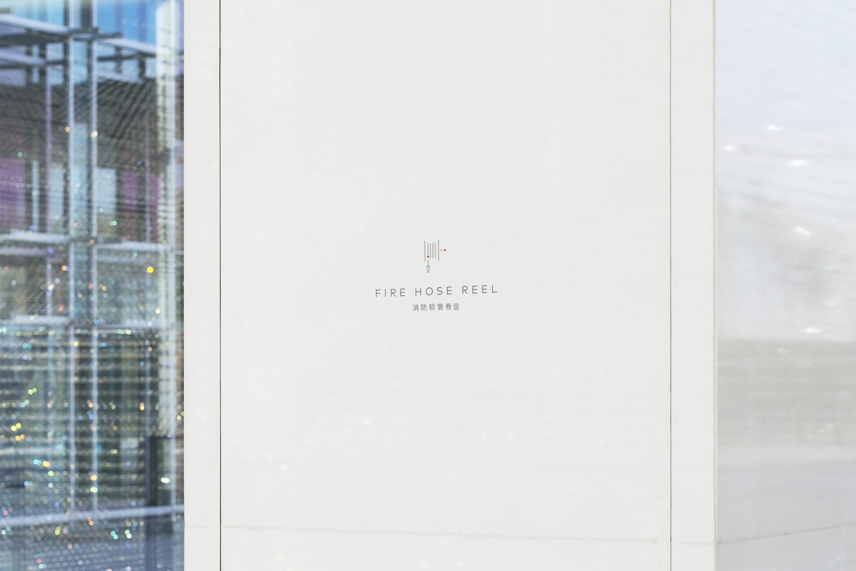
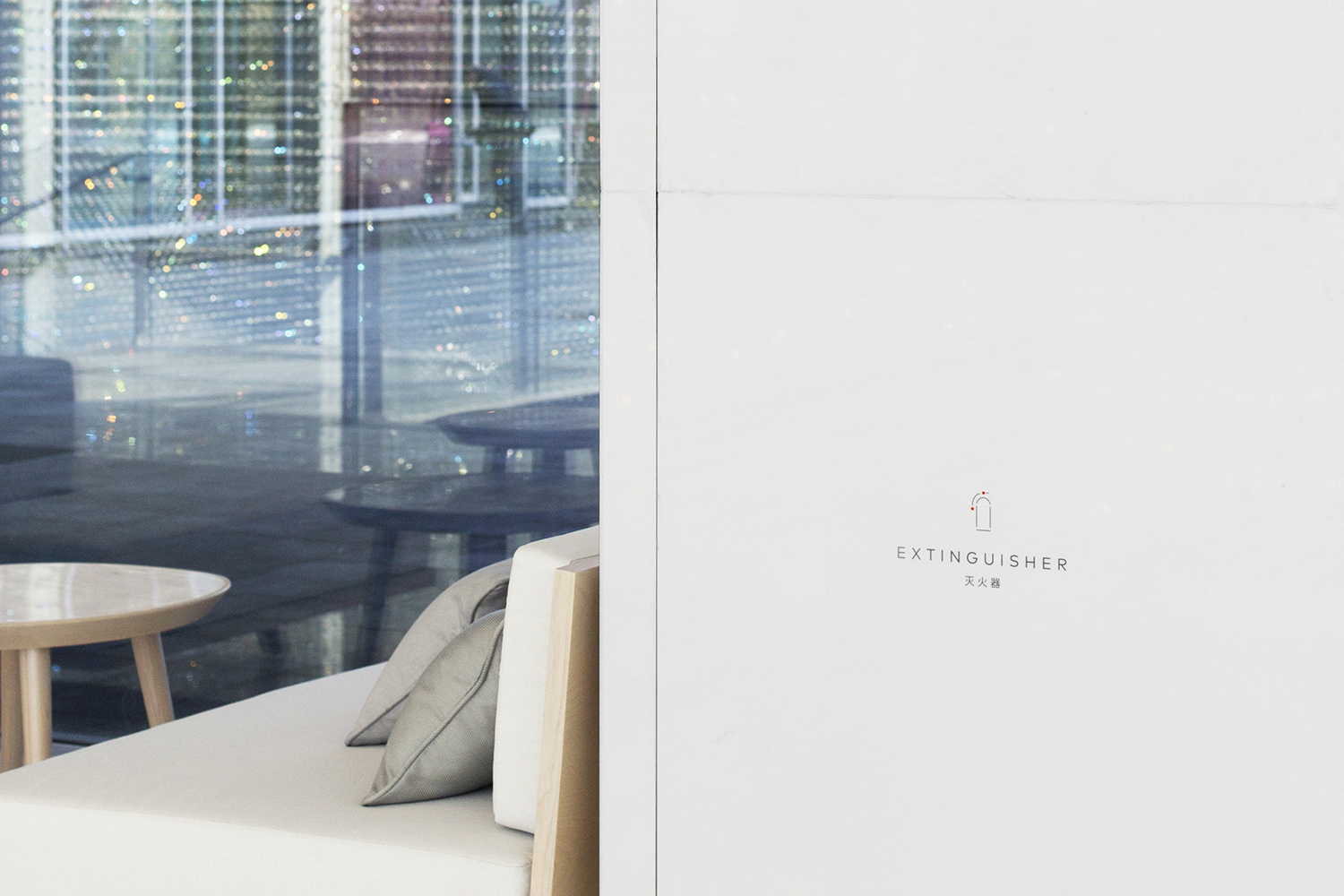
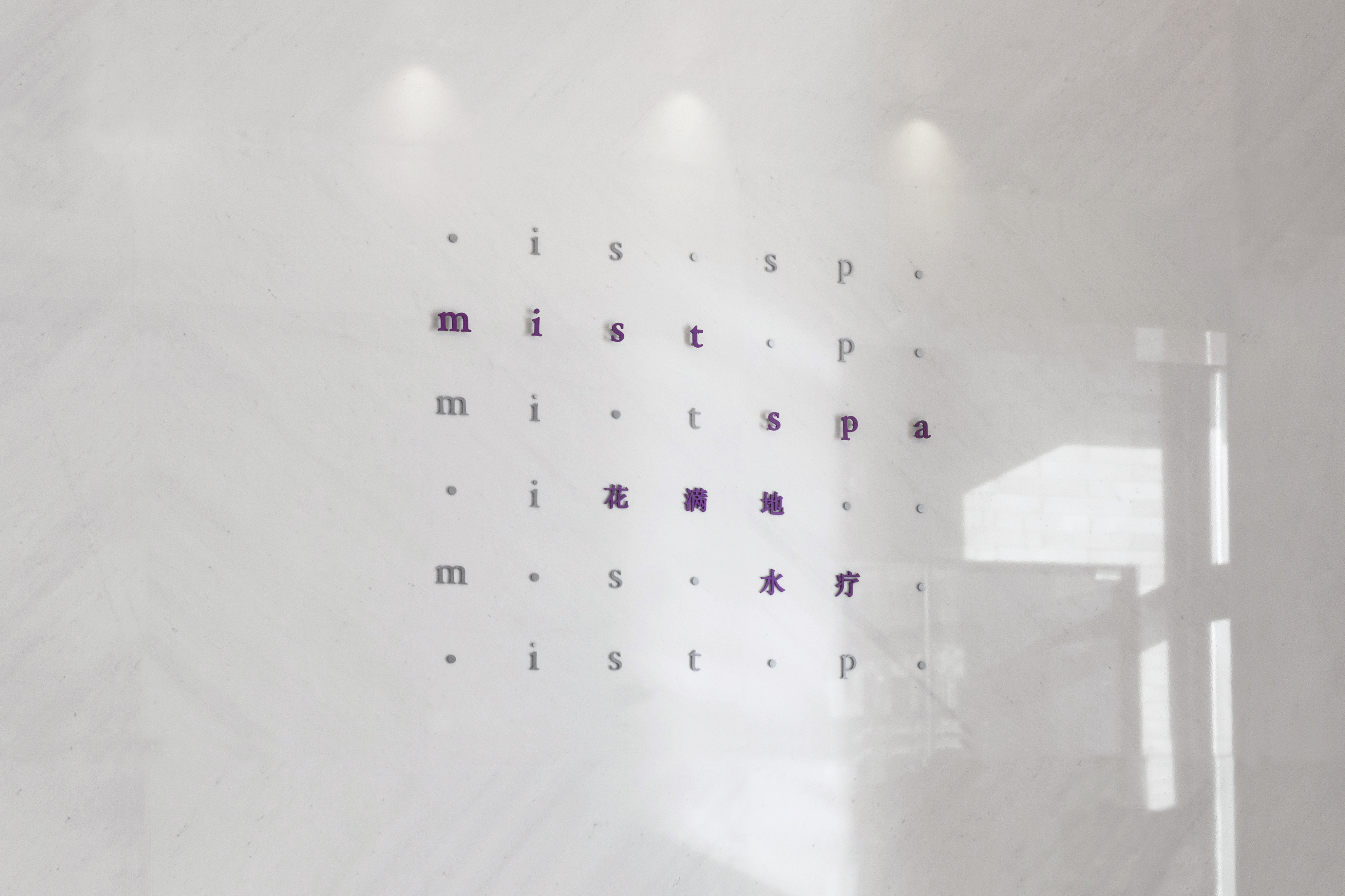
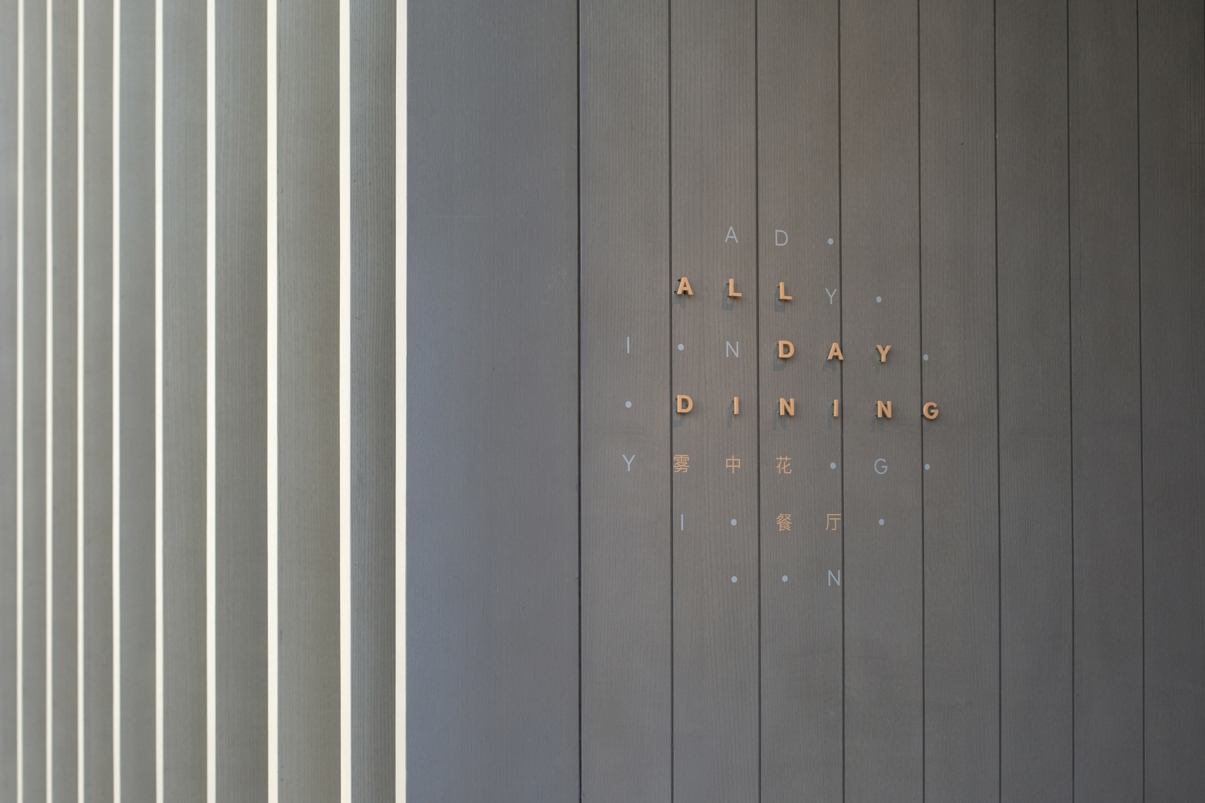
The sign system is developed from the algorithm of the logo.
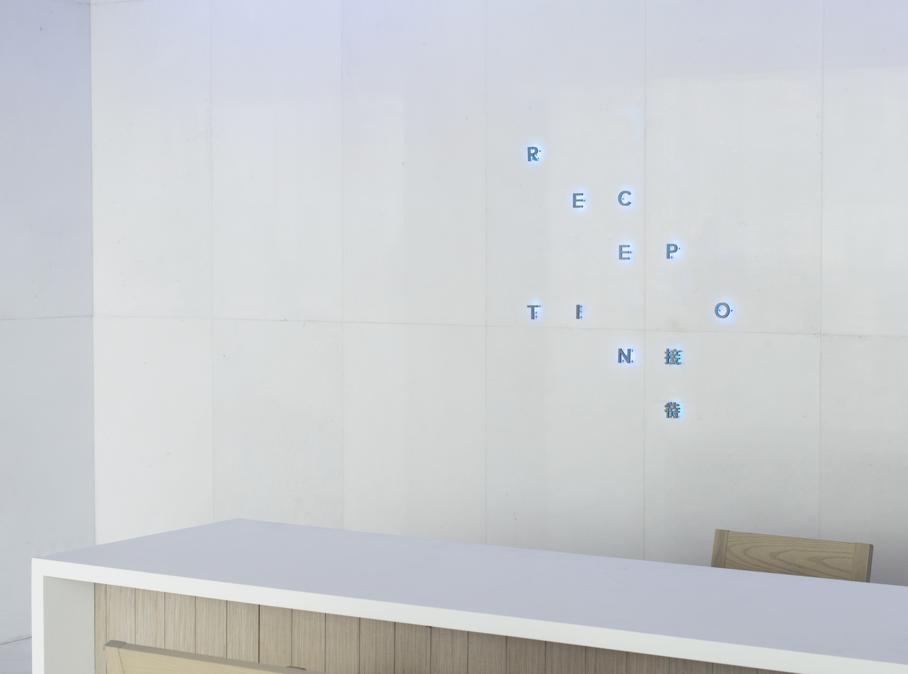
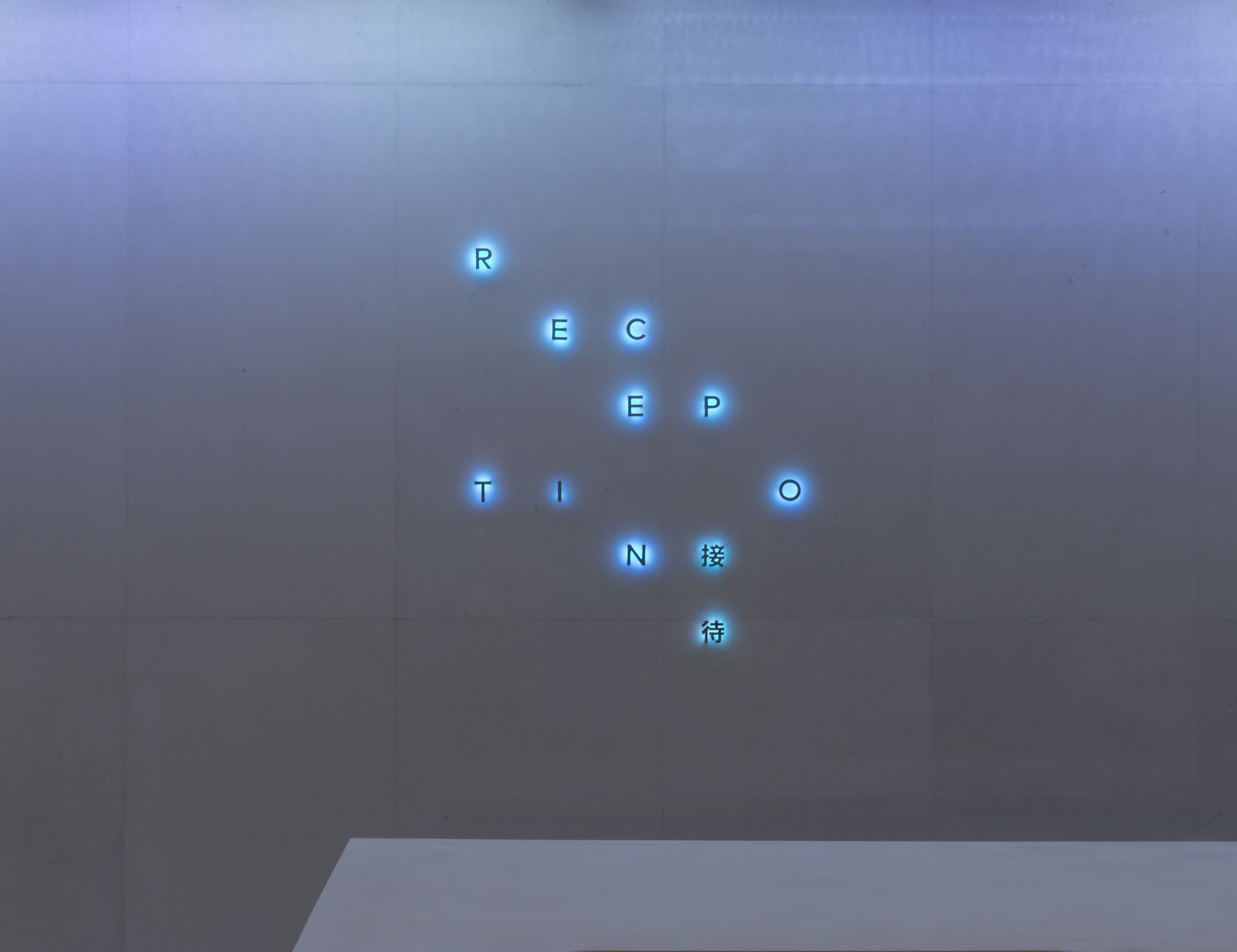
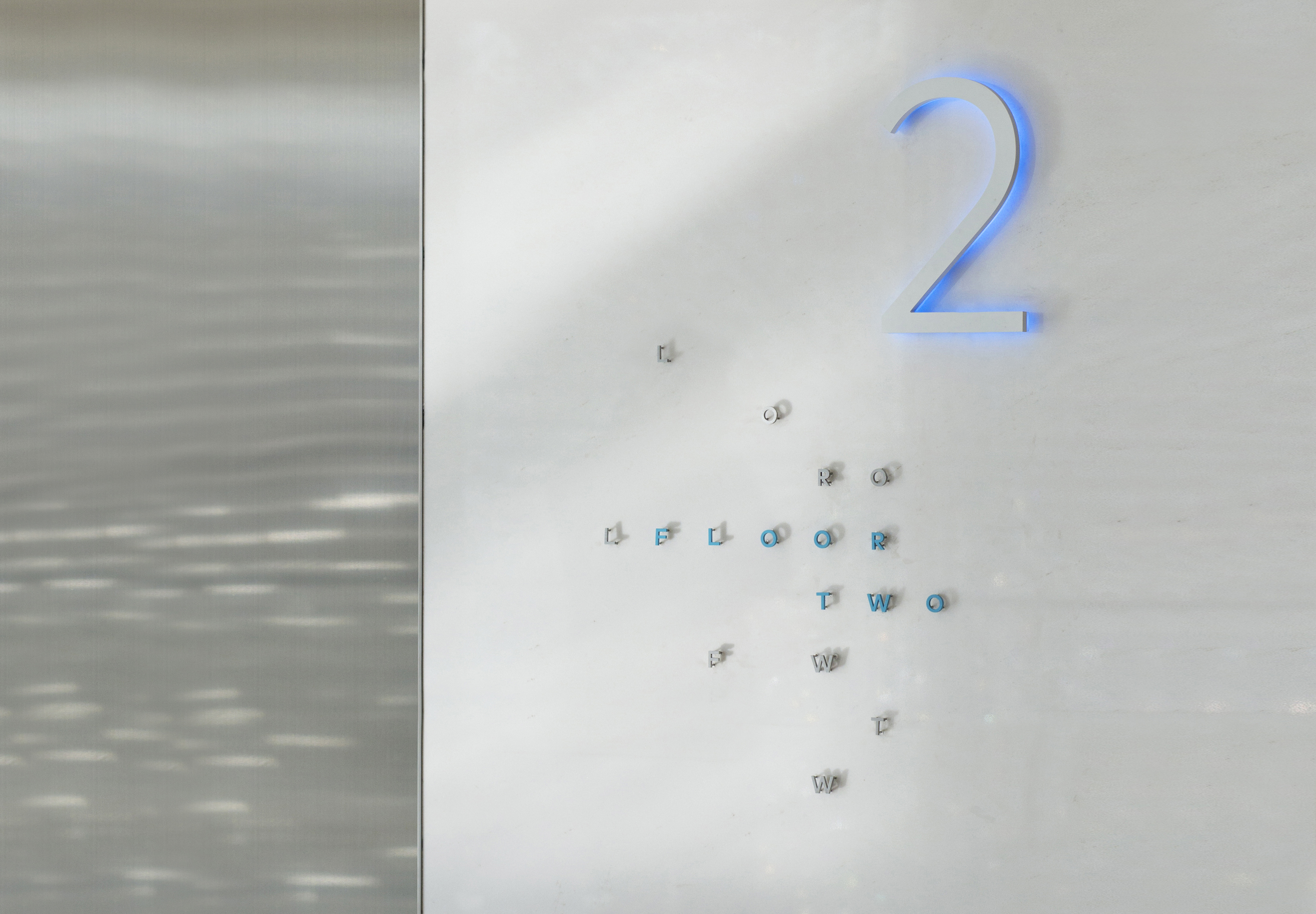
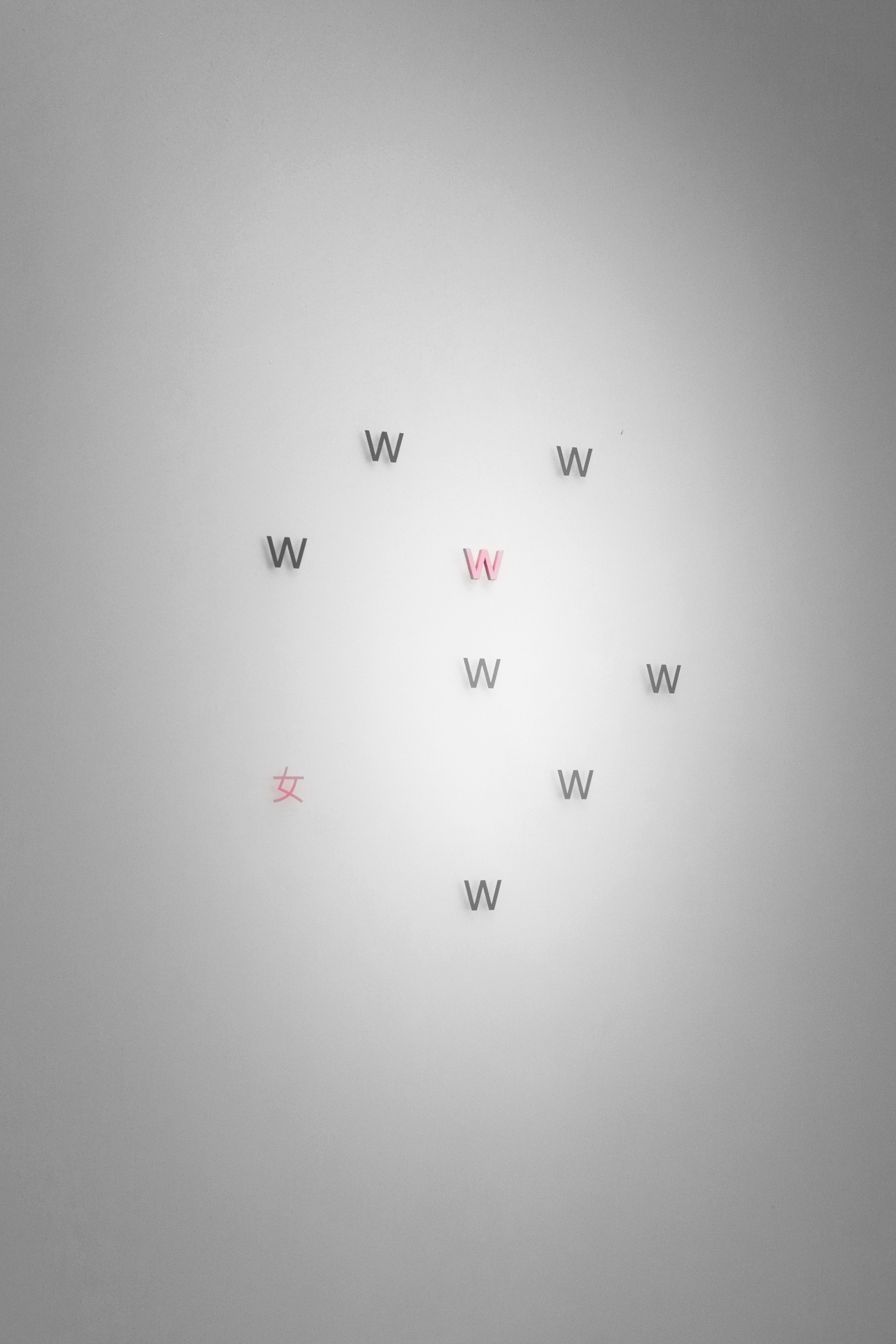
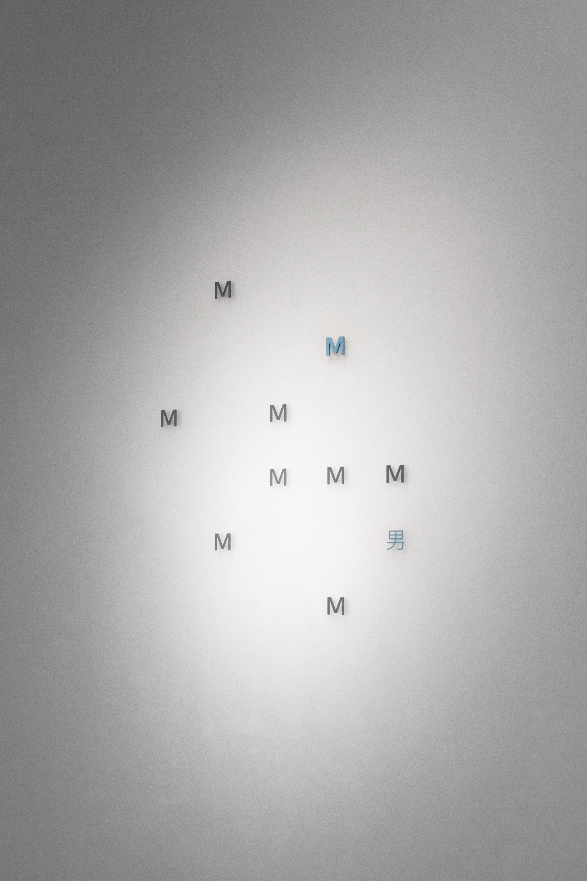
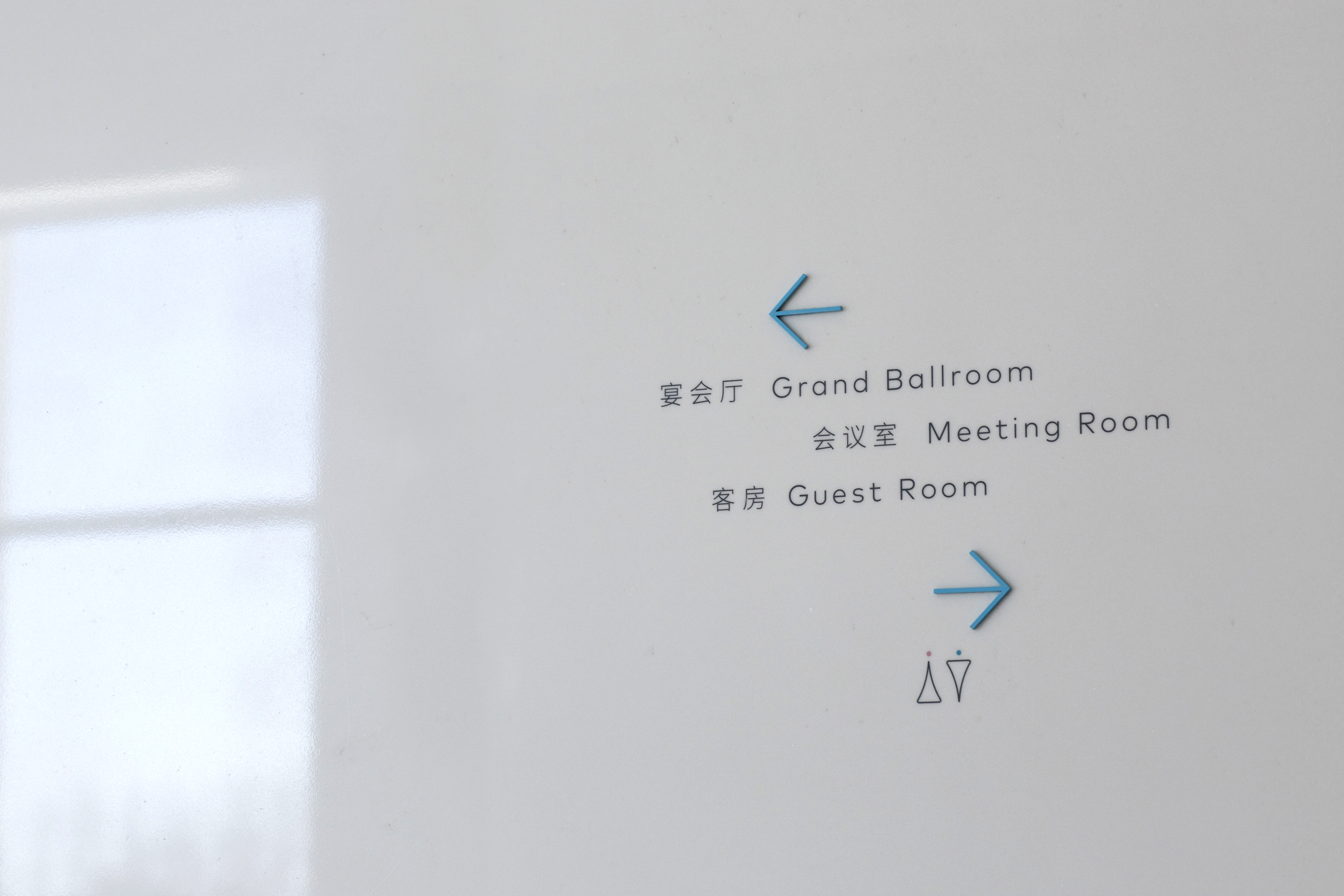
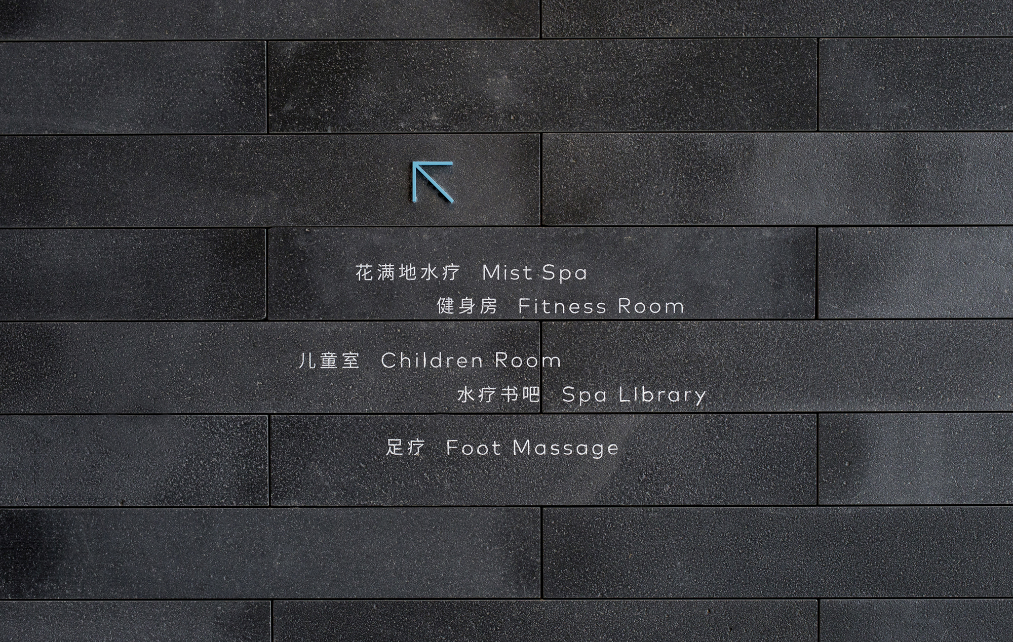
The icons are characterised with droplets, and are also effectively used in signages.


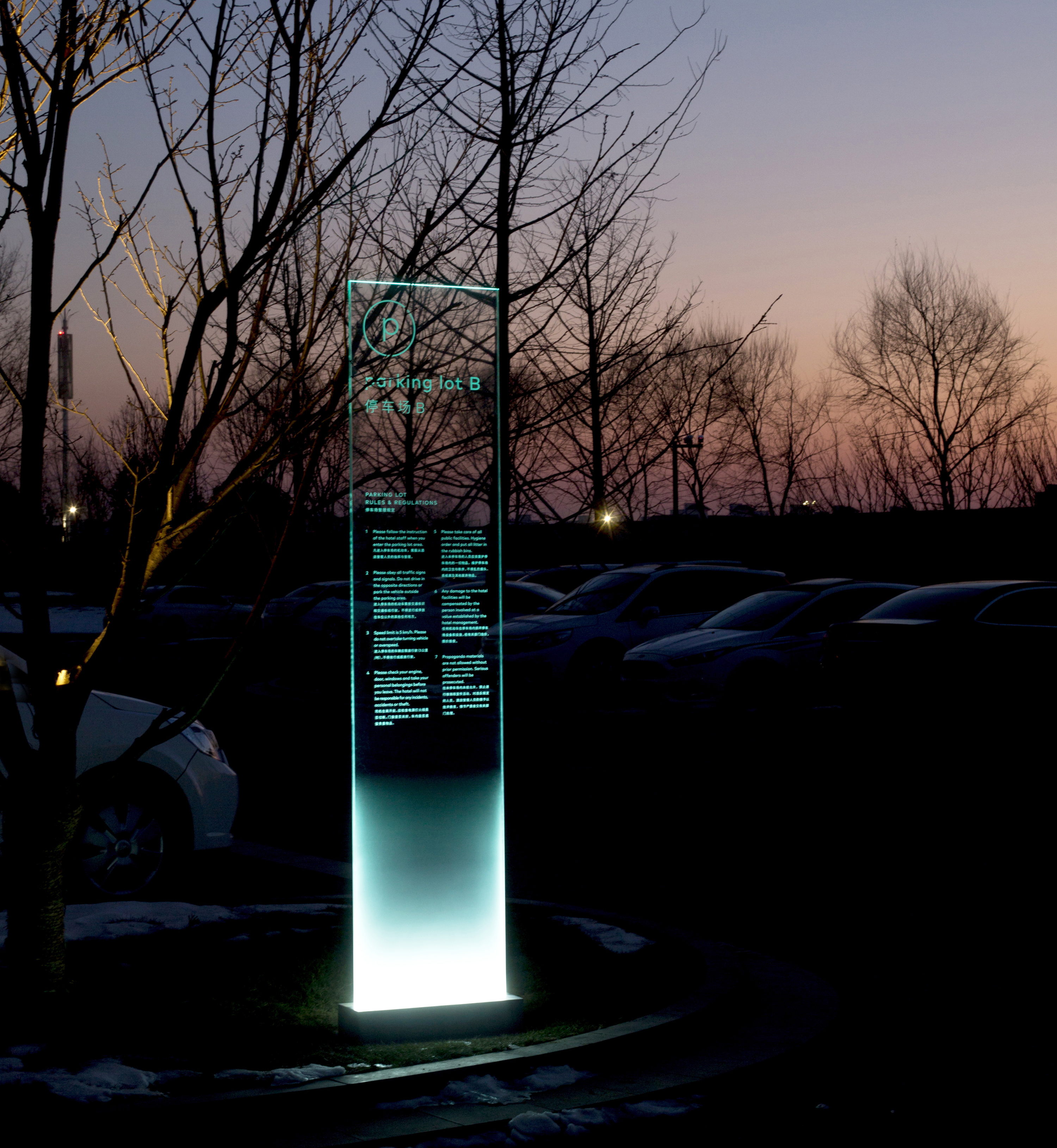
The exterior monumental signs use sandblasted gradation, making the signs appear as if they are floating in the mist.
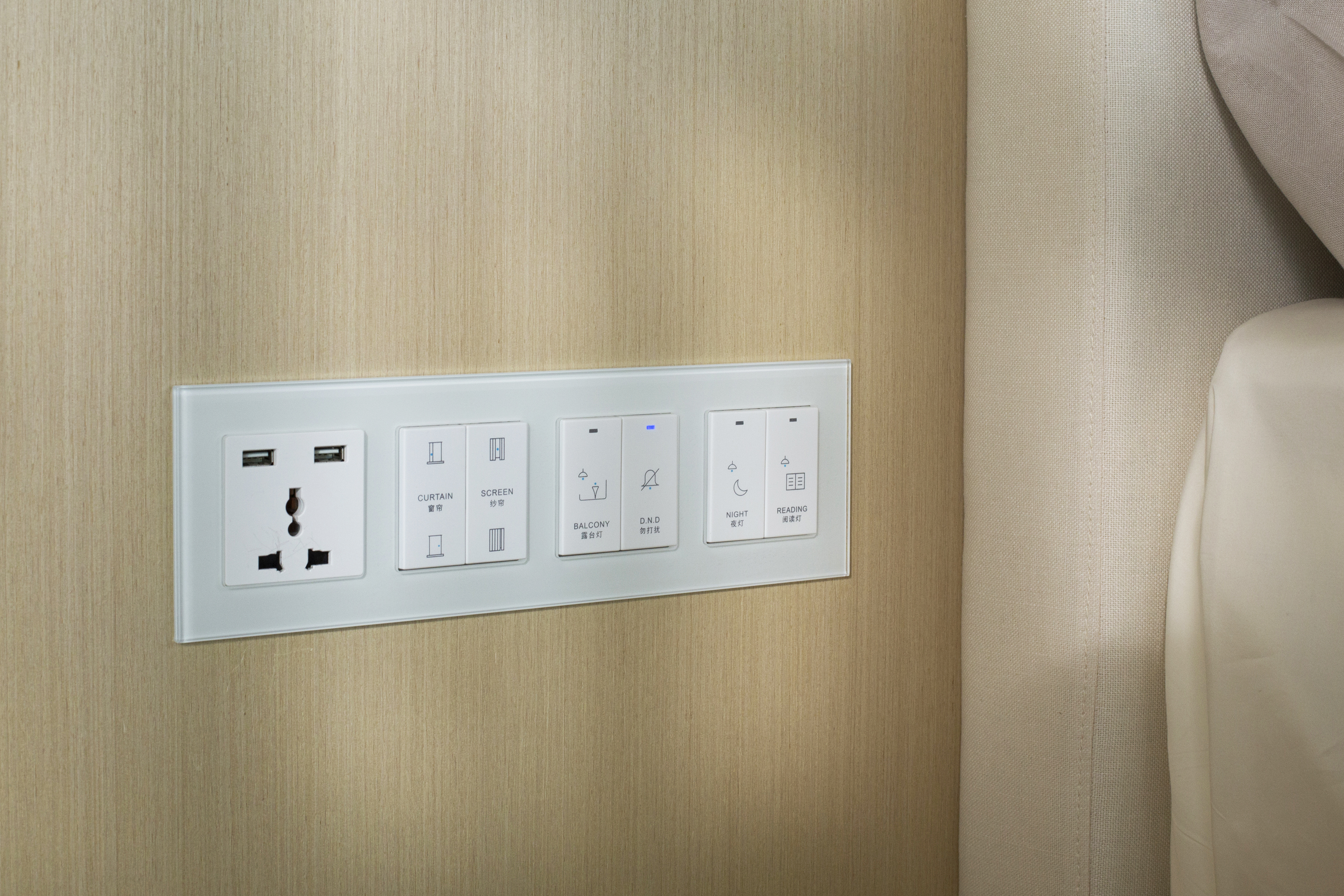
The hotel comes with self-branded spa and restaurant.

Undertaken as a member of artless Inc.
creative direction: shun kawakami
art direction & graphic design: koyuki inagaki
assistant design: nooey nitipon, kanako ueno
project management: ken aoki
architecture & interior design: department of architecture
photography: yuu kawakami