logo & packaging design
KAGUWA
∞
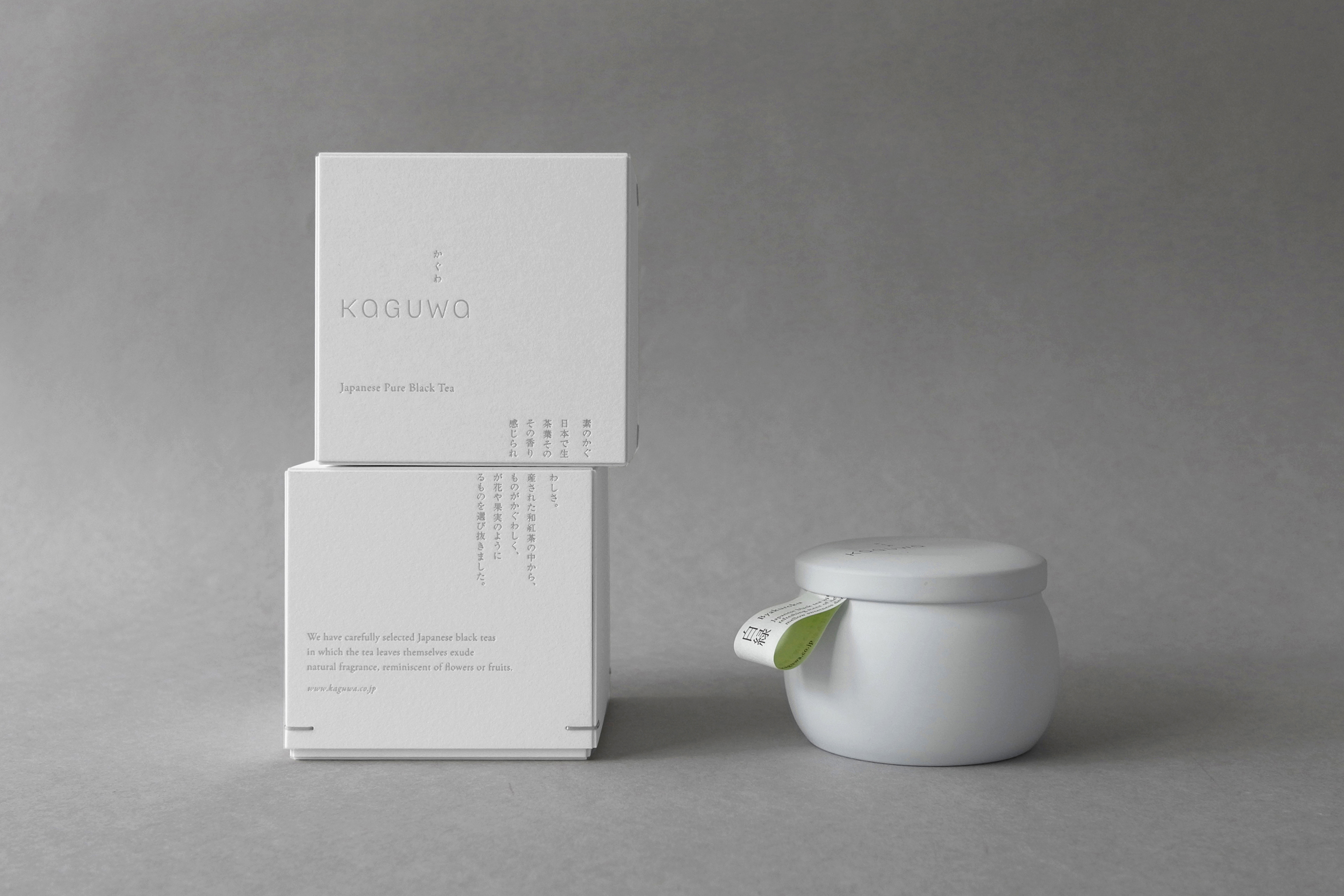
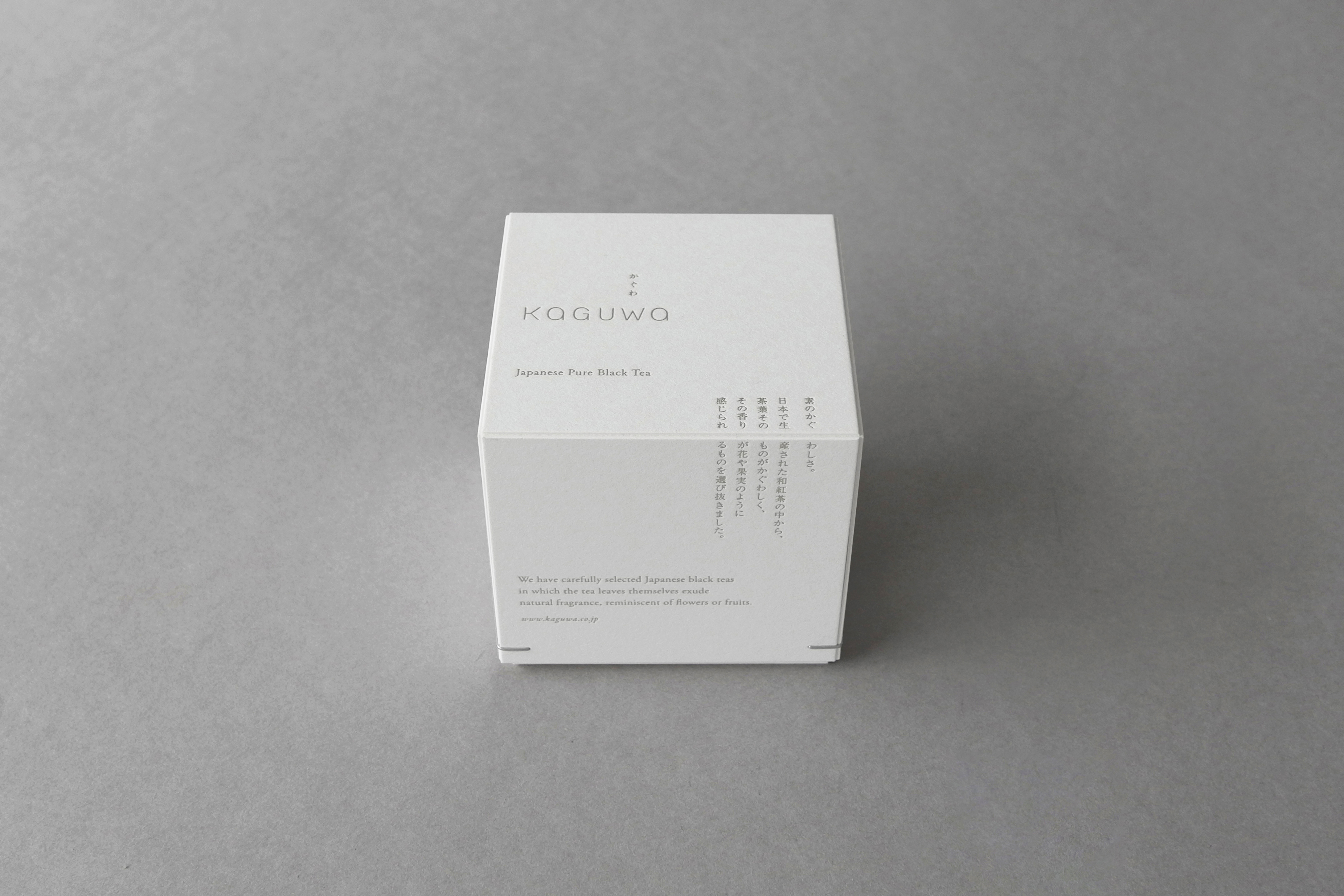
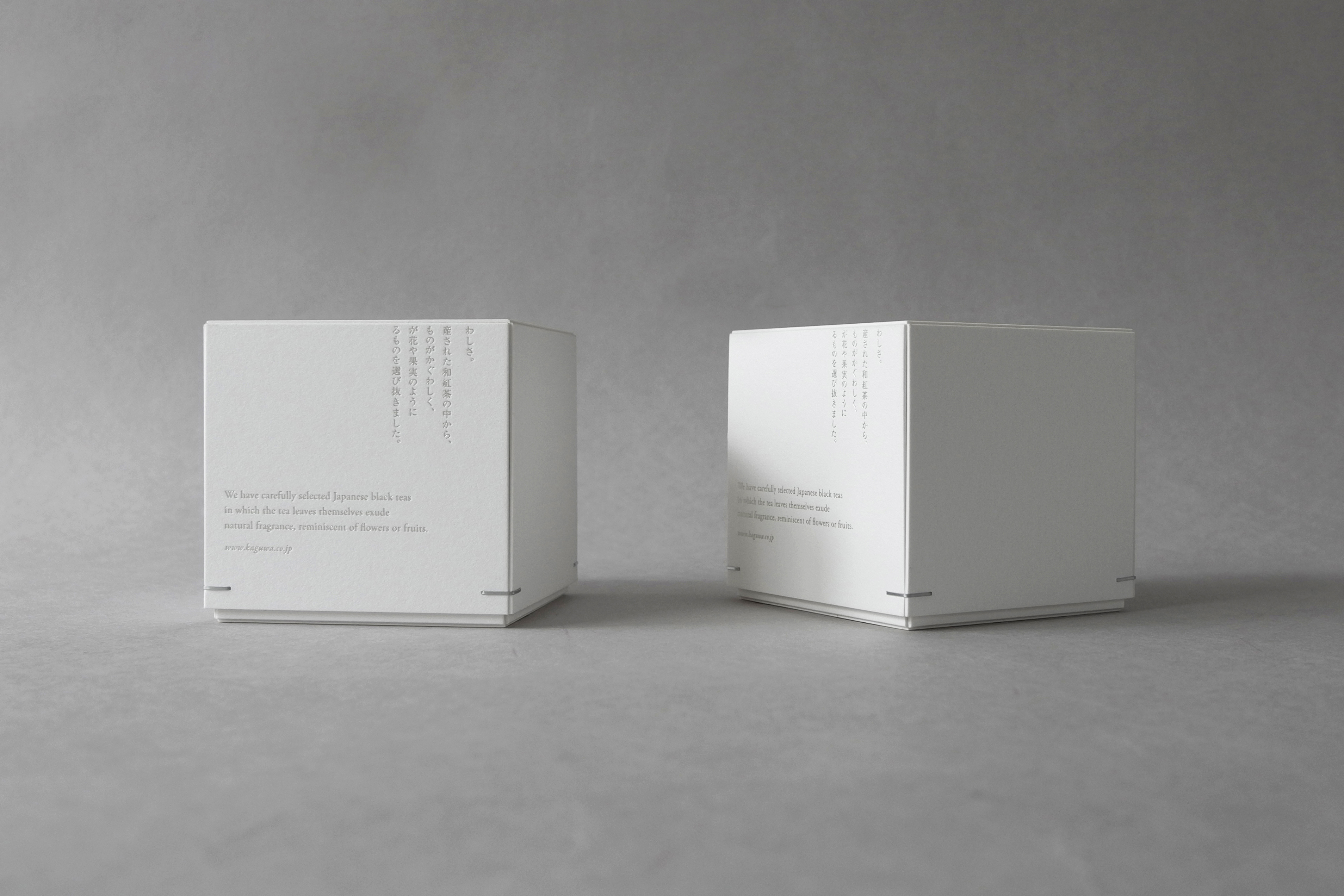
The branding and packaging design started from re-looking at what is essentially Japanese. Looking too ‘traditional’ has been intentionally avoided, to respect the fact that black tea originates from the West. The result aims to balance the look between Japanese and Western.
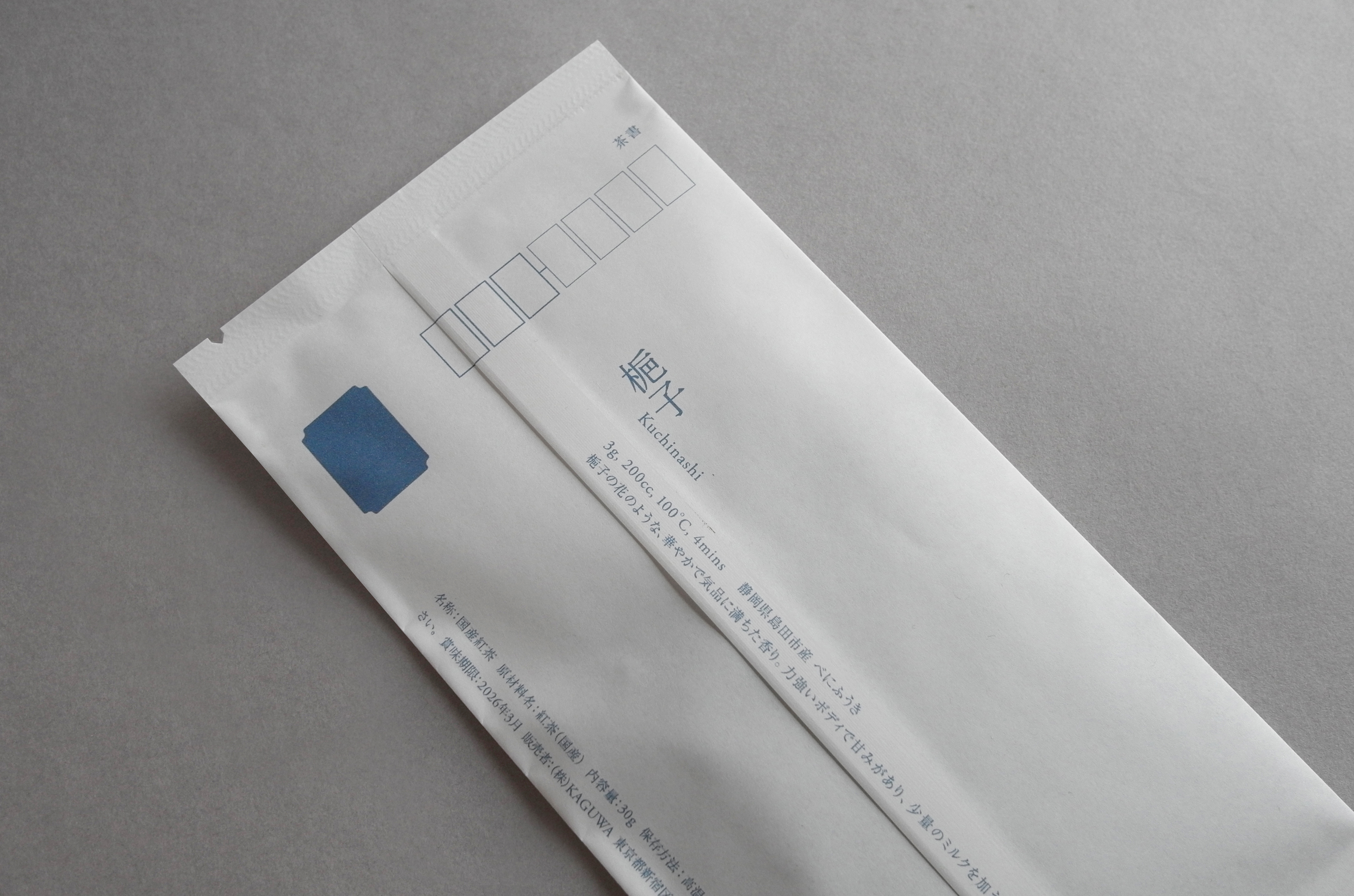
KAGUWA believes in ‘pure’ black tea—tea without flavouring ingredients. To express the philosophy, the design is kept minimalistic, with only necessary decoration and processing.
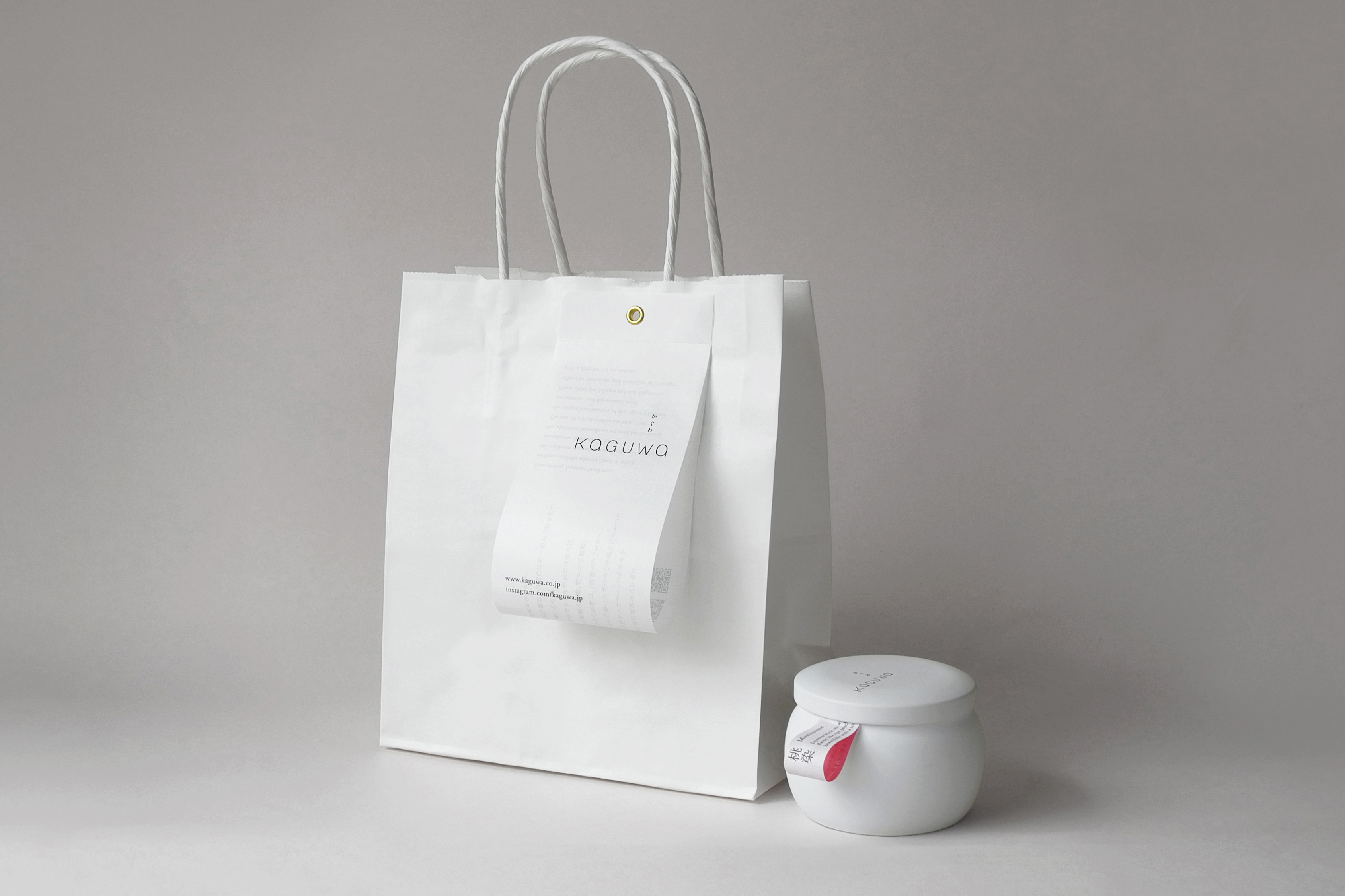
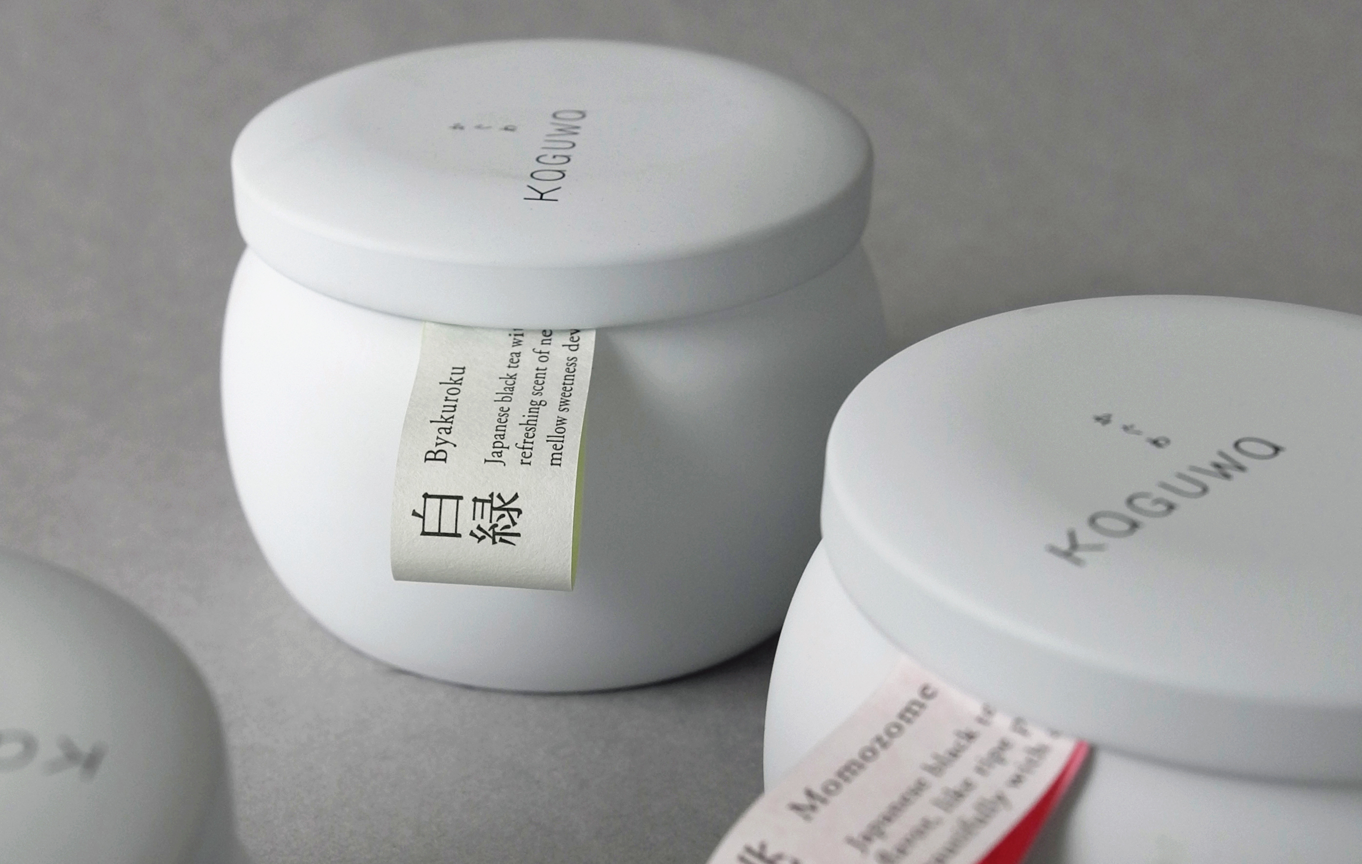
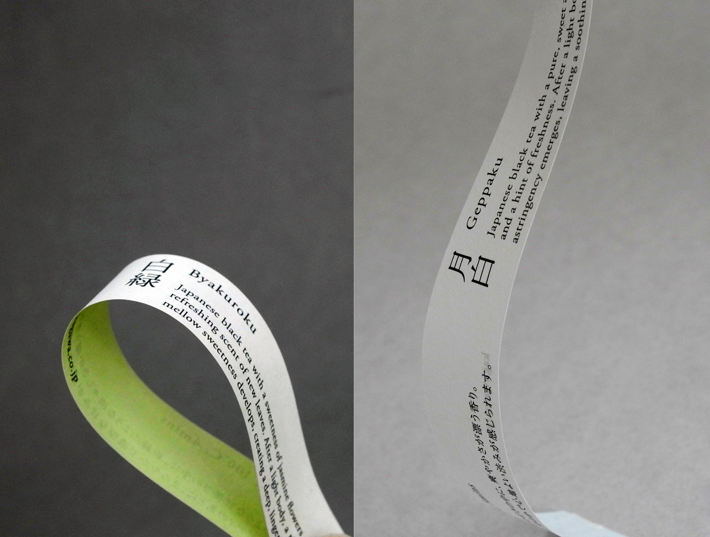
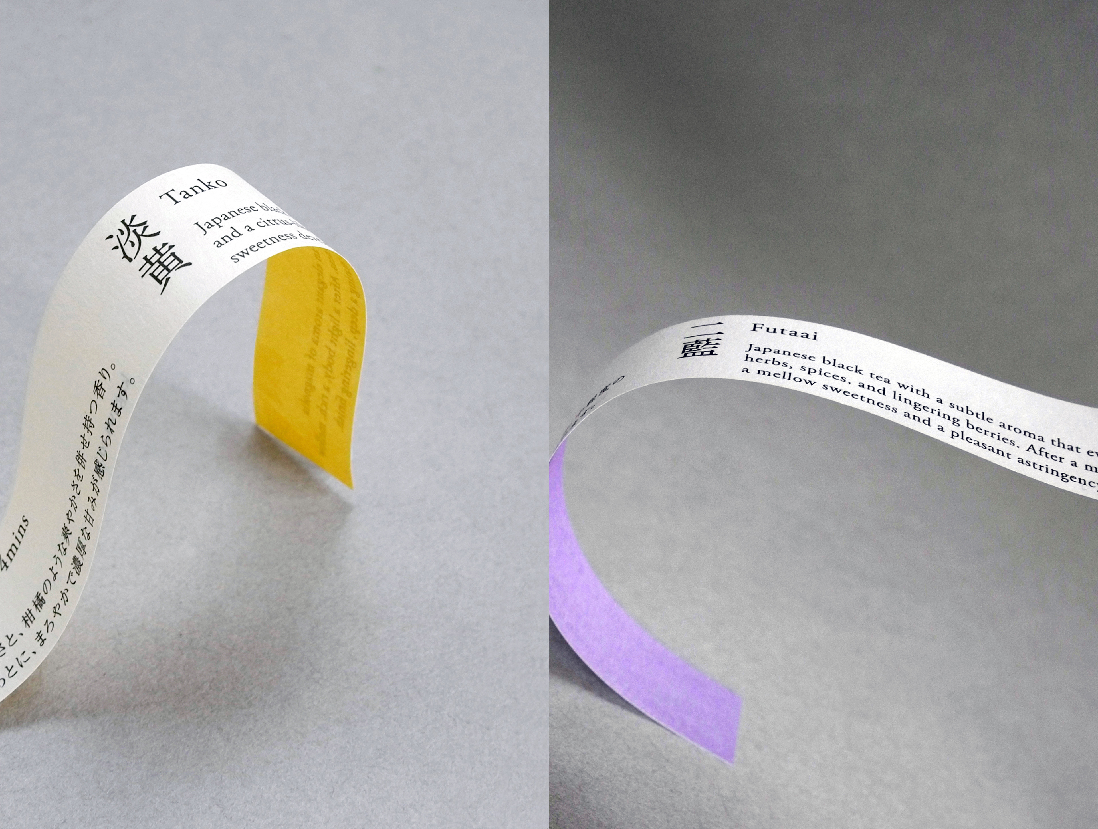
A petite, curvy can has been chosen, to which a 'tag' with the tea name is attached in a way that it gives an organic curve. Given that e-commerce is the main sales channel, it was important that the silhouette is distinctive even when displayed as a small thumbnail image.
The logotype is designed with large counters and curvy lines, made to subtly remind the aesthetics of hiragana letters.
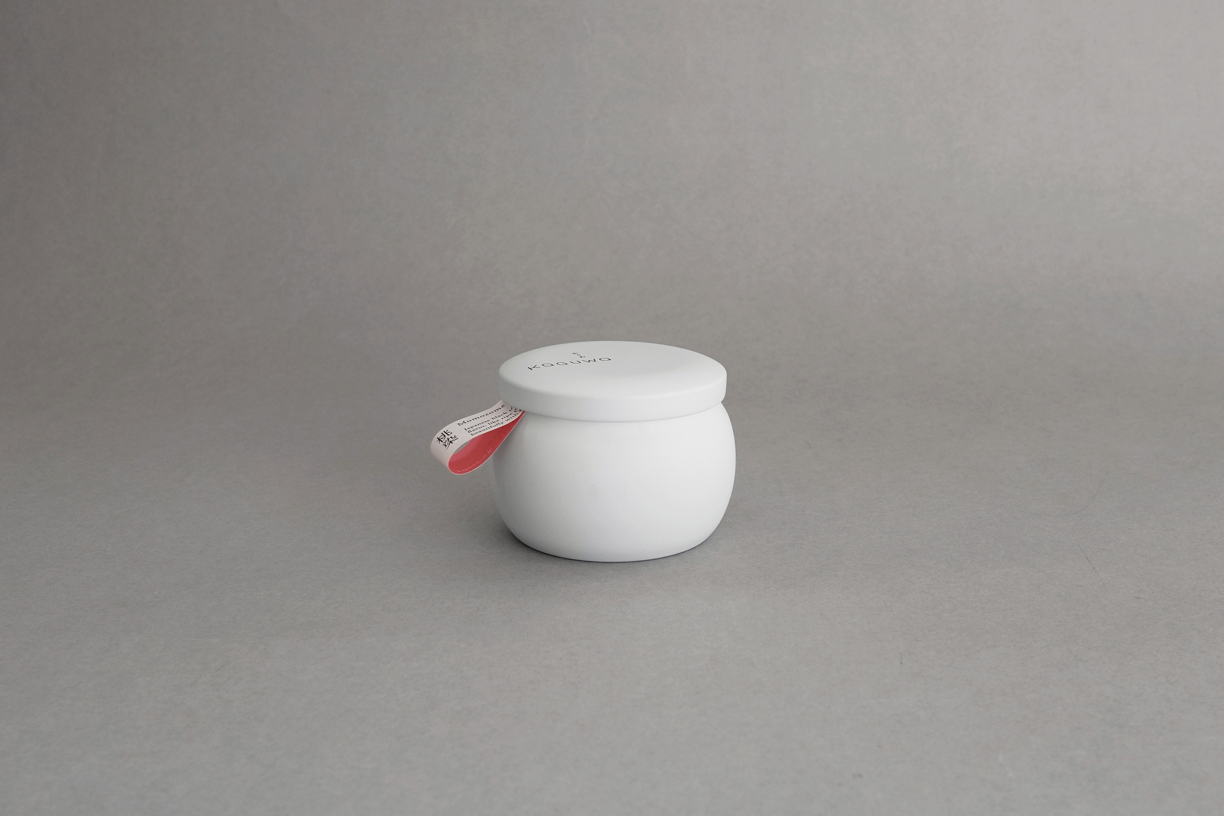
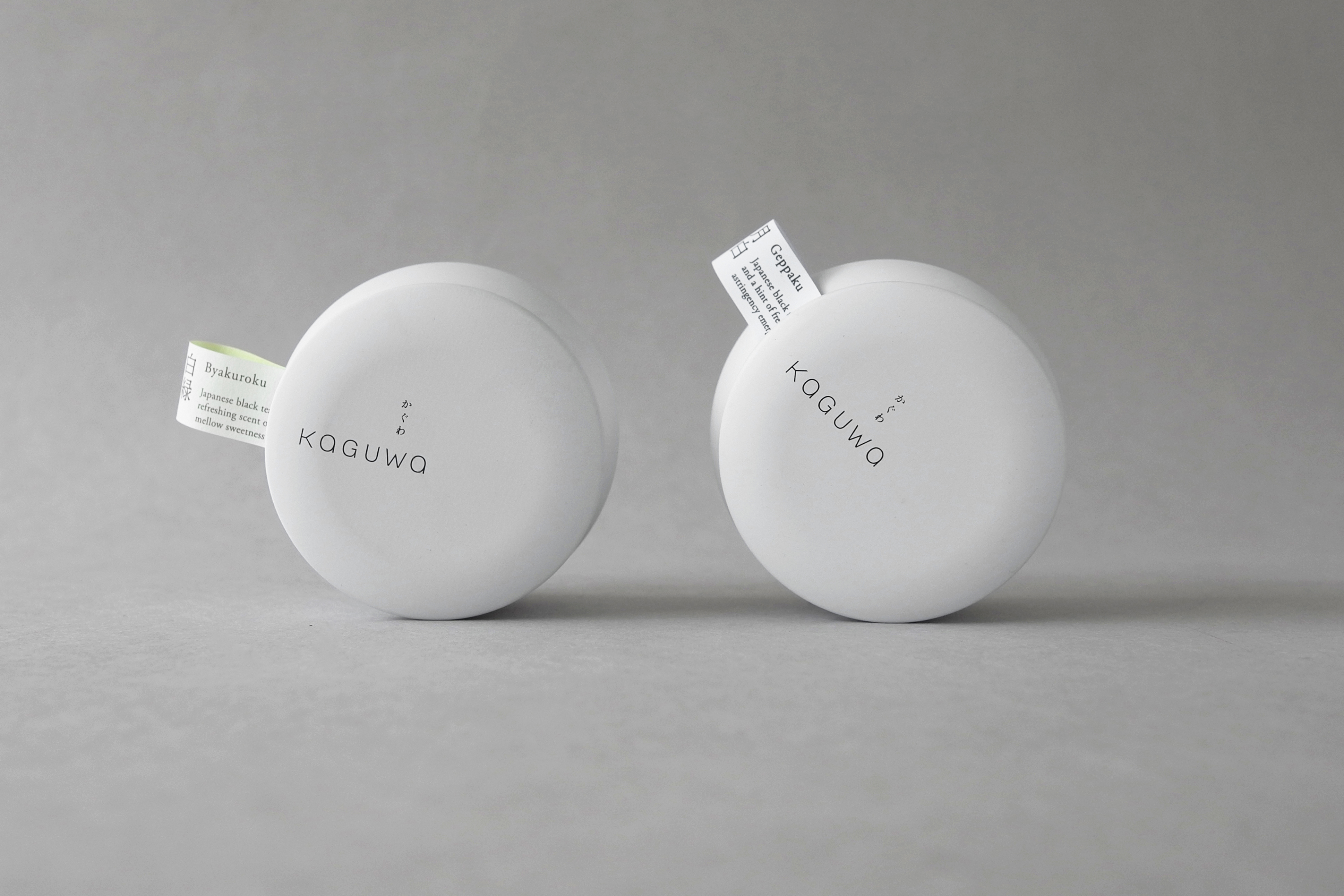
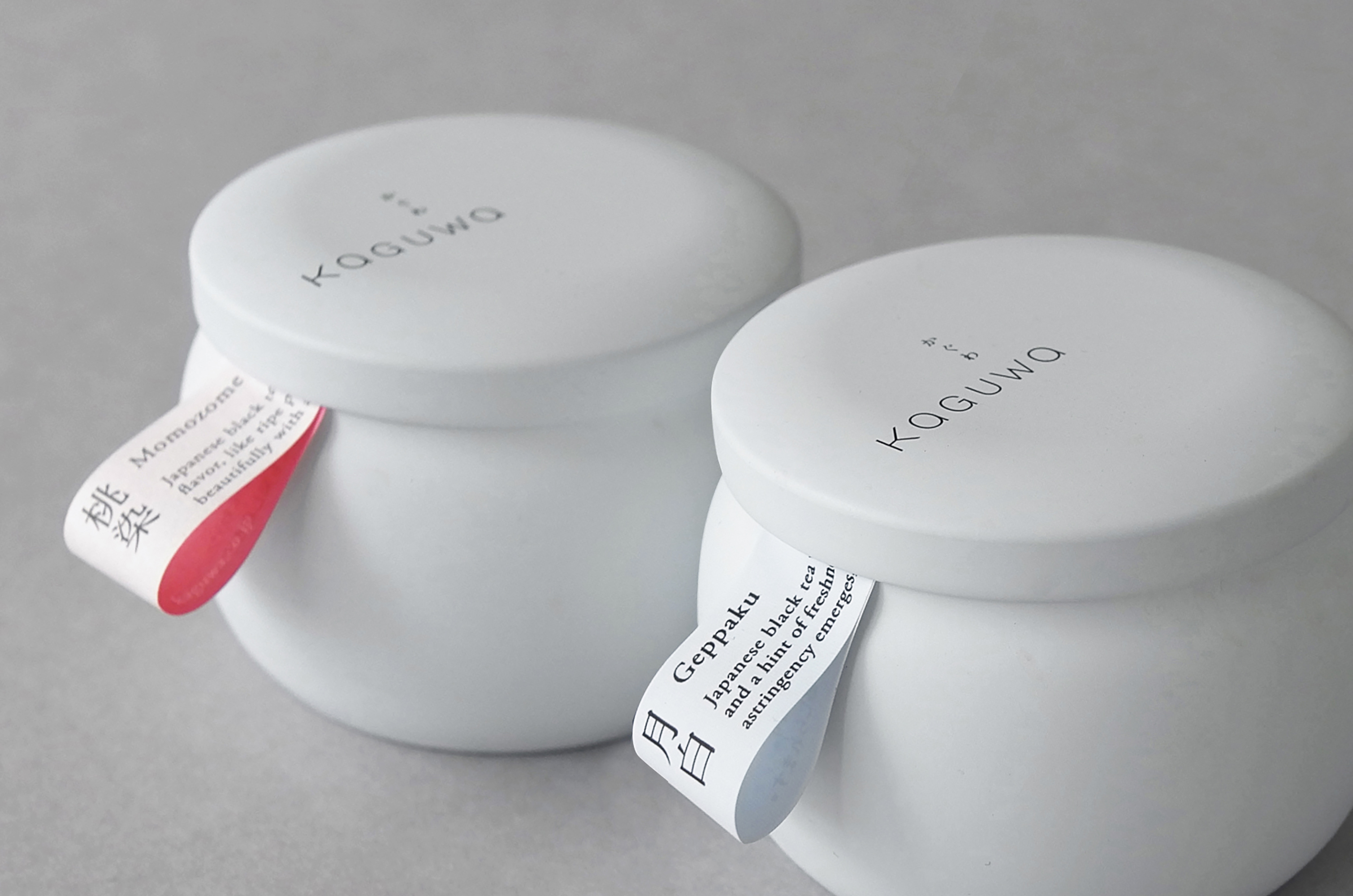
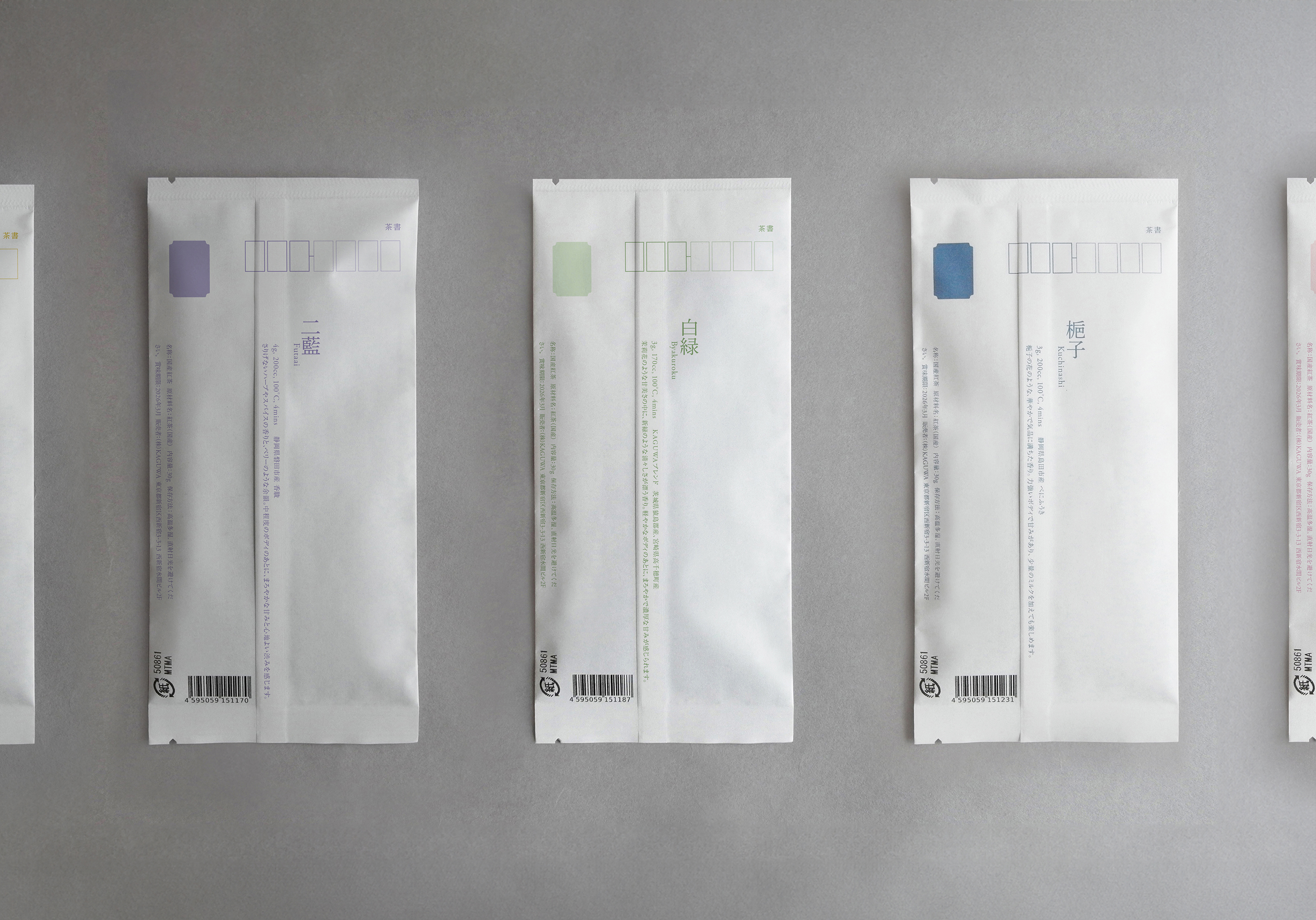
To express the aroma of tea, the names of traditional Japanese colours are picked as a naming system that the tea sommelier can utilise to for the seasonal tea selections.
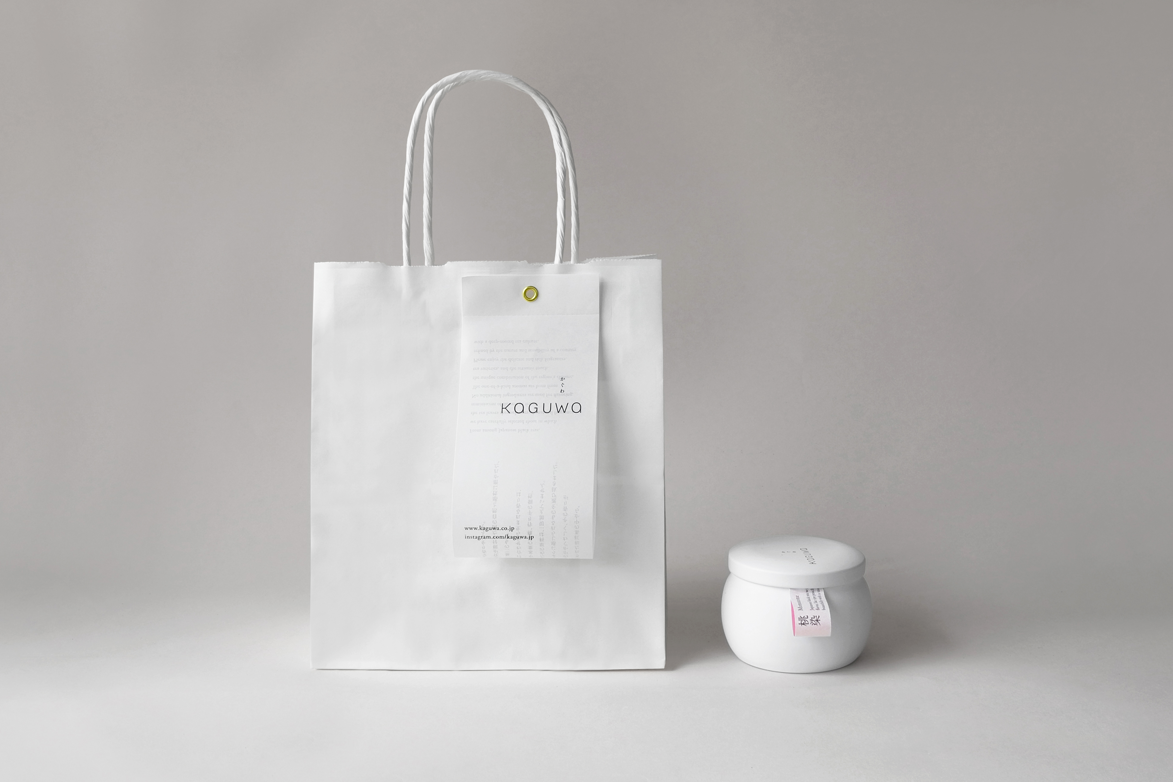
Other packaging items include paper bags, boxes and refills.
Paperbags


Boxes

Refills

Available for purchase from here.
www.kaguwa.co.jp
credits
Art direction, design & photography: Koyuki Inagaki
Copywriting: Mariko Hara
Copywriting: Mariko Hara