branding
INCH
♢
INCH is a restaurant in Penang, Malaysia, that offers Indochina's street food & drinks. The brand system was developed to express the dynamicness, liveliness of the region where races, cultures, histories are complexly interwined.

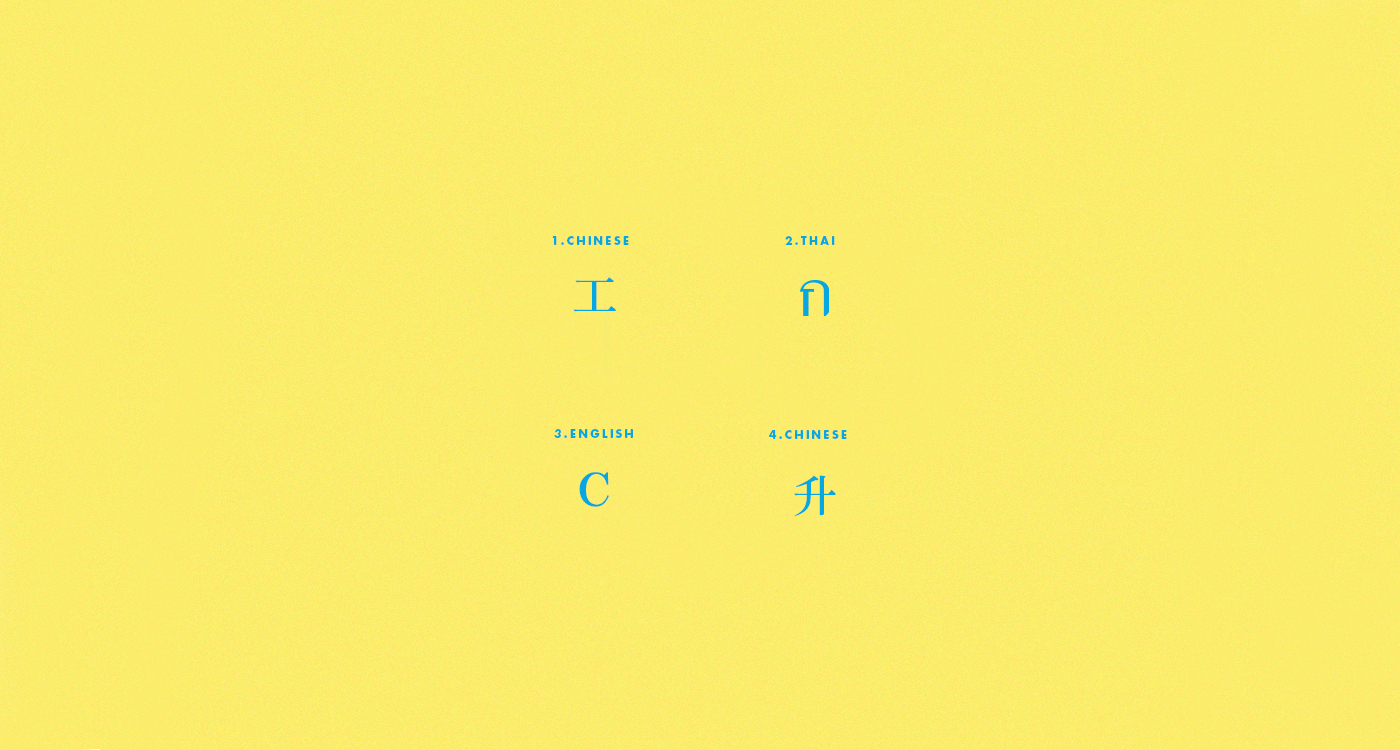
Culture and language are closely connected with each other. Indochina, being a region diverse in ethnicities, is a ground for various languages with their own unique alphabet systems: Chinese, Thai, Hindi, Tamil, etc.
These alphabets when mixed together to form the word INCH, they give an unpredictible, unique look to the logo while representing the complex, interweaved culture of Indochina.

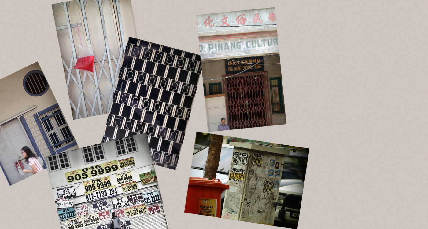
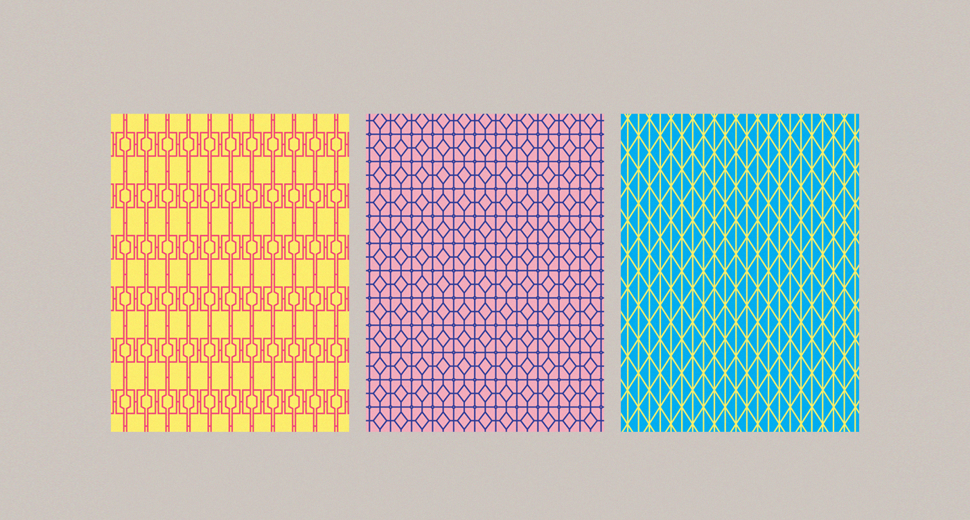
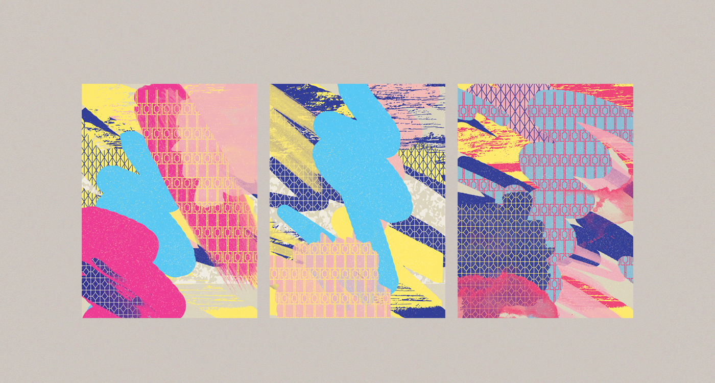
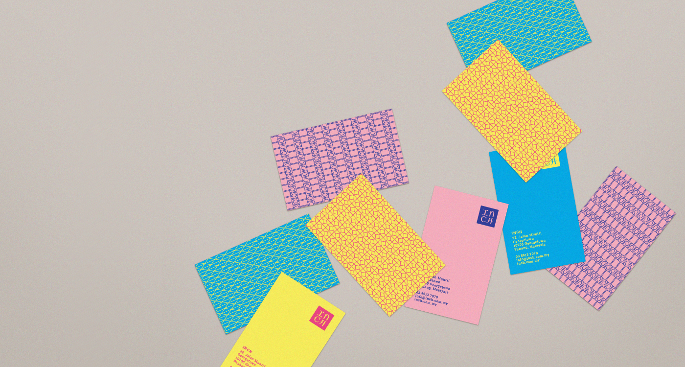
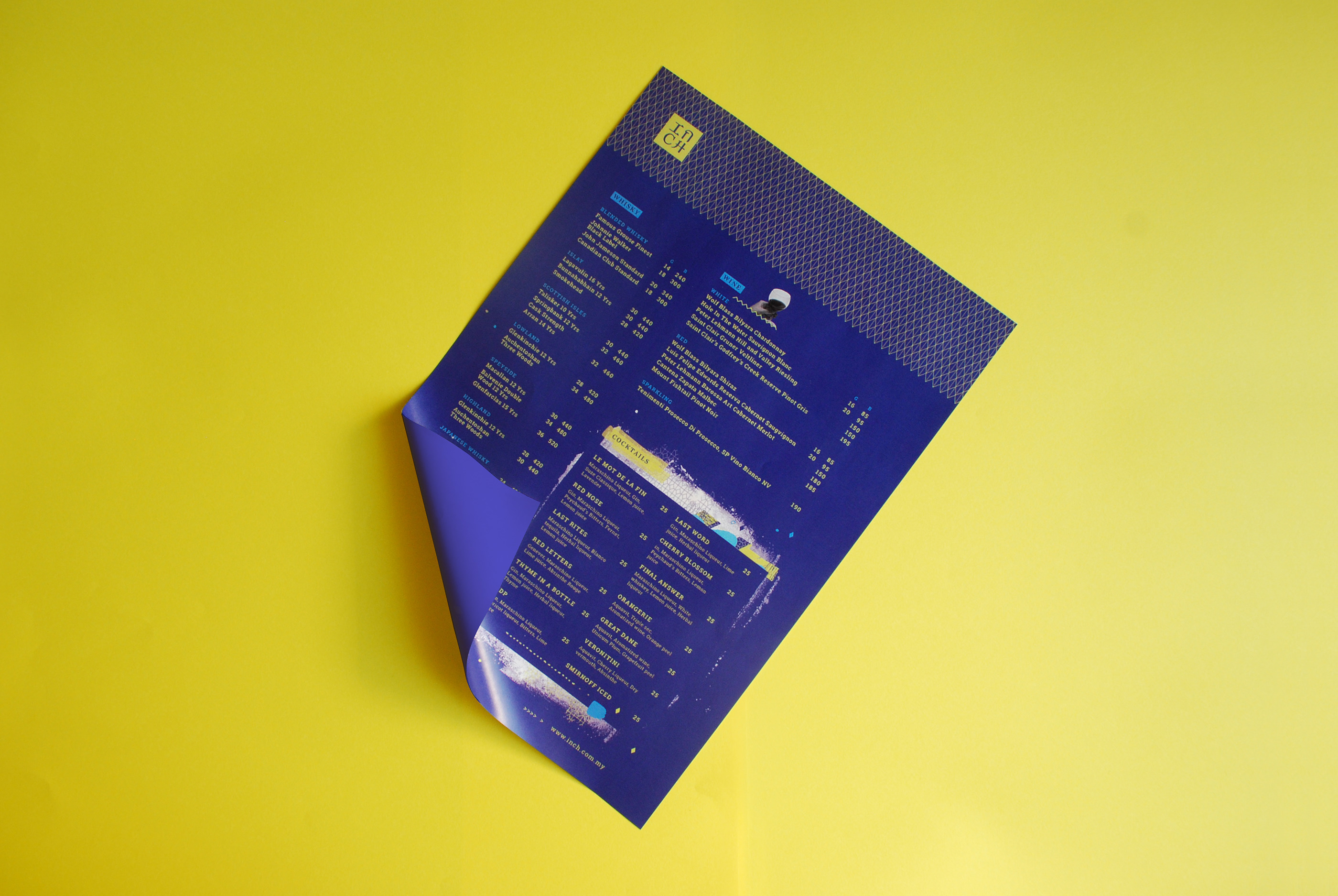
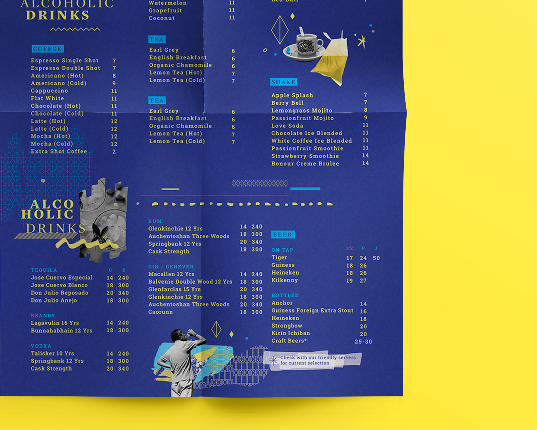
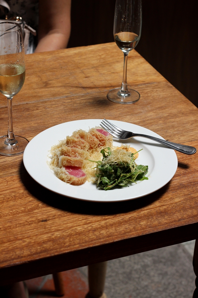
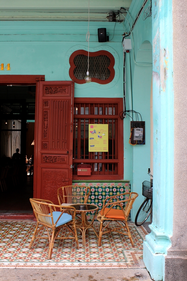
The brightest, most vivid colours are combined to depict the vibrancy of the region's street scenes. The graphics were developed, inspired from facades with patterned fences and randomly pasted street advertisements.
Patterns
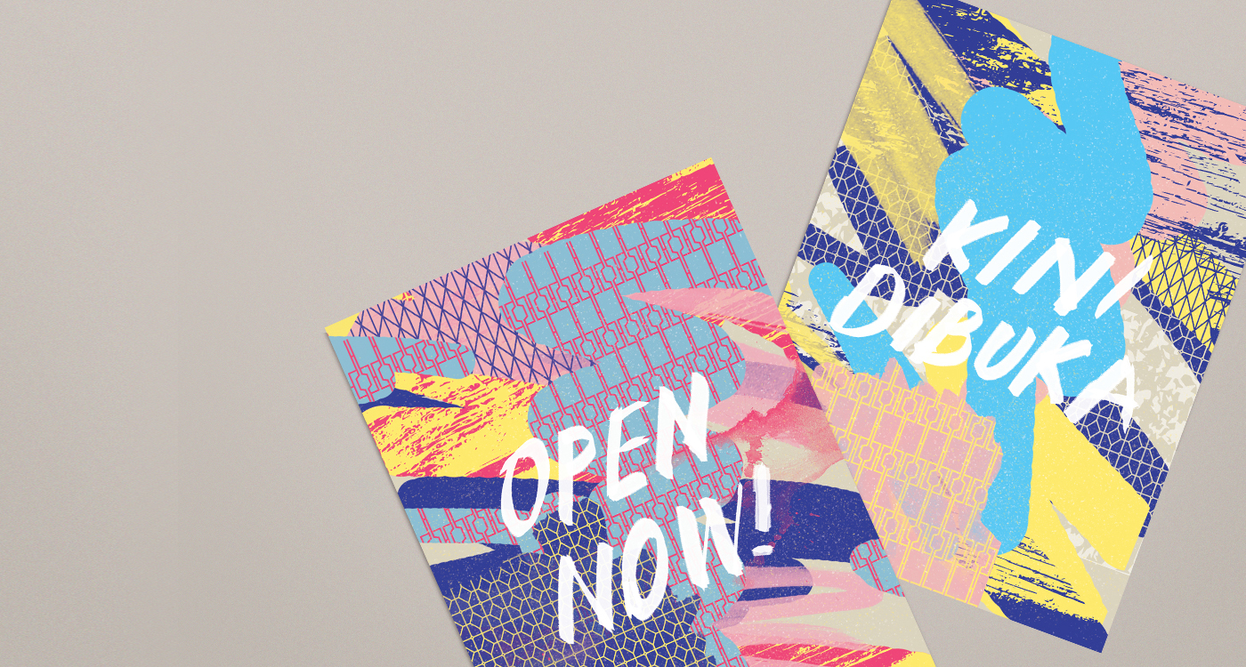
applications
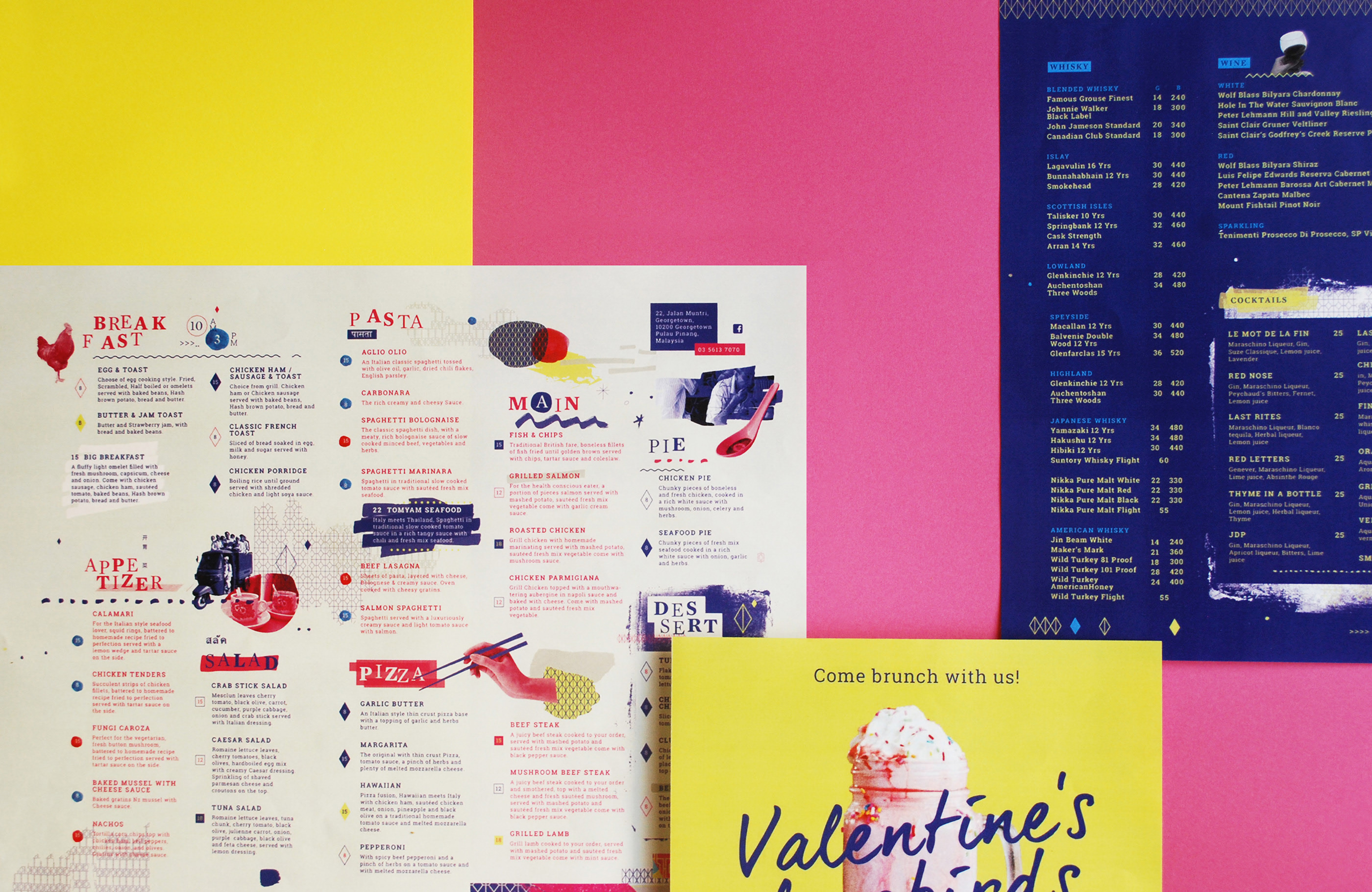
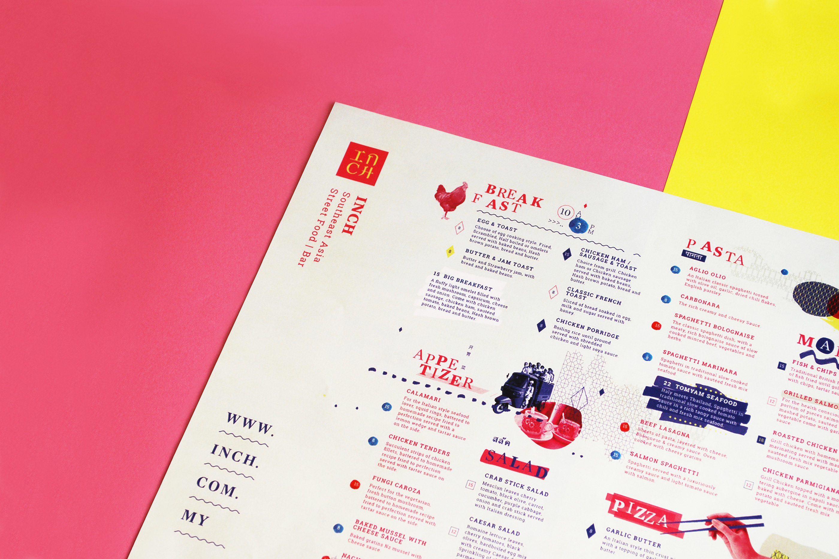
menu


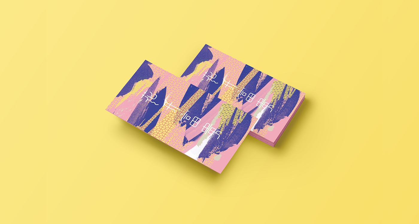
Other Applications and E-posters
Graphic Design by Alicia Ng, Freeform


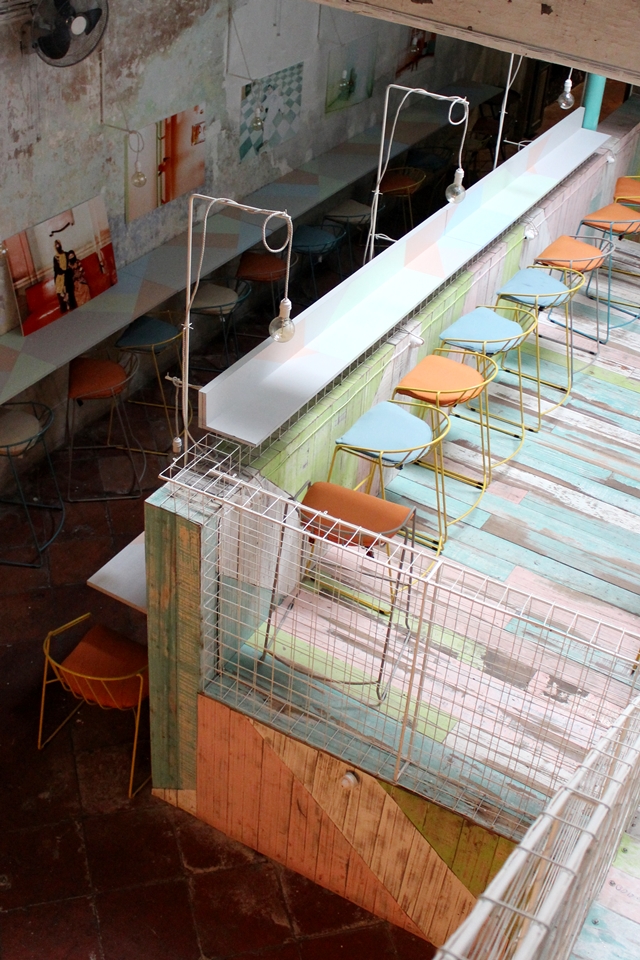
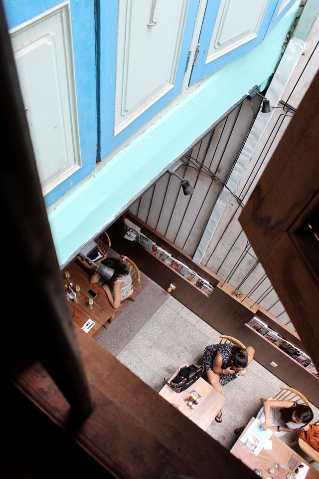
Interior / Exterior
Photography by Trisha Toh
credits
creative direction: koyuki inagaki
graphic design: alicia ng, freeform
interior / exterior photography: trisha toh
graphic design: alicia ng, freeform
interior / exterior photography: trisha toh