branding, wayfinding
Hotel Risveglio Akasaka
-
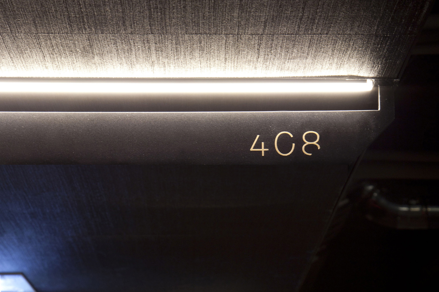
The custom typeface which we call ‘Risveglio,’ is used throughout the identit on collaterals, signages and so on. The incompletion suggests growth, possibilit and unexpectedness - through this identity we aim to awaken the guests’ senses.
Iconography
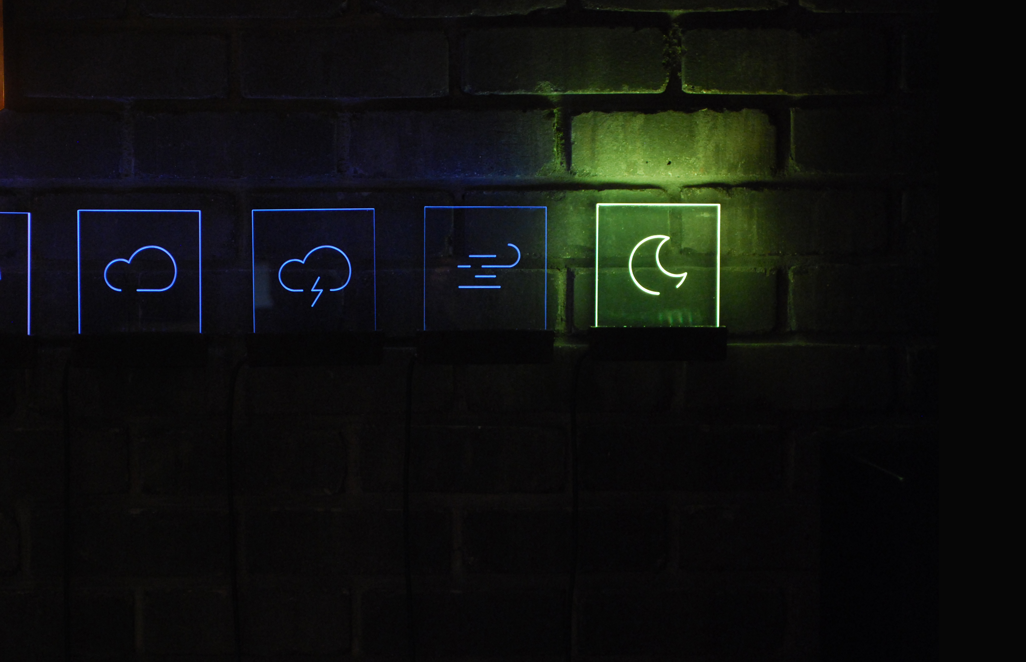
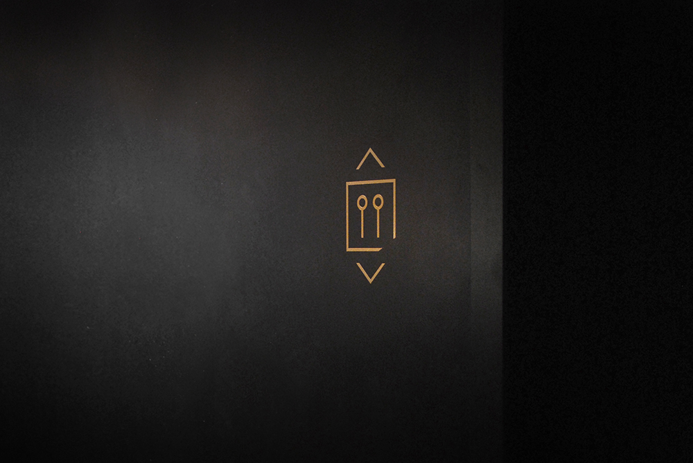
Other wayfinding signs


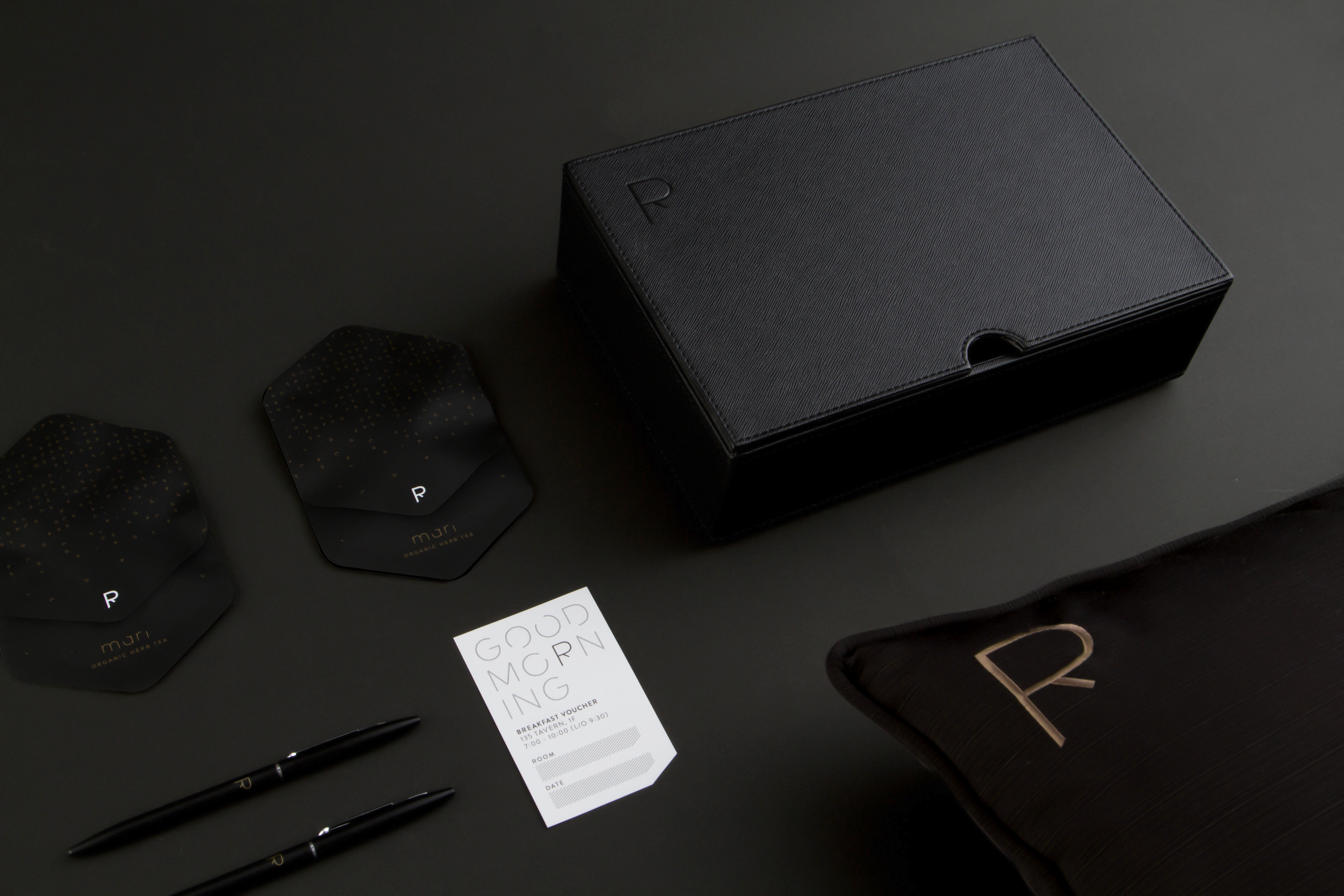
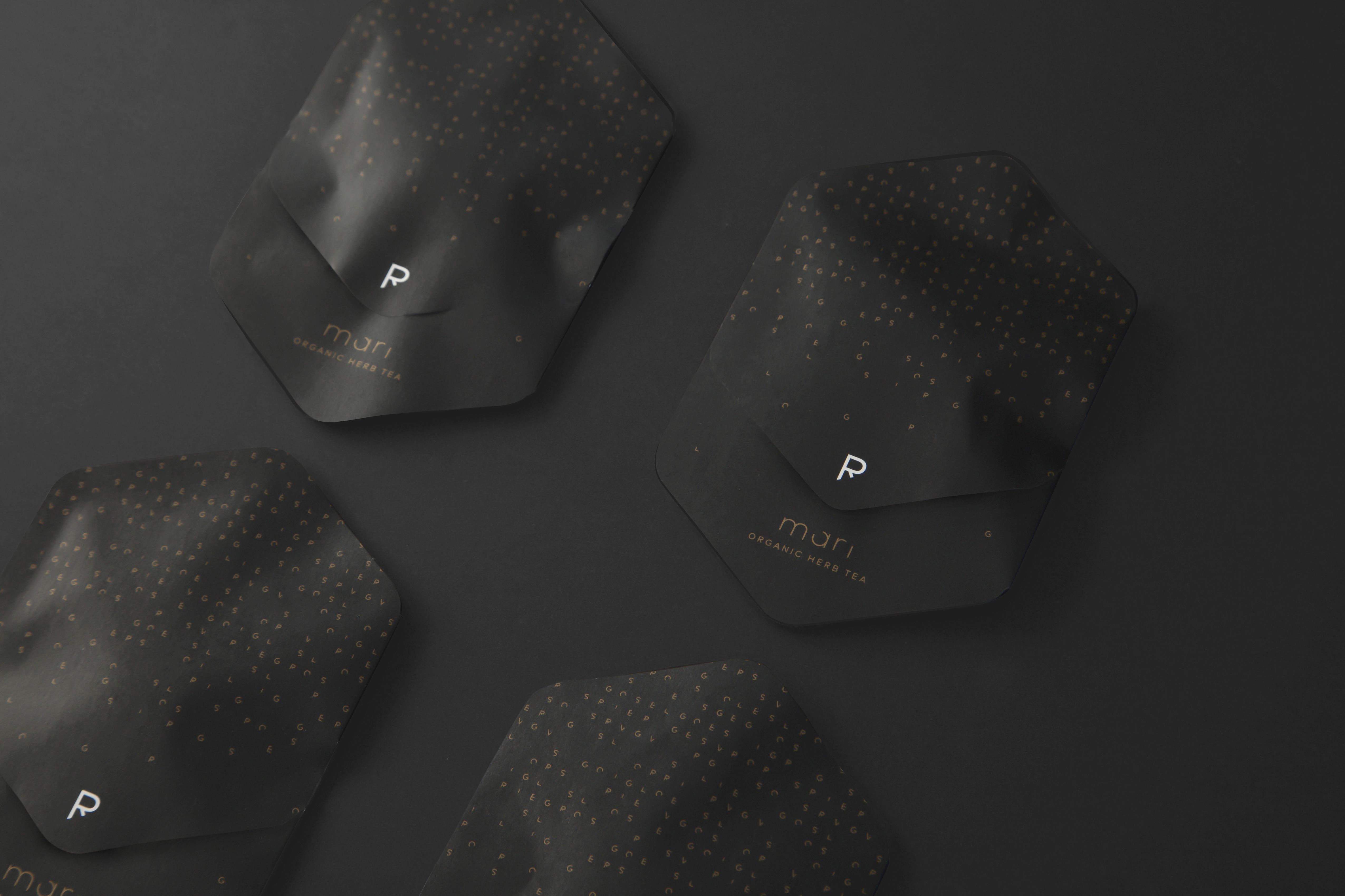
stationeries and amenities


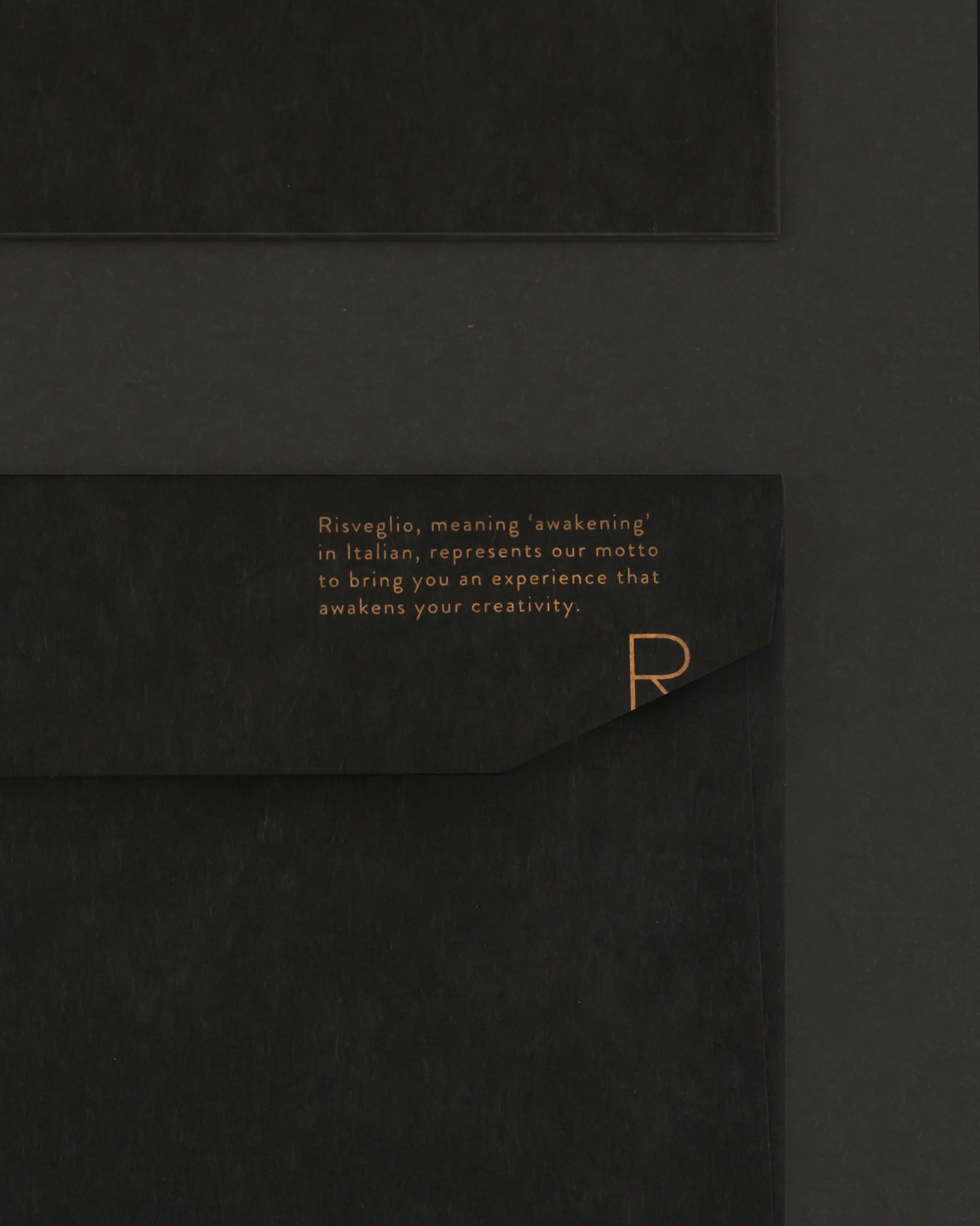

do not disturb cards

‘Tenugui’, Japanese handkerchief

credits
art direction & logo: Shun Kawakami
graphic design: Koyuki Inagaki
assistant design: Stefano Cometta
photography: Yuu Kawakami & Koyuki Inagaki
interior design: Seki Kagu
