branding, packaging
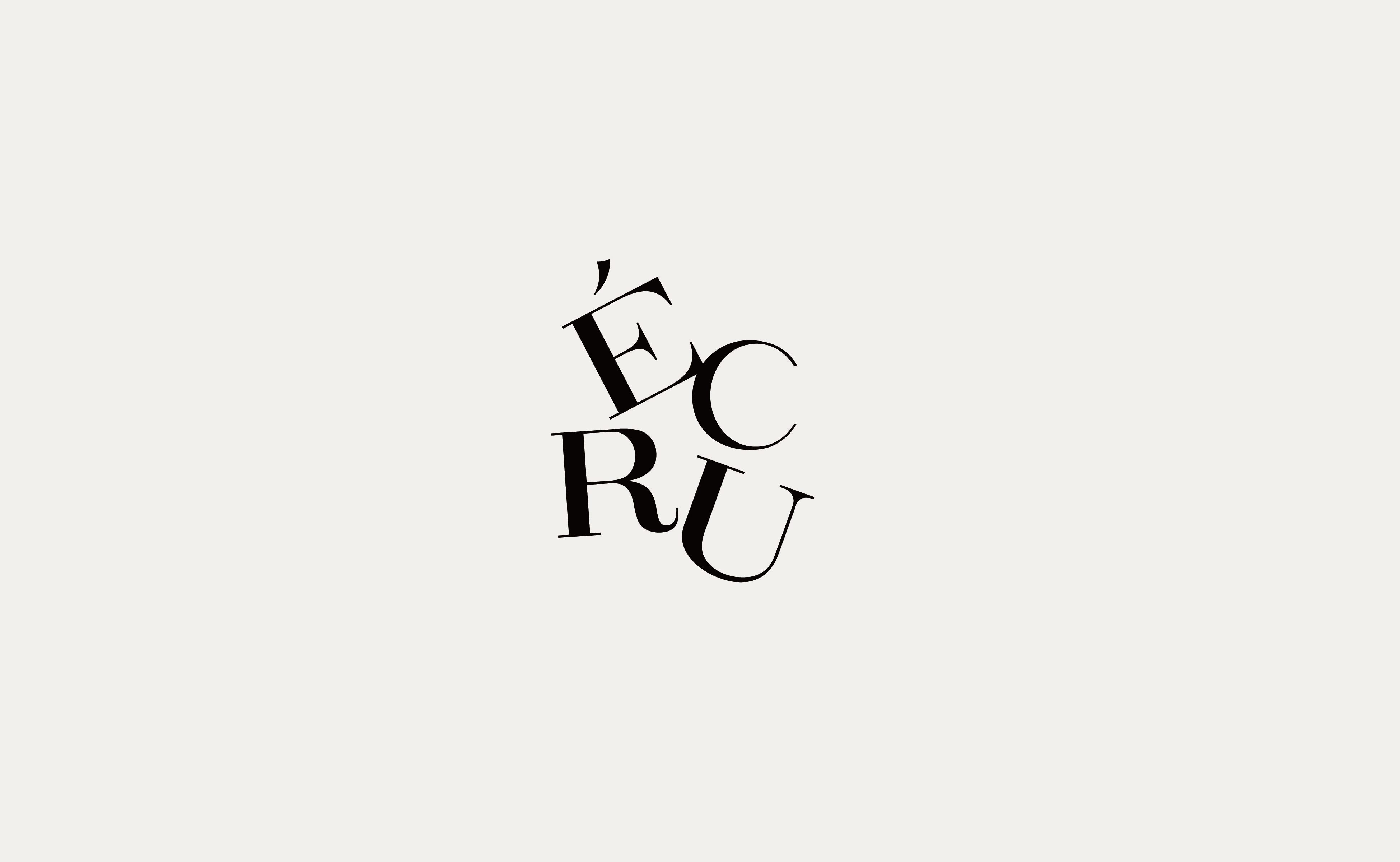
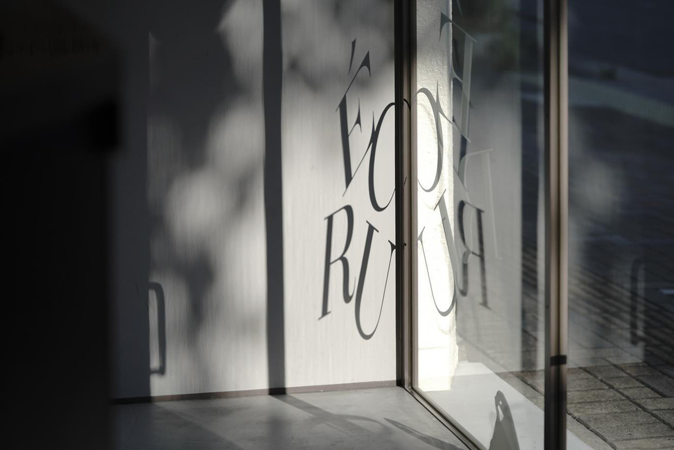
ÉCRU
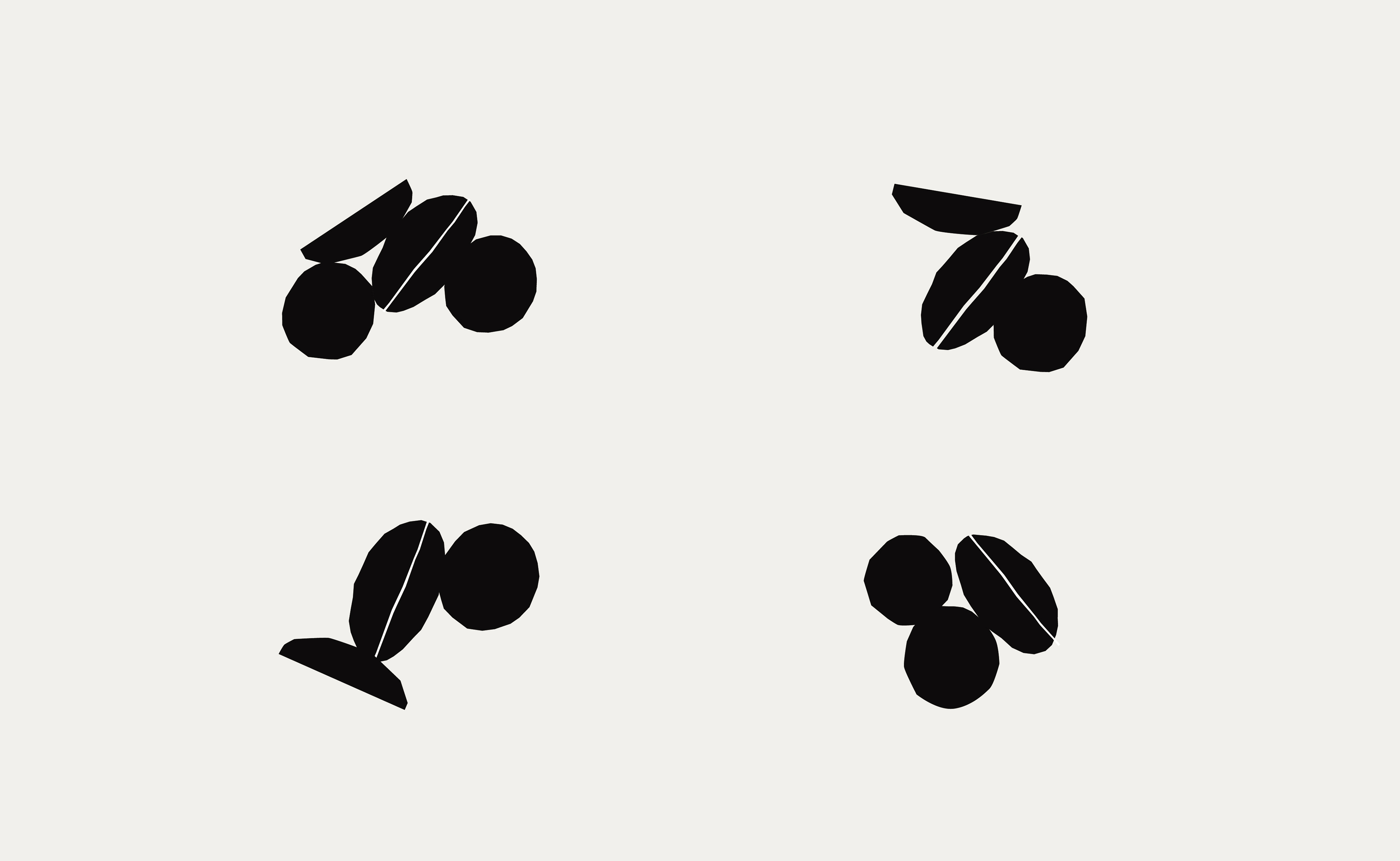
◖◗
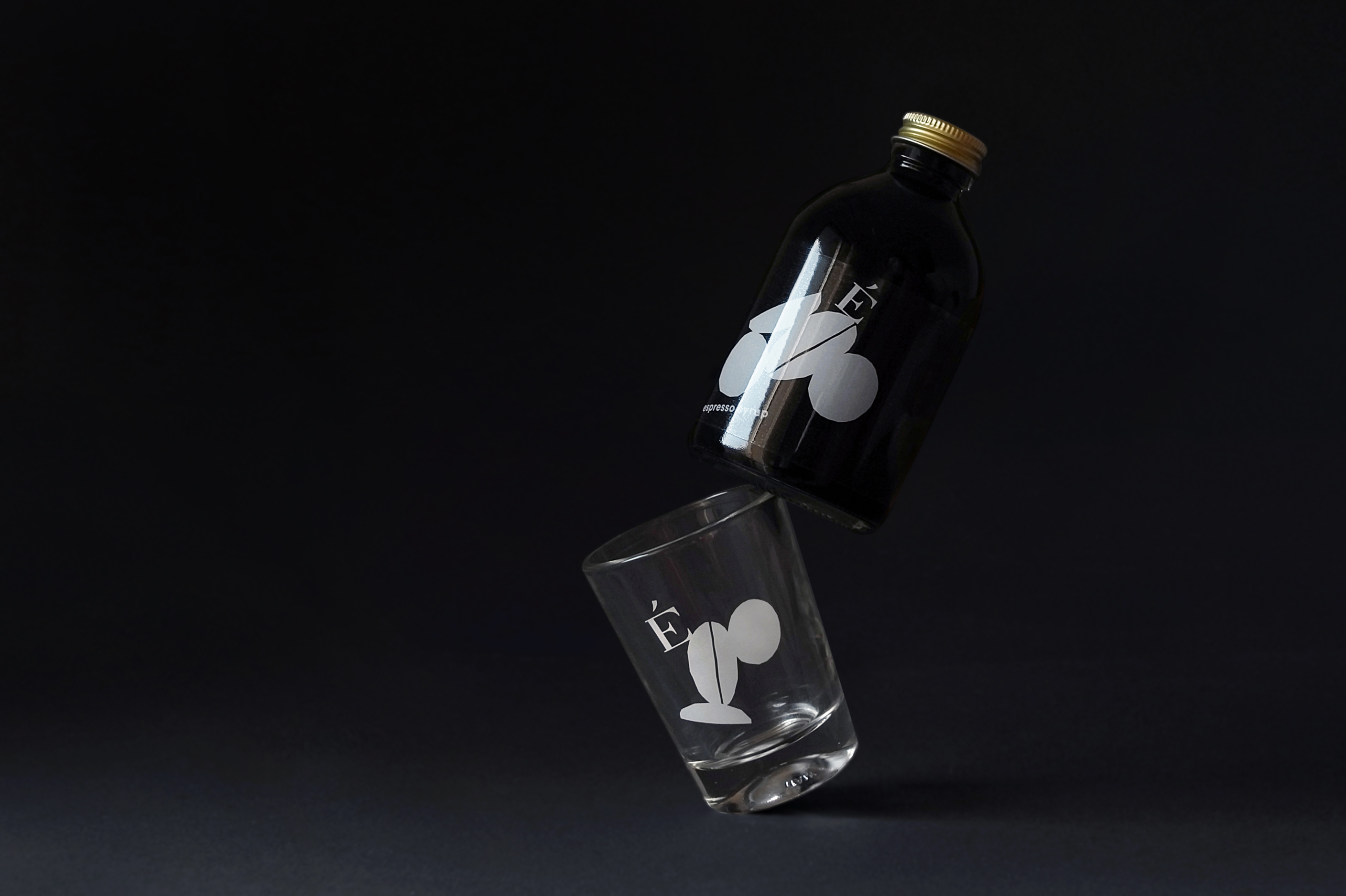
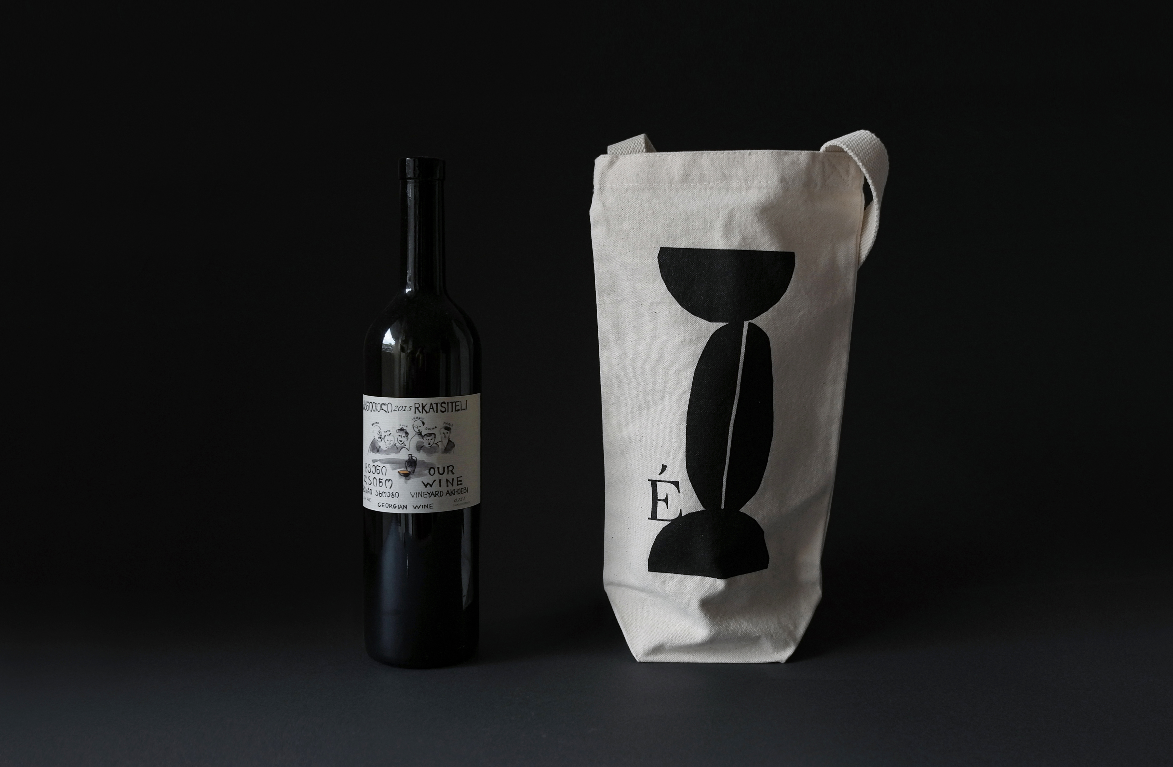
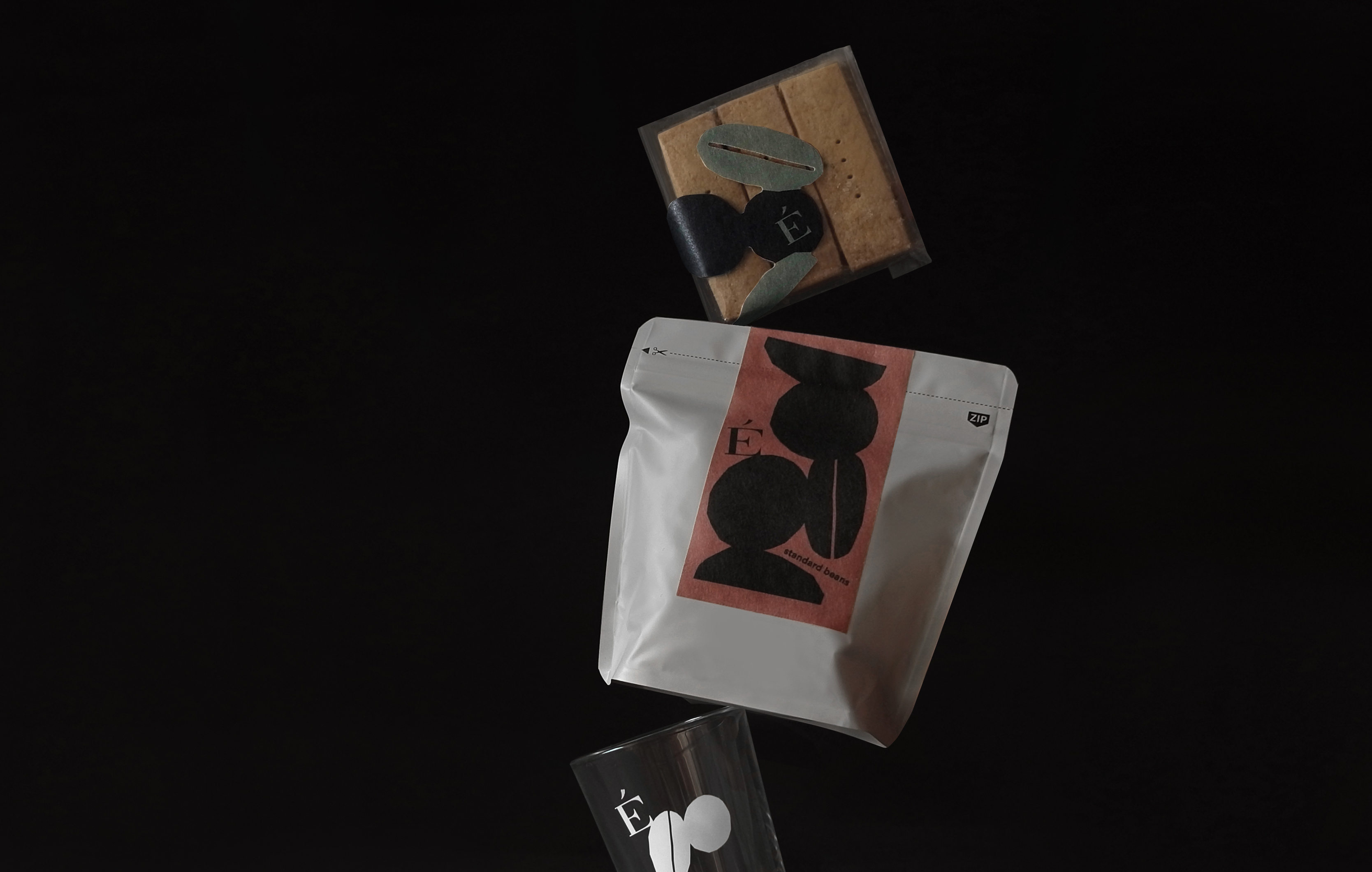
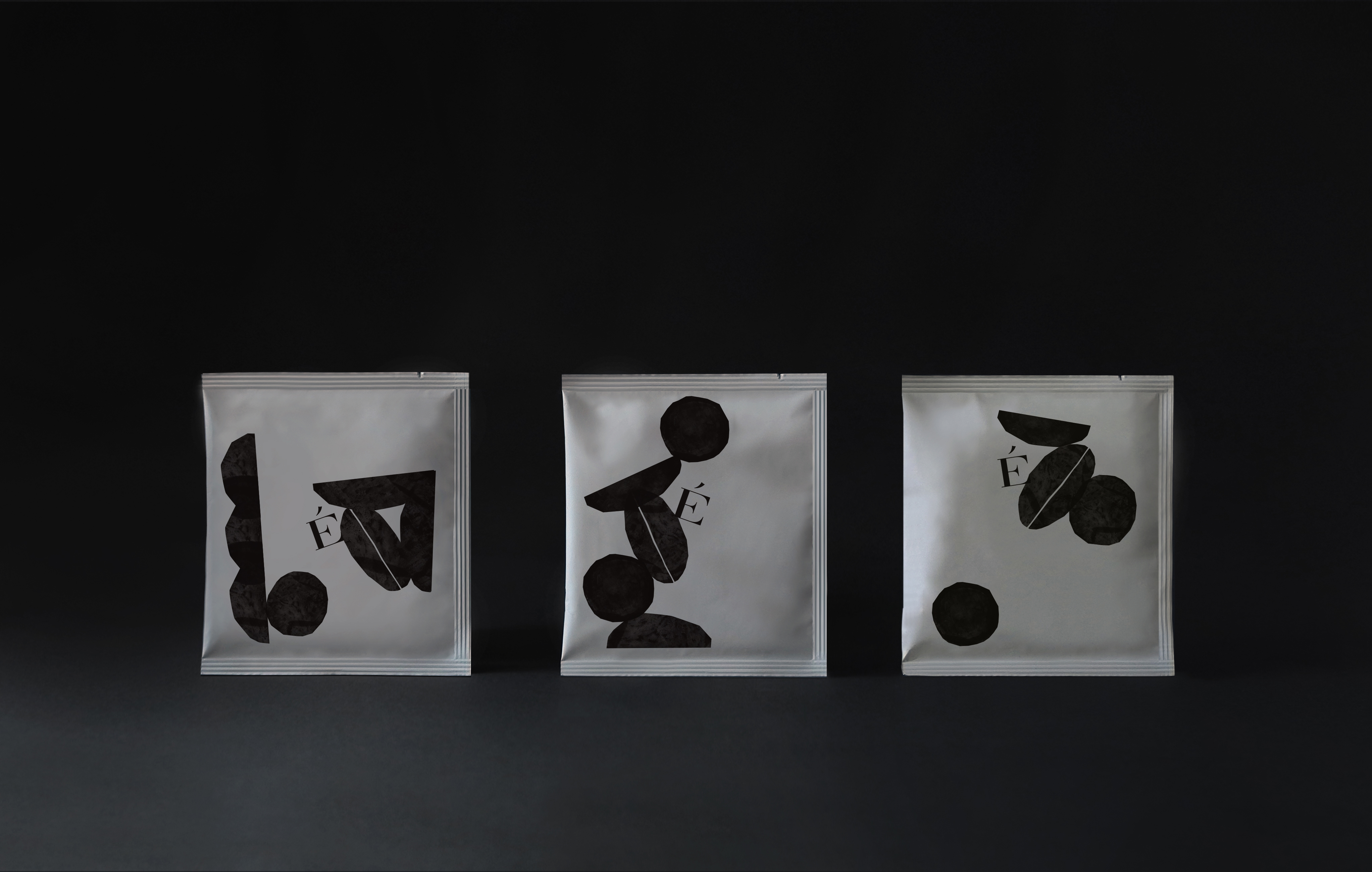
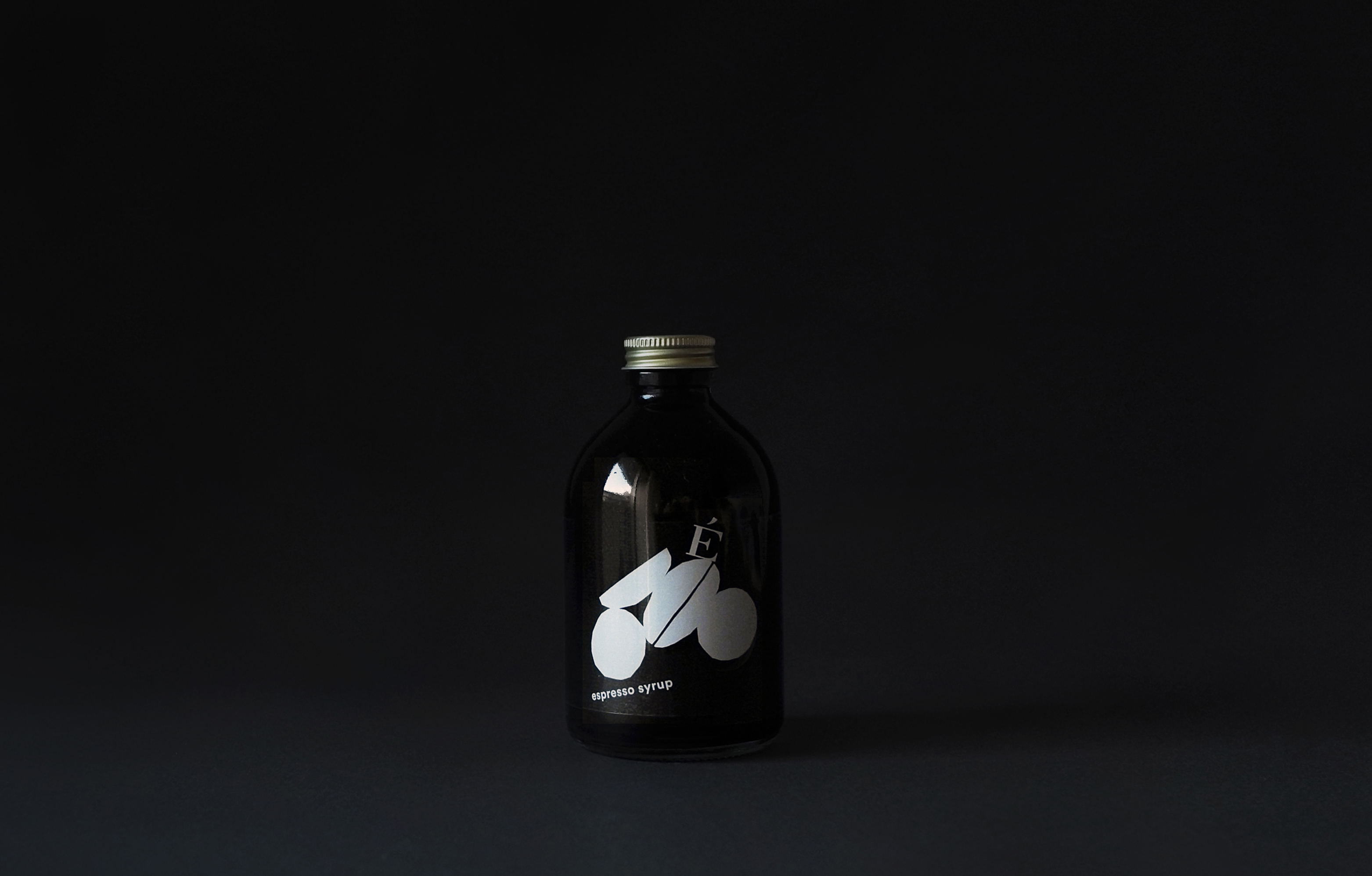
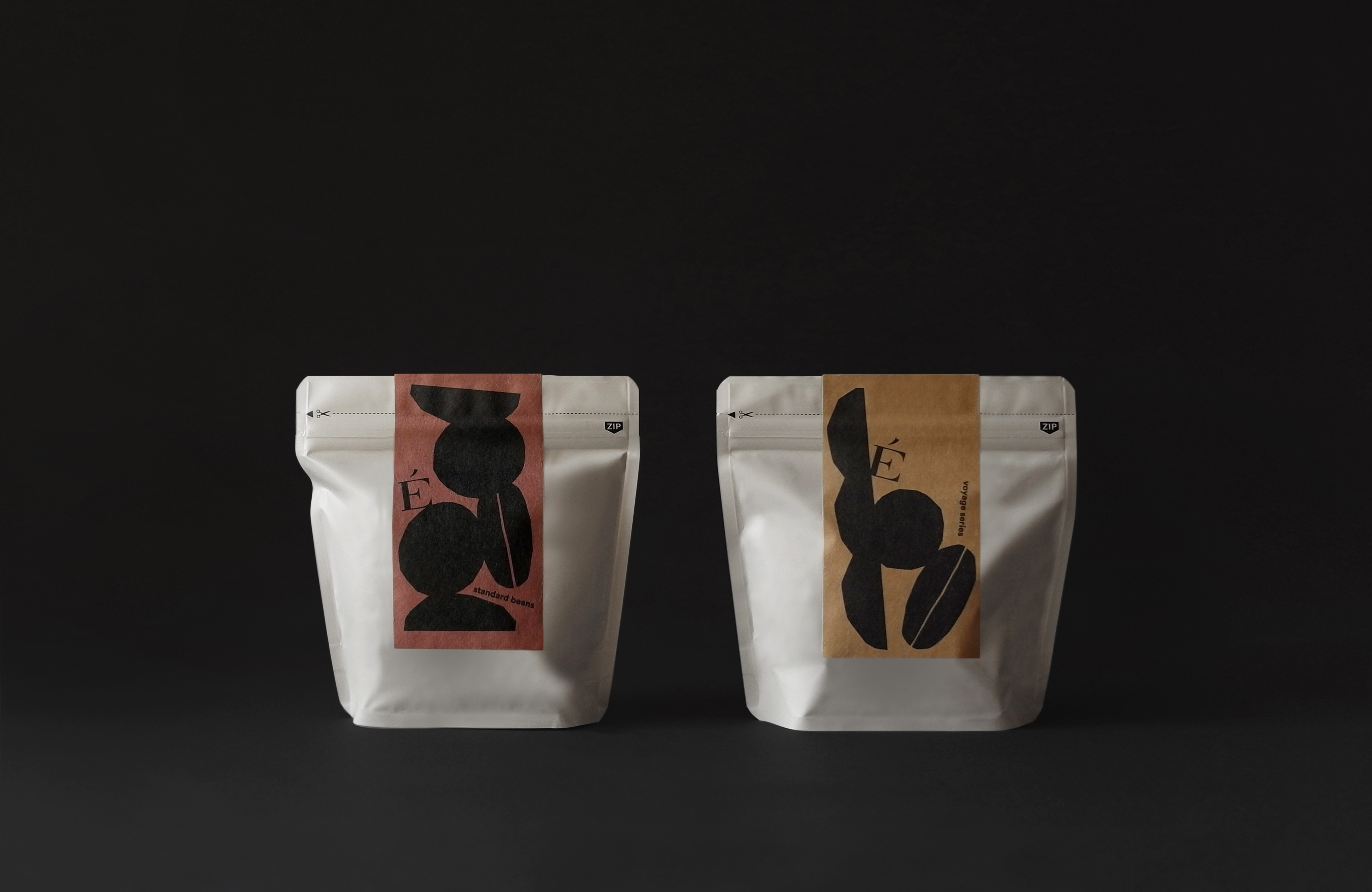
Branding and packaging design for a coffee stand & wine bar ‘ÉCRU’ in Fukuoka, Japan. The branding comprises ‘stacked’ coffee beans and grape berries. The elements, when stacked, form a new, accidental shapes—just like ÉCRU creating new chemical reactions by being a crossing point for coffee and wine drinkers.


The graphics are made bold and heavy-weighted, to match ÉCRU’s role in the community; ÉCRU is not an enclosed hidden shop, but a gathering point that is open for all kinds of people in the neighbourhood.

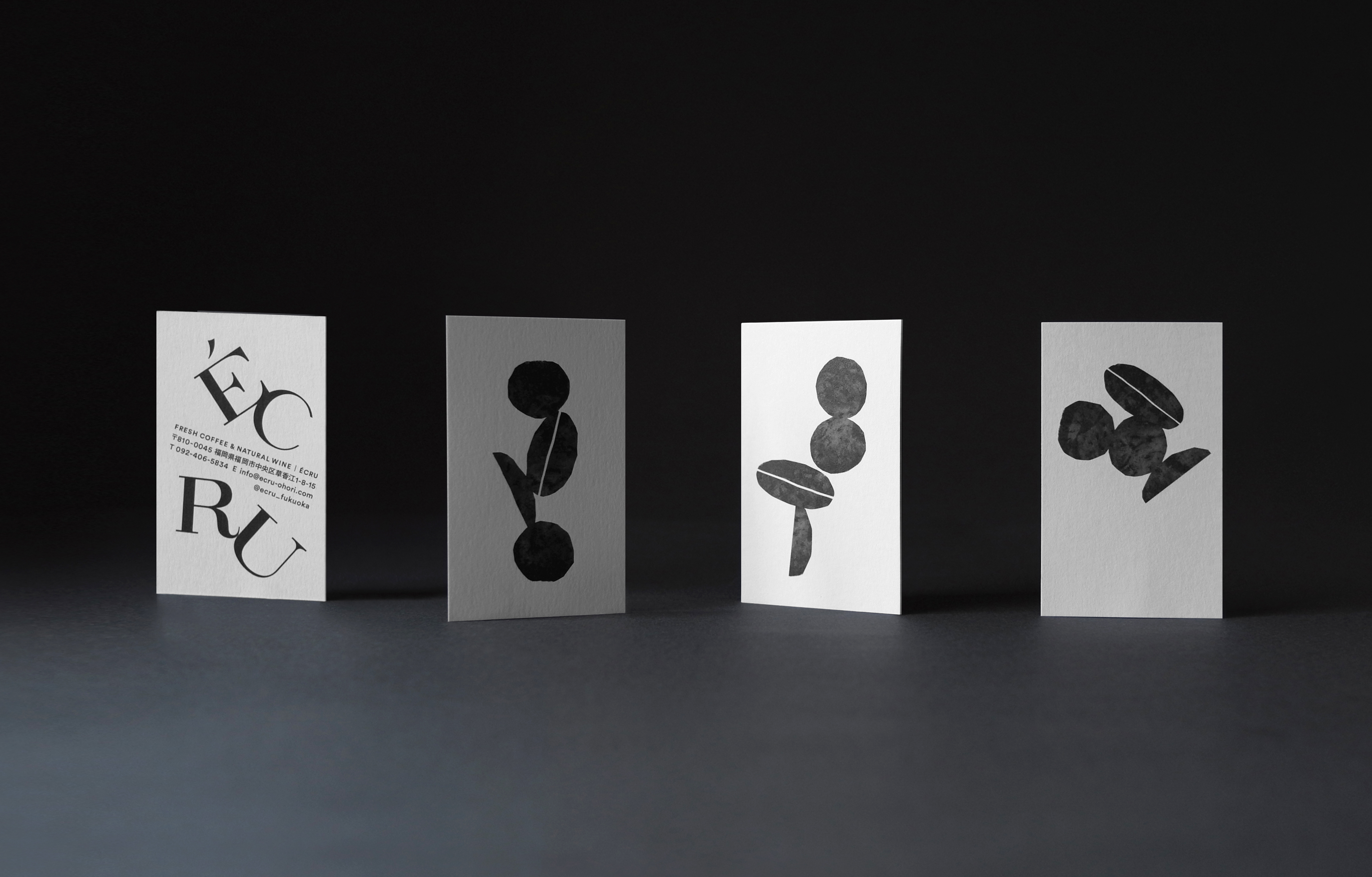

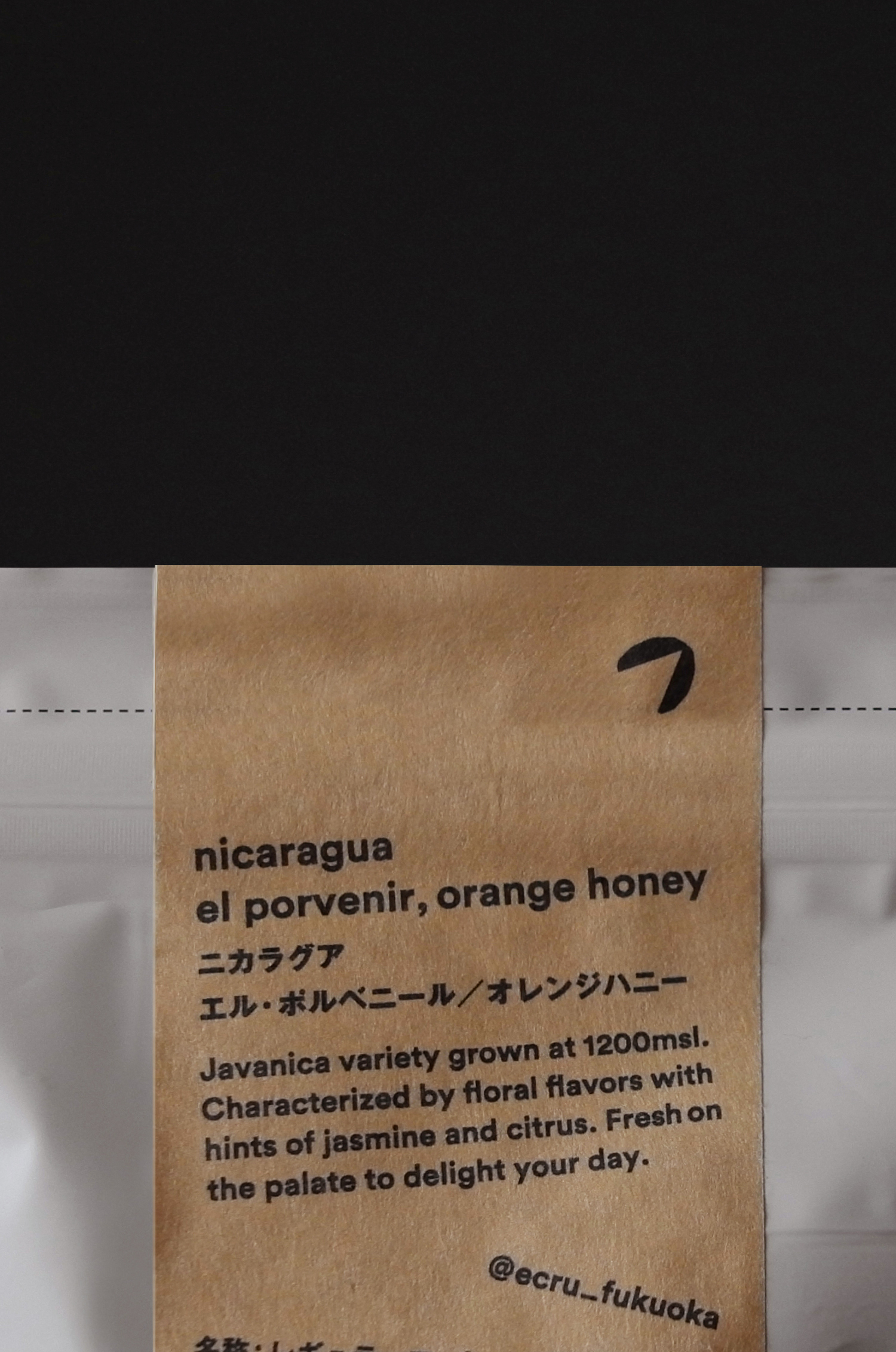
Retail goods


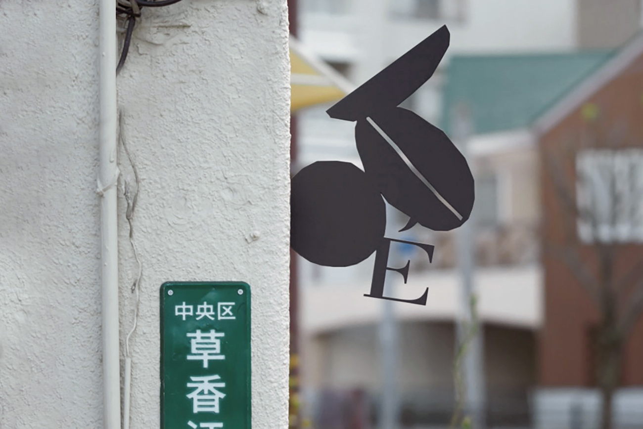
Signage

www.instagram.com/ecru_fukuoka
credits
interior design: CASE-REAL
comissioned by: Ito Soken Co., Ltd.
interior & exterior photography: Tatsuya Harada
special thanks: Tatsuya Harada
graphic design: Koyuki Inagaki
comissioned by: Ito Soken Co., Ltd.
interior & exterior photography: Tatsuya Harada
special thanks: Tatsuya Harada
graphic design: Koyuki Inagaki